
- Home
- Protocols

-

Enrichr pathway analysis: Reactome (2022) and Gene Ontology (GO Biological Processes 2023) bulk RNA and luminal proteomics analysis
Last updated date: Jan 28, 2026 Views: 517 Forks: 0
Bulk RNA-sequencing Differential Gene Expression Generation:
With respect to bulk RNA-sequencing analysis, differentially expressed genes with respect to condition (pregnant/pseudopregnant/superovulation) and time (0.5 days-post-coitus (dpc) pregnant vs 1.5 dpc pregnant) were generated utilizing the Biojupies web-interface pipeline (https://maayanlab.cloud/biojupies/).
Excel sheets containing differentially expressed genes were exported from Biojupies, and further manipulated with respect to Log2FC.
Utilizing the Filter function in Excel, gene lists were filtered to isolate upregulated (Log2FC > 1.00) and downregulated (Log2FC < -1.00) genes of interest. See images below:
| Upregulated (Log2FC > 1.00) | Downregulated (Log2FC < -1.00) |
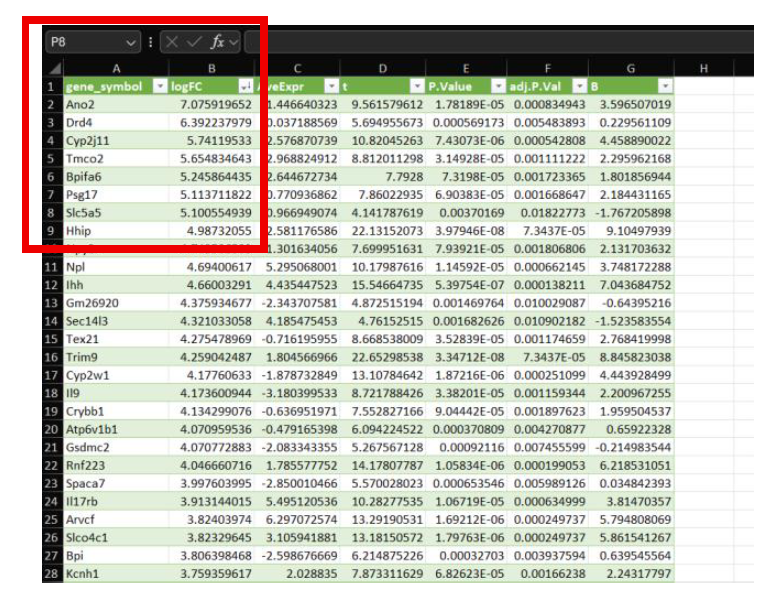 | 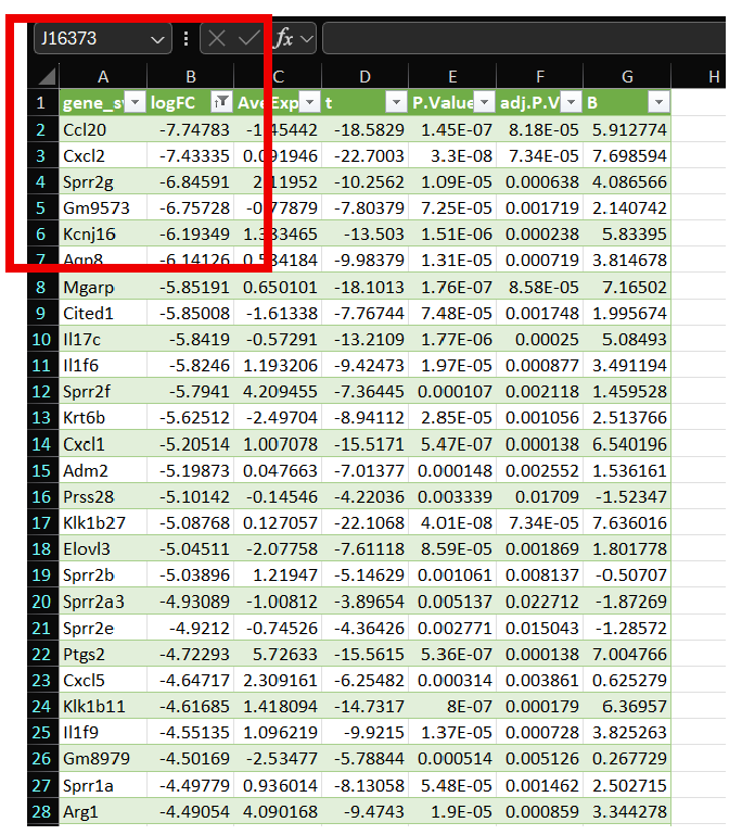 |
Genes represented in Column A now represent up- or downregulated genes with respect to Log2FC, however, you can also utilize P-Value, as seen above in representative Excel Sheets.
Ma'ayan A. Enrichr Pathway Analysis:
Navigate to the Ma'ayan Lab's Enrichr webpage: https://maayanlab.cloud/Enrichr/
Copy and paste gene lists generated in Column A.
- Note: You can only place one set of filtered gene lists into Enrichr, i.e. can only prompt upregulated or downregulated gene lists separately.
- Note: Enrichr utilizes Entrez gene symbols, if your genes are represented in any other fashion (for instance Accession Number) you will have to convert these gene lists to Entrez gene symbol format.
Guided images provided below:
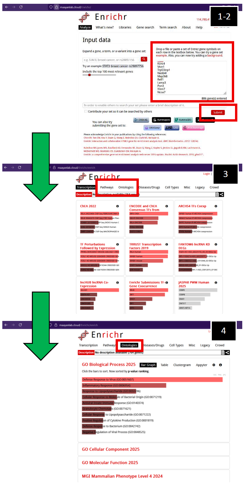 | Ma'ayan Lab's Enrichr webpage (2025)
1. Enter filtered gene list of interest. You can upload a file or simply copy- and-paste your generated gene lists.
2. Press “Submit”.
3. The initial page you will navigate to is with respect to “Transcription”. Navigate to either “Pathways” or “Ontologies”.
4. After navigating to “Ontologies”, you will observe a suite of options. In this example, I clicked on GO Biological Processes (2025), but other pathway ontology analysis tools are available for you to explore if necessary. |
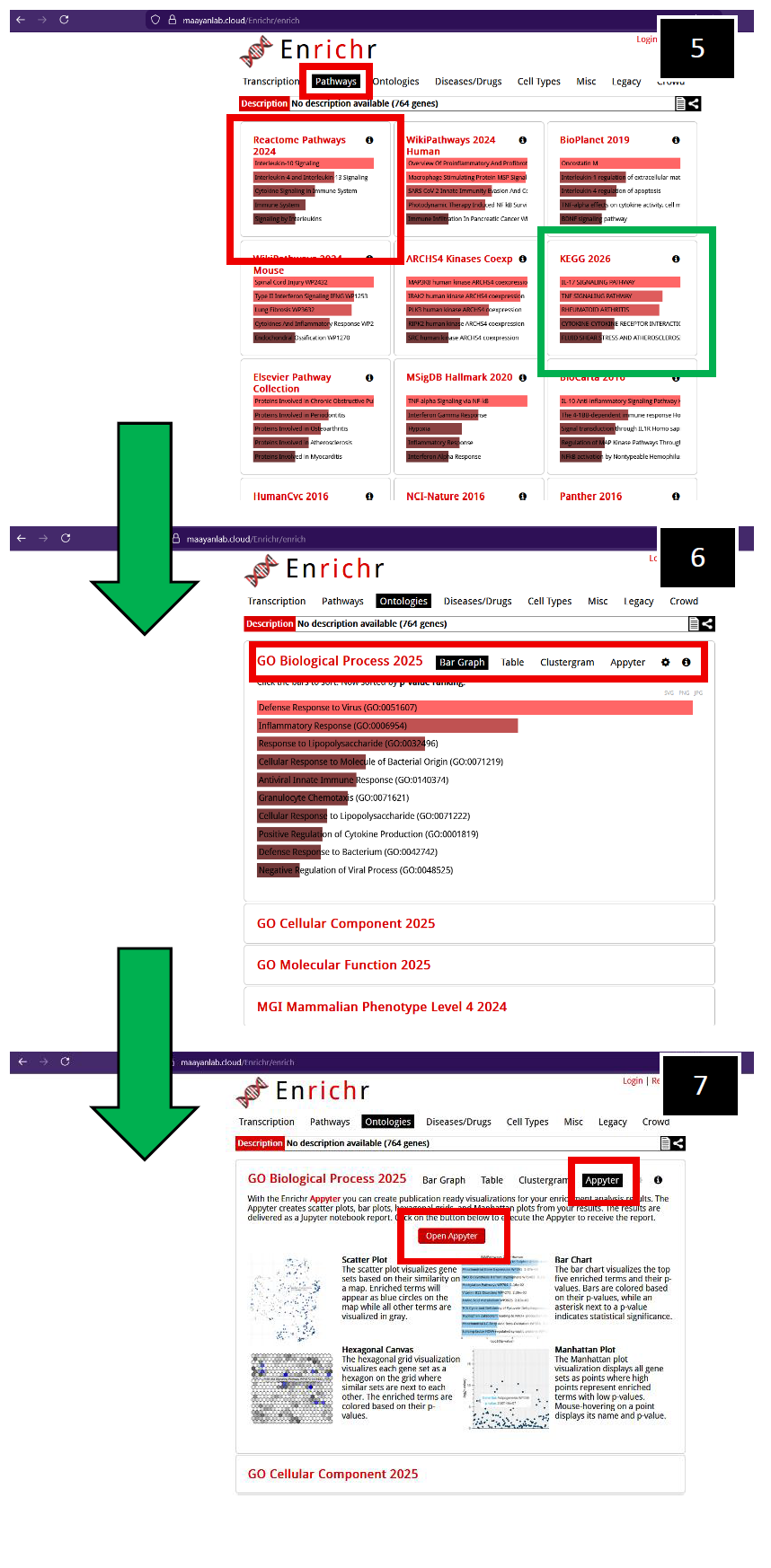 |
5. After navigating to “Pathways”, you will observe a suite of options. In this example, click on Reactome Pathways (2024) (Red-box outline), but other pathway analysis tools are available for you to explore if necessary, such as KEGG 2026 (Green-box outline).
6. Toggling the GO Biological Process (2025) generates more visualization options, initially displaying a bar graph of significant pathways as determined by GO.
7. To obtain bar graphs containing Log10 p-values with respect to significant pathways, toggle "Appyterz", then toggle "Open Appyter".
You will navigate to the Appyter web- interface, scroll down to "Bar Chart". |
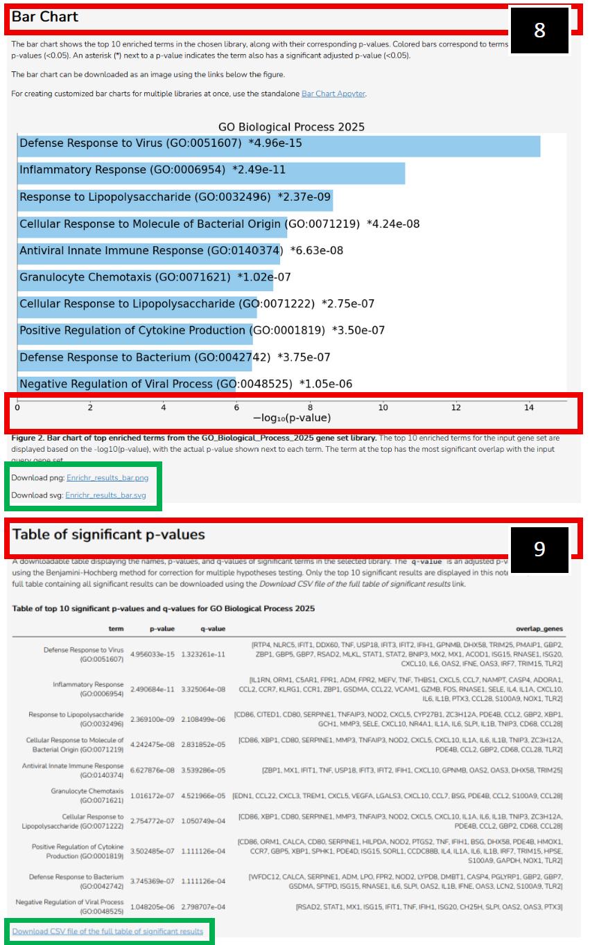 | 8. Example representation of Log10 p- values associated with filtered differentially expressed genes. You can download a .png or .svg file with respect to this bar chart (Green-box outline).
9. You can also export a table (Green- box outline) of significant p-values, detailing genes of significance from each significant pathway that was called.
The same manipulations can be conducted in Appyter if you toggle Reactome Pathways (2024). Examples also provided on the following page. |
- Note: Reactome (2022) and GO Biological Processes 2023 tables (with respect to this published article) were generated and utilized in combination as each database establishes pathway p-value significance differently. This strategy allows the investigator to interrogate a broader range of parallel, similar, or unique significant pathways and establish which genes or pathways are consistently similar, or different, across a variety of ontology platforms.
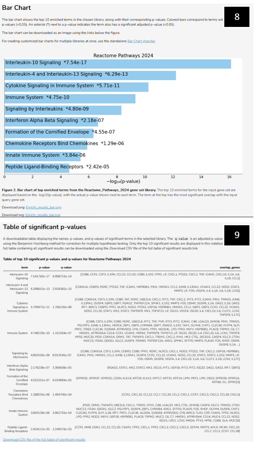 | Ma'ayan Lab's Enrichr webpage (2025) continued (Reactome examples):
8. Example representation of Log10 p-values associated with significant pathways as determined by Reactome (2024).
9. A table of significant p-values, detailing genes of significance from each significant pathway that was called by Reactome (2024). |
Proteomics Analysis Utilizing Ma'ayan Enrichr Web-Interface:
Every sample submitted for LC–MS/MS contained five paired oviduct flushes at each respective timepoint/condition. Once all samples were collected, they were shipped on dry ice overnight to Tymora Analytical Operations (West Lafayette, IN) to perform LC–MS/MS analysis.
Tymora provided an Excel sheet, which contained an Accession ID (See image below, Red-box outline) for every protein identified in our luminal protein samples. Additionally, the abundance value associated with the Accession ID protein was provided.
Since these were pooled samples, we only received one abundance value (theoretical average) correlating to a specific Accession ID. This is problematic for statistical analyses, such as t-tests.
Therefore, transform the data by invoking the Gaussian Normal Distribution to each sample's abundance value.
Guided images provided:
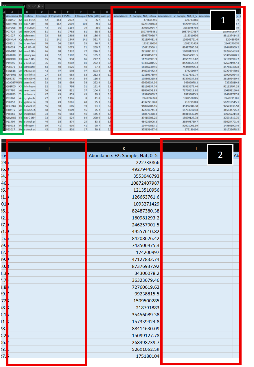 | 1. Example of LC-MS/MS luminal protein abundance read-out provided by Tymora. Accession ID' s are in Column A (Green-outlined box). Sample identifiers can be seen outlined in the Red box, starting at Column I.
2. Initially, generate two additional columns (Columns J and L, Red-box outlines) adjacent to your empirically measured sample (Column K). |
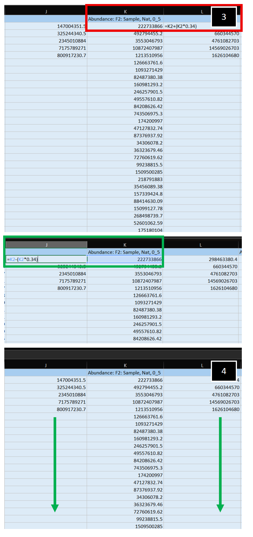 | 3. Apply a Gaussian Normal Distribution transformation to your empirically measured abundance value. In this example, one-standard deviation to the right (+, Column L, Red-box outline) and to the left (-, Column J, Green-box outline) were applied to the center, empirically measured value.
4. Apply this transformation to both columns, for all abundance values present, generating your theoretical values. Repeat, starting at Step 2 in this section, for all additional samples present in the dataset. |
- Note: If you have Accession ID's that correspond to zero abundance or "NA", you will have to remove these protein ID's from your dataset to statistically analyze in the Perseus software later. For additional information on how to handle zero or "NA" values in your dataset, see Perseus instructions.
Download the open software platform Perseus at https://maxquant.net/perseus/.
To upload your transformed Excel sheets, you will have to convert them into .txt format. A file can be generated from an excel sheet by using the export as a tab-separated .txt file. See Perseus instructions here: https://cox-labs.github.io/coxdocs/genericmatrixupload.html
Additionally, you will need to ensure you upload the appropriate annotation file with respect to the species you have obtained samples from. These are read from specifically formatted files contained in the folder conf/annotations in your Perseus installation. Species-specific annotation files generated from UniProt can be downloaded from a link. See Perseus instructions here: https://cox-labs.github.io/coxdocs/addannotationtomatrix.html
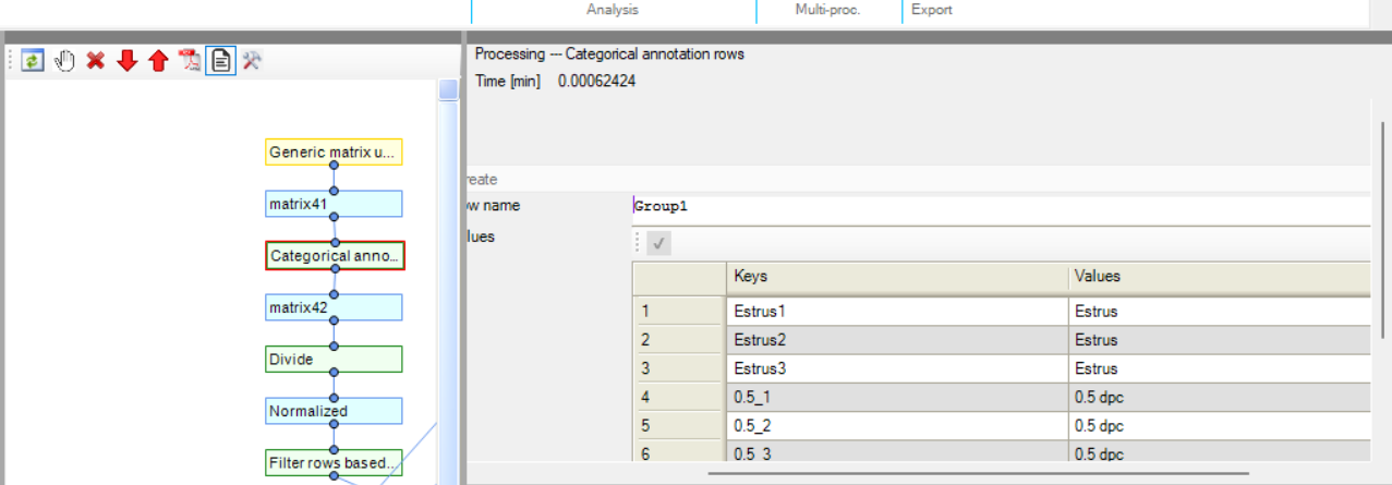
Once you have uploaded your matrix you need to perform Categorical Annotation to group different conditions, times, or perturbations with respect to your samples. See Perseus instructions here: https://cox-labs.github.io/coxdocs/createcategoricalannotrow.html.
With respect to the image below, Estrus 1 is with respect to the theoretical value produced after the Gaussian Normal Distribution application (K2 – (K2 * 0.34)), Estrus 2 corresponds to the non- manipulated central value abundance observed, and Estrus 3 corresponds to the theoretical value produced after the Gaussian Normal Distribution application (K2 + (K2 * 0.34)).
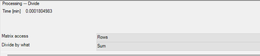
Next you will need to Normalize your abundance values, in this example, the Perseus function “Divide” was utilized.
- Note: Normalization may need to be more rigorous with respect to your samples, refer to Perseus instructions for more detailed/rigorous Normalization processes (https://cox-labs.github.io/coxdocs/perseus_activities.html#normalization)
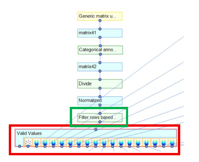
Next, utilize the Perseus function "filter rows based on valid values" (Green-box outline in image below). Here, you define the minimal number of valid values each row needs to have in the expression columns to survive the filtering process. More detailed Perseus instructions here https://cox-labs.github.io/coxdocs/filtervalidvaluesrows.html.
After you have filtered your dataset for Valid Values, you can now utilize visualization tools to interrogate this matrix (Red-box outline below).
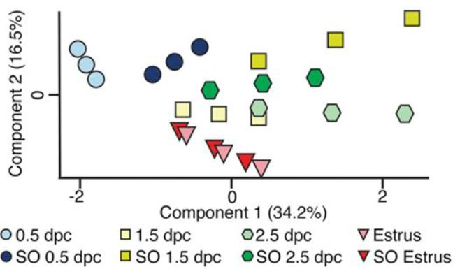
In the above image, differential comparisons were made between groups to then generate a PCA plot and volcano plots.
- Note: Your PCA plot will reflect the Gaussian Normal Distribution curve transformation, i.e. if protein abundance is greater at any given condition or time, the two theoretical points introduced will center around the empirically observed average but will space further apart, and vice versa. An example from this published article highlights this. Greater protein abundance at SO 1.5 dpc below (Dark yellow-boxes in image below) leads to greater distance from the empirically measured value as the 34% Gaussian Normal Distribution transformation becomes more dramatic (i.e. 34% above/below an arbitrary center value of 1000 generates two theoretical values of 1340 and 660 (Dark-yellow boxes in image below), whereas 34% above/below a center value of 500 generates two theoretical values of 670 and 330 (Light-blue boxes in image below), which visually generates a looser and tighter PCA plot grouping, respectively):
- Note: With respect to statistical tests, t-tests carried out with the Gaussian Normal Distribution transformation will assign empirical measurements as the means for statistical comparisons (since the two theoretical values you generate are equally proportional, t-test will perceive the empirical measurement as the mean). However, if more rigorous statistical analysis is necessary, refer to Perseus instructions.
To generate a matrix of differentially expressed proteins between timepoints or conditions, a volcano plot was utilized. After which a matrix was generated and exported with corresponding Accession ID' s. In the comparison below, I compared 0.5 dpc to 1.5 dpc.
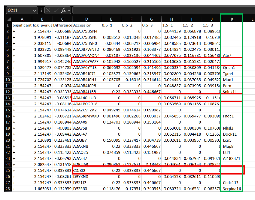
Next, use a web-interface Accession ID converter to convert all Accession ID labels to Entrez gene symbol format for entry into Ma'ayan Lab Enrichr web-interface, as detailed previously.
- Note: Not all Accession ID's will correspond to an Entrez gene symbol (i.e. Red-box outline in above image). In the sheet above, Entrez symbols after conversion are pasted (Column K, Green-box outline) back into the Excel sheet to correspond back to the appropriate Accession ID.
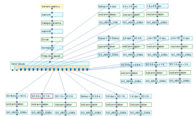
Perseus pipeline, manipulations and comparisons with respect to this article:
Related files
 Enrichr_Reactome_DetailedProtocolRequest_RMF_WW_2026.pdf
 - Finnerty, R and Winuthayanon, W(2026). Enrichr pathway analysis: Reactome (2022) and Gene Ontology (GO Biological Processes 2023) bulk RNA and luminal proteomics analysis. Bio-protocol Preprint. bio-protocol.org/prep2892.
- Finnerty, R. M., Carulli, D. J., Hedge, A., Wang, Y., Boadu, F., Winuthayanon, S., Jack Cheng, J. and Winuthayanon, W.(2025). Multi-omics analyses and machine learning prediction of oviductal responses in the presence of gametes and embryos. eLife. DOI: 10.7554/eLife.100705
Do you have any questions about this protocol?
Post your question to gather feedback from the community. We will also invite the authors of this article to respond.