


- Protocols

- Articles and Issues
- For Authors
- About
- Become a Reviewer


A Python-Based Workflow for Image-Based Single-Cell Phenotypic Profiling From Fluorescence Microscopy Images

Published: Vol 16, Iss 21, Nov 5, 2026 DOI: 10.21769/BioProtoc.5848 Views: 31
Reviewed by: Fred D. MastAarya Vaikakkara ChithranAnonymous reviewer(s)
 PDF
PDF  Ask a question
Original research article
The authors used this protocol in:
Jan 2026

Protocol Collections
Comprehensive collections of detailed, peer-reviewed protocols focusing on specific topics



Abstract
While advances in omics technologies have greatly improved our understanding of cellular heterogeneity, there is an increasing need for complementary approaches that capture the spatial organization and structural dynamics of cells. Image-based single-cell phenotypic profiling provides quantitative information on cell morphology and organelle organization, offering valuable insights into cellular function and regulation. Although numerous image analysis tools are available, establishing a complete analysis workflow, from image preprocessing and segmentation to feature extraction and multivariate analysis, often requires substantial computational expertise and software integration. Here, we describe a Python-based workflow for image-based single-cell phenotypic profiling from immunofluorescence microscopy images and provide a detailed protocol for its implementation. Using synchronized HeLa cells with drug-induced mitotic spindle defects as an example, the workflow covers image loading, cell segmentation, quantitative feature extraction, profile integration, dimensionality reduction, clustering, and data visualization. The protocol is accompanied by example datasets, annotated Jupyter Notebooks, and instructions for execution in either a local Python environment or Google Colab, facilitating straightforward implementation and customization. By integrating the entire analysis pipeline within a single coding environment, this workflow enables reproducible and accessible single-cell morphological profiling without requiring specialized imaging equipment or extensive programming expertise. The workflow therefore provides a practical platform for studying cell morphology, organelle organization, and cellular dynamics across a broad range of biological applications.
Key features
• Complete image analysis workflow implemented in Python within a single coding environment.
• Flexible and customizable analysis pipeline that can be readily adapted to different fluorescence imaging datasets and biological applications using mammalian cell culture monolayers.
• Automated extraction of quantitative single-cell morphological profiles from fluorescence microscopy images.
• Step-by-step tutorial with example datasets, source code, and Google Colab support to facilitate reproducible and accessible image analysis.
Keywords: High-content imaging Image-based phenotyping
Single-cell analysis
Cell morphology
Fluorescence microscopy
Multivariate analysis
Image-based phenotyping
Single-cell analysis
Cell morphology
Fluorescence microscopy
Multivariate analysis
Graphical overview
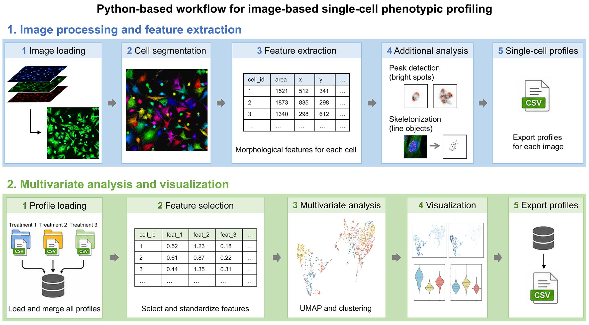
Overview of the image-based single-cell phenotypic profiling workflow. This workflow includes image loading, cell segmentation, quantitative feature extraction, multivariate analysis, and data visualization for image-based single-cell phenotypic profiling. It generates quantitative cell phenotypic profiles from immunofluorescence images and supports profile integration and export of processed datasets. The workflow is implemented as annotated Jupyter Notebooks and can be executed in either a local Python environment or Google Colab.
Background
Cells continuously adjust their morphology, intracellular organization, and organelle architecture in response to both intrinsic and extrinsic signals. These morphological characteristics provide informative readouts of cellular state, function, and regulation, complementing recent advances in omics technologies [1–3]. Accordingly, quantitative analysis of cellular and subcellular morphology has become increasingly important for investigating biological processes such as cell cycle progression, cell polarization, migration, and differentiation [4–8]. During mitosis, for example, cells undergo characteristic structural changes, including cell rounding, chromosome condensation, spindle assembly, and Golgi reorganization [9]. Although many of these changes are readily recognizable, others are subtle and heterogeneous, making them difficult to evaluate consistently by manual observation alone. Artificial intelligence (AI)-assisted image analysis, including CNN-based approaches for extracting phenotypic features from microscopy images, has demonstrated considerable potential for detecting such subtle morphological changes at the single-cell level [10]. These advances have created a growing need for robust and accessible workflows that convert microscopy images into quantitative, reproducible phenotypic data.
Recent advances in fluorescence microscopy and computational image analysis have greatly expanded the ability to extract quantitative information from cell images. However, image-based phenotyping typically requires multiple computational steps, including image preprocessing, cell segmentation, feature extraction, dimensionality reduction, clustering, and visualization, which are often performed using different software packages or custom scripts. As a result, establishing reproducible and easily adaptable analysis workflows remains a practical challenge for many laboratories.
To facilitate routine image-based phenotyping, we developed a Python-based workflow that integrates image loading, preprocessing, segmentation, feature extraction, multivariate analysis, and visualization within a single analysis pipeline [11]. Numerous image analysis platforms are available, including ImageJ/Fiji [12,13], napari [14], CellProfiler [15], Cellpose [16,17], and ilastik [18]. Rather than replacing these established tools, our workflow is designed to provide (i) a seamless pipeline from raw images to quantitative results within a single coding environment, (ii) concise and transparent code that is easy to understand and modify, and (iii) flexibility for customization to accommodate different imaging datasets and biological questions. The workflow combines Cellpose-based cell segmentation with quantitative feature extraction and multivariate analysis. Using fluorescence images of drug-treated HeLa cells as an example [11], this protocol provides a step-by-step tutorial covering the complete workflow, from image loading to downstream biological interpretation.
Software and datasets
The dataset used in this protocol, including the source code and cell images, can be downloaded from the Dryad repository (https://doi.org/10.5061/dryad.8gtht771s, 2025/11/07; updated 2026/08/19). A Python environment is required to run the analysis. Because there are many ways to set up such an environment, we describe two example workflows: (1) installing Miniconda and Visual Studio Code (VS Code), or (2) using Google Colab. For users without experience managing Python environments, we recommend the Google Colab option because it does not require local installation or manual environment configuration. Users who already have a suitable Python environment can use it instead. The Python environment can be created using the provided YAML file, while the versions of key packages used in this protocol are listed in Table 1.
Table 1. Key Python packages used in the image-based phenotypic profiling workflow.
The table lists the key Python packages used in the workflow, together with their versions and primary functions. The complete computational environment can be reproduced using the provided YAML file.
| Python=3.8.15 | ||
|---|---|---|
| Package | Version | Description |
| cellpose | 2.1.1 | Deep learning–based cell segmentation from microscopy images. |
| matplotlib | 3.5.3 | For creating plots and data visualizations. |
| numpy | 1.23.4 | For numerical computing and multidimensional array operations. |
| opencv (cv2) | 4.11.0.86 | A computer vision package for image processing and analysis. |
| pandas | 1.5.1 | For data manipulation and tabular data analysis. |
| scikit-image (skimage) | 0.20.0 | For image processing and analysis. |
| scikit-learn (sklearn) | 1.2.2 | A machine learning package for data preprocessing, clustering, and other analyses. |
| seaborn | 0.13.2 | A data visualization package based on matplotlib. |
| tifffile | 2022.10.10 | For reading and writing TIFF image files. |
| trackpy | 0.6.1 | For detecting and tracking features in images. |
| umap-learn (umap) | 0.5.6 | For dimensionality reduction and visualization using UMAP. |
Note: The code is provided as Jupyter Notebooks and can be executed in VS Code, JupyterLab, or Google Colab. For users running the analysis in VS Code or JupyterLab, the cellphenotype_full.yaml environment file provided in the Dryad repository can be used to recreate the software environment. At least 8 GB RAM is recommended, although 16 GB RAM is preferable for running the complete workflow. This protocol was tested on a Windows computer equipped with an Intel Core i5-12400 processor and 16 GB RAM, as well as on Google Colab with an NVIDIA T4 GPU. Although GPU acceleration is optional, it substantially improves segmentation speed.
Procedure
A. Preparation of code and image files
In this tutorial, the workflow is demonstrated by reproducing the data shown in Figure 1 of [11], using images of HeLa cells synchronized in mitosis and treated with three different drugs (DMSO, taxol, and monastrol). While the DMSO control yields normal bipolar spindles, taxol and monastrol induce the formation of multipolar and monopolar spindles, respectively, thereby providing datasets suitable for phenotypic analysis.
1. Prepare the code and data.
Download Figure_1_S1.zip from the Dryad repository (Aug 19, 2026, version files) and extract its contents to any user-accessible directory (e.g., the desktop as shown in Figure 1). The extracted folder contains the code (Code), original cell images in TIFF format (multi-channel images with maximum intensity projection of the z-stack), their corresponding segmentation results for each condition (DMSO, Taxol, and Monastrol), and cell profile data (MVA_Profiles) (Figure 1).
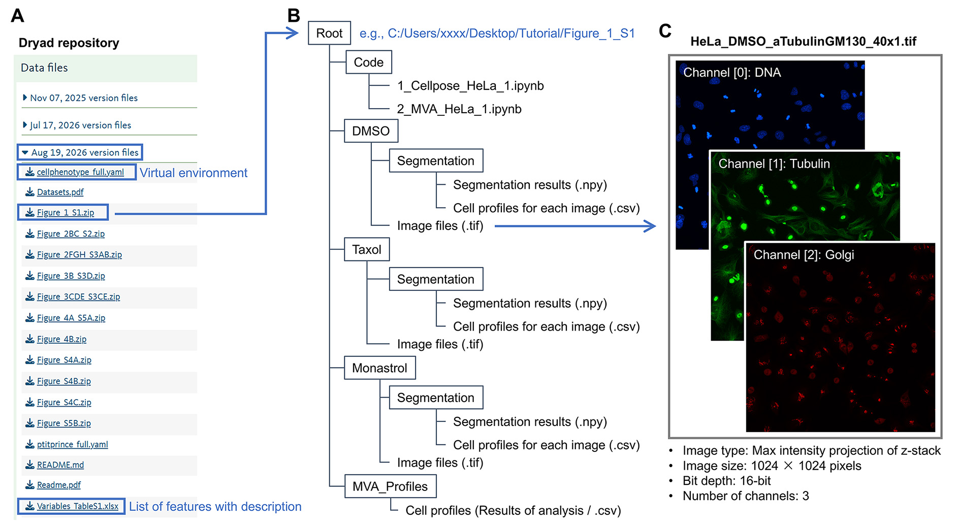
Figure 1. Directory and data structure. (A) Files available in the Dryad repository. To follow the example workflow in this protocol, download Figure_1_S1.zip. If using Miniconda or Anaconda, use cellphenotype_full.yaml to create the virtual environment. This step is not required when using Google Colab. (B) Folder and file structure. Extract Figure_1_S1.zip and place the resulting folder (Figure_1_S1) in an appropriate location. This folder serves as the root directory ( in the code). If using Google Colab, save this folder to Google Drive. (C) Representative image data. The image consists of three channels with a resolution of 1,024 × 1,024 pixels and a bit depth of 16-bit. Although displayed here in pseudo-color with contrast adjustments for better visibility, it is crucial in practice to optimize image acquisition settings to prevent pixel saturation. Each channel is a two-dimensional image generated by a maximum intensity projection of a confocal z-stack.
Note: The existing files in the Segmentation and MVA_Profiles folders will be overwritten when the workflow is executed. If desired, these folders may be emptied before running the workflow. This prevents files from previous analyses from being mixed with the results of the current analysis.
2. Prepare the virtual environment.
If using VS Code or JupyterLab, download cellphenotype_full.yaml from the Dryad repository and use it to create a dedicated Conda environment containing the required Python packages and their compatible versions. Detailed instructions for installing and using Conda are beyond the scope of this protocol; users unfamiliar with local Python environment management may instead use the Google Colab version of the workflow, which does not require local environment setup.
B. Image loading, cell segmentation, and feature extraction
The Code folder contains two Jupyter Notebook files: 1_Cellpose_HeLa_1.ipynb for image loading, preprocessing, and cell segmentation, and 2_MVA_HeLa_1.ipynb for feature profile integration, postprocessing, multivariate analysis, and visualization. These notebooks are designed so that the basic workflow can be completed simply by executing the cells sequentially while following the comments provided in the code. For the example dataset, users can initially use the parameter values provided in the notebooks as recommended starting parameters. These values may be adjusted when analyzing their own data. This protocol complements the notebooks by providing additional explanations for each step.
1. Open 1_Cellpose_HeLa_1.ipynb.
Option A: Open the notebook in VS Code or JupyterLab using the virtual environment created from cellphenotype_full.yaml (Figure 2).
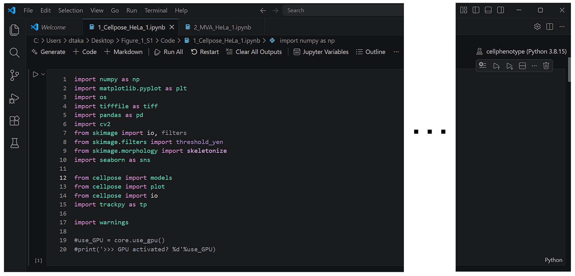
Figure 2. Overview of code execution. When 1_Cellpose_HeLa_1.ipynb is opened in VS Code, the interface appears as shown. The appearance is largely the same in JupyterLab and Google Colab. The notebook is designed so that the workflow can be completed by executing the cells sequentially.
Option B: Open the notebook in Google Colab (Figure 3).
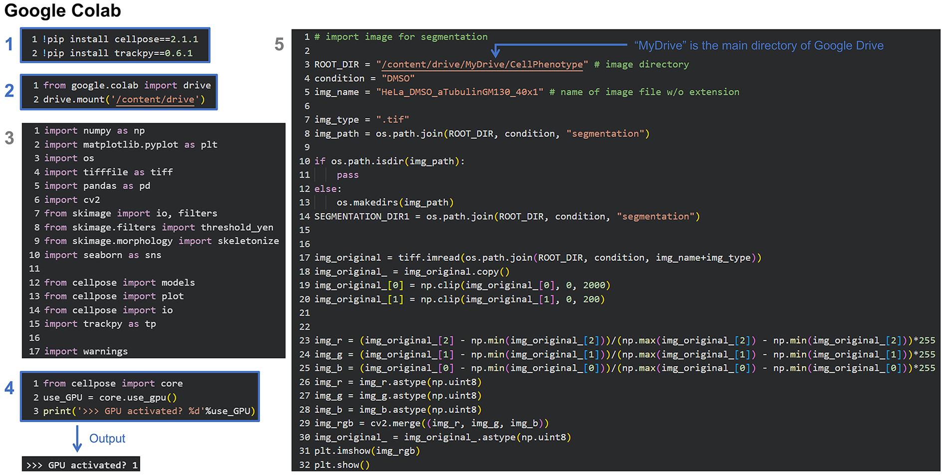
Figure 3. Initial setup using Google Colab. When using Google Colab, insert cells 1 and 2 at the beginning of the notebook to install the required packages and mount Google Drive. Cell 3 corresponds to the first cell of the original notebook. Optionally, insert cell 4 to enable GPU acceleration during segmentation. Cell 5 corresponds to the second cell of the original notebook (Figure 4). In this cell, set ROOT_DIR to the location of the Figure_1_S1 folder in Google Drive.
Note: The remaining procedure is essentially identical for both options.
2. Load images (Figure 4).
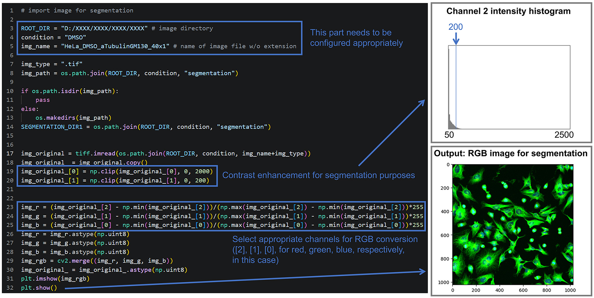
Figure 4. Image file loading. Load an original 16-bit TIFF image file and convert it into an RGB image for Cellpose segmentation. ROOT_DIR needs to be modified to point to the folder where the data is actually stored. Image contrast can be enhanced by clipping the range of pixel values. This may improve segmentation accuracy in some cases. As an example, the histogram obtained when clipping a tubulin image (Channel 2) with a range of 0–200 is shown at the top right. The output image with enhanced contrast for segmentation is shown at the bottom right.
a. Set ROOT_DIR to the main directory containing the extracted Figure_1_S1 folder (e.g., C:/Users/XXXX/Desktop/Data_cellphenotype/Figure_1_S1). The project directory must be accessible with read/write permissions for the user.
b. Set condition and img_name to the desired experimental condition and image file.
c. Generate an RGB image for Cellpose segmentation by selecting the channels to be used. In this example, the Golgi (channel 2 of the original three-channel image), tubulin (channel 1), and DNA (channel 0) channels are assigned to the red (img_r), green (img_g), and blue (img_b) channels of the RGB image, respectively.
Tips: Adjusting image contrast can affect segmentation performance. For example, increasing the contrast of the tubulin channel beyond pixel saturation allows the background signal to serve as a cytoplasmic marker for segmentation. This method is useful when there are no markers dedicated to segmentation. The clipping values (e.g., 0–2,000) are example starting values for the 16-bit images used in this protocol and are not universal thresholds. Users should inspect the intensity distribution of their images when adapting the workflow to images with different bit depths or intensity scales. We recommend adjusting the contrast so that the cell outlines are clearly visible. Segmentation-specific preprocessing parameters, including the clipping values, should be kept consistent across experimental groups to avoid introducing condition-dependent segmentation bias. Because the RGB image is used only for segmentation, these contrast adjustments do not affect subsequent feature quantification. If the original image contains four or more channels, only the channels required for segmentation need to be selected. If it contains fewer than three channels, one channel may be duplicated (e.g., “tubulin, tubulin, DNA” assigned to the red, green, and blue channels).
3. Run segmentation (Figure 5).
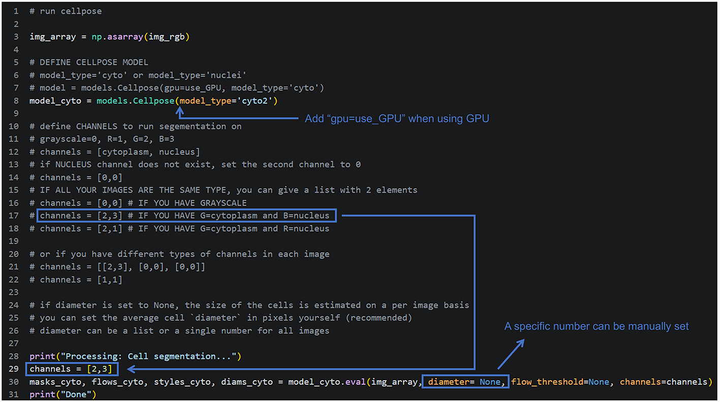
Figure 5. Segmentation setup and execution. Configure the segmentation parameters and execute Cellpose segmentation. Specify the channel to be used to create the cell masks and the nuclear channel (if available). We recommend starting by setting the diameter parameter to None for automatic mode. If the segmentation results are unsatisfactory, a specific value can be set, which may improve segmentation accuracy.
a. Configure the Cellpose segmentation parameters, including the model type and the channels used for segmentation. Cellpose is a deep learning–based image segmentation method that predicts individual cell masks from microscopy images [16,17]. In most cases, the pretrained cyto2 model is appropriate for whole-cell segmentation. In this example, channels 2 (green in the RGB image, tubulin) and 3 (blue in the RGB image, DNA) of the input image are specified as the cytoplasmic and nuclear markers, respectively. Although the nuclear marker is optional, including it generally improves segmentation accuracy.
Tips: Other pretrained models are also available, including cyto for general cell segmentation and nuclei for nuclear segmentation. Setting diameter=None allows Cellpose to estimate the cell diameter automatically for each image. Alternatively, diameter can be manually set to the approximate cell diameter (in pixels), which may improve segmentation accuracy in some cases. We recommend starting in automatic mode (diameter=None) and then specifying the cell diameter if the segmentation results are unsatisfactory. Depending on cell morphology and image quality, it may be necessary to test with different cell diameter values.
b. Run the notebook cell to perform segmentation. During execution, the message “Processing: Cell segmentation...” is displayed, followed by “Done” when the analysis is complete.
Tips: The flow_threshold parameter (default: None) controls the sensitivity of boundary detection and can usually be left at its default value. The Cellpose function returns four outputs: masks_cyto (labeled cell masks; primary segmentation results), flows_cyto (flow fields used for boundary refinement), styles_cyto (style vectors), and diams_cyto (estimated cell diameters).
c. Display the segmentation results for quality control (Figure 6). The output includes the original image, predicted outlines and masks (two different representations of the segmentation results) overlaid on the original image, and the flow fields for reference. Use these images to confirm that the segmentation parameters correctly identify cell boundaries before proceeding to feature extraction.
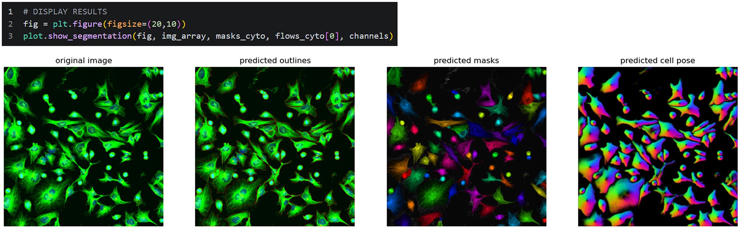
Figure 6. Display of the segmentation results. Display the segmentation results and evaluate their accuracy. In addition to the original image, the predicted outlines, masks, and Cellpose results are displayed; these are used to visually check the segmentation accuracy.
Tips: The segmentation parameters will likely require optimization, particularly for the first few images, by repeating steps a–c. In some cases, returning to step 2-c and adjusting the contrast of the images used for segmentation (for both cytoplasmic and nuclear markers) further improves the results. This optimization process is often the most time-consuming part of the workflow. Segmentation performance may vary with cell morphology, cell density, staining quality, and imaging conditions, and segmentation results should be visually inspected before downstream analysis. For touching or overlapping cells, accurate separation of individual cells may not always be possible, and some compromise in segmentation accuracy may be unavoidable. Manual correction of segmentation masks is not implemented in the current workflow. Visual inspection alone does not constitute quantitative validation; therefore, if quantitative evaluation is required for a new cell type or imaging condition, users should independently prepare a validation dataset and evaluate segmentation accuracy. For example, this can be achieved by calculating IoU (Intersection over Union) using manually annotated cell masks. Once segmentation-related parameters are set, these should be kept consistent across images to avoid introducing segmentation bias.
d. Save the segmentation results in NumPy ndarray format (Figure 7). By default, the files are saved in the Segmentation subfolder within the directory containing the original images. Once the segmentation results have been saved, these cell segmentation steps can be skipped in future analyses, allowing the workflow to resume from the subsequent feature extraction steps.

Figure 7. Saving the segmentation results. Save the segmentation results to the specified location.
4. Load previously saved segmentation results (Figure 8; optional).
If resuming the workflow from this point, load the saved segmentation results (Figure 8). If continuing directly from step 3, running this cell has no effect.

Figure 8. Loading the segmentation results. Load the previously saved segmentation results.
5. Examine the segmentation results in detail (Figure 9; optional).
Display all segmented masks simultaneously or inspect an individual cell by specifying its mask ID (num; e.g., 29).
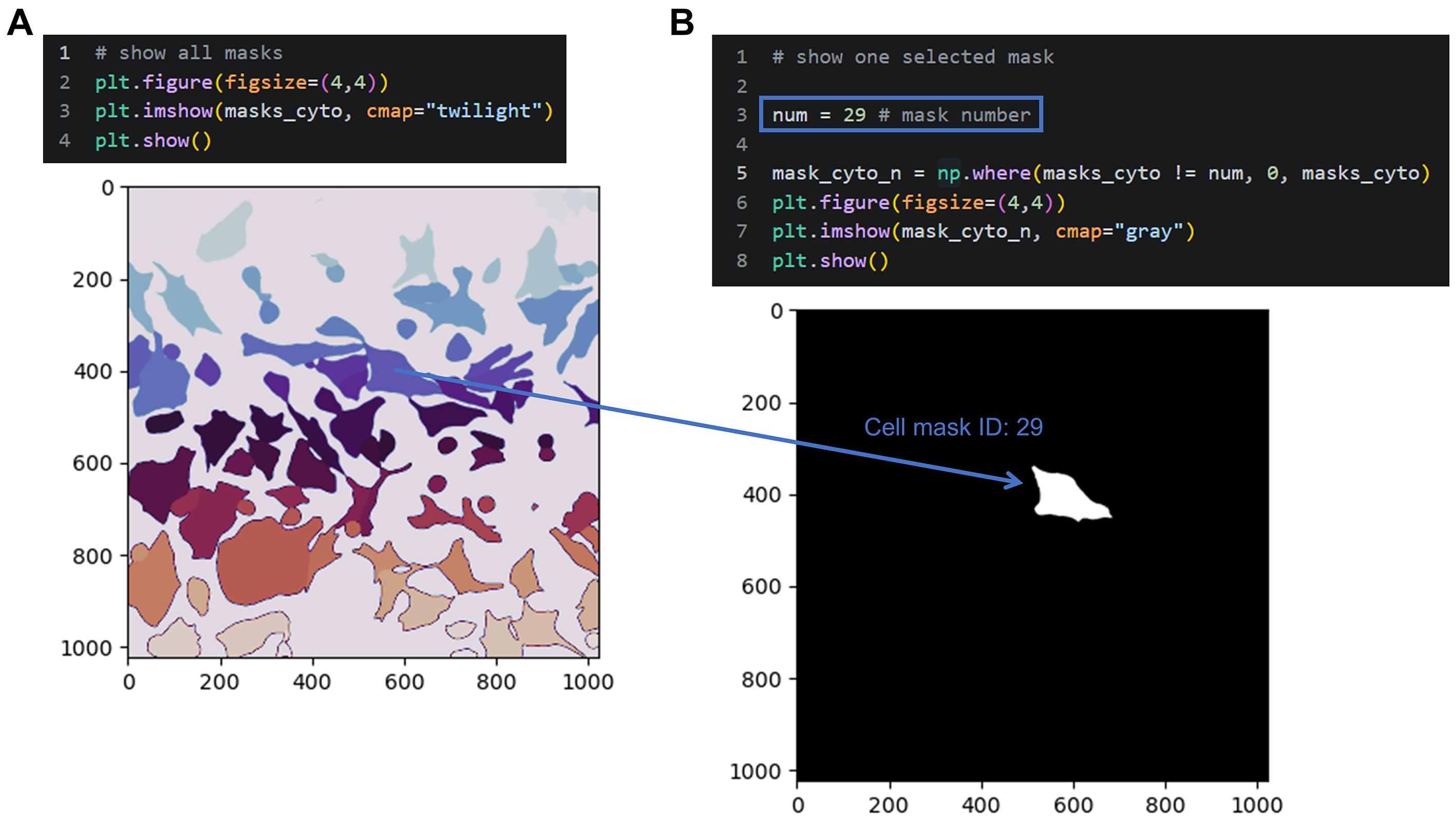
Figure 9. Display of segmented masks. Display all segmented masks or a selected mask for quality assessment. (A) All masks are shown in different colors for visual inspection. (B) A specific mask can be shown by its number for verification.
Tips: Obvious segmentation errors, including extremely small masks (which may include some border-touching cell masks), are excluded in the subsequent step. Beyond the size-based filtering, cells touching the image border are not specifically identified or excluded in the current workflow and are therefore retained for downstream analysis. Users should consider excluding border-touching cells if complete cell morphology is required for their specific analysis.
6. Convert the segmentation results to a DataFrame (Figure 10).
Convert the segmentation results from NumPy ndarray format to a pandas DataFrame for subsequent feature extraction (Figure 10). This step converts the segmentation masks into a tabular representation in which each row corresponds to an individual cell and each column contains a measured feature. At this stage, the mask ID (mask), centroid coordinates (x and y), and mask area (mask_area, in pixels2) are extracted for each cell.
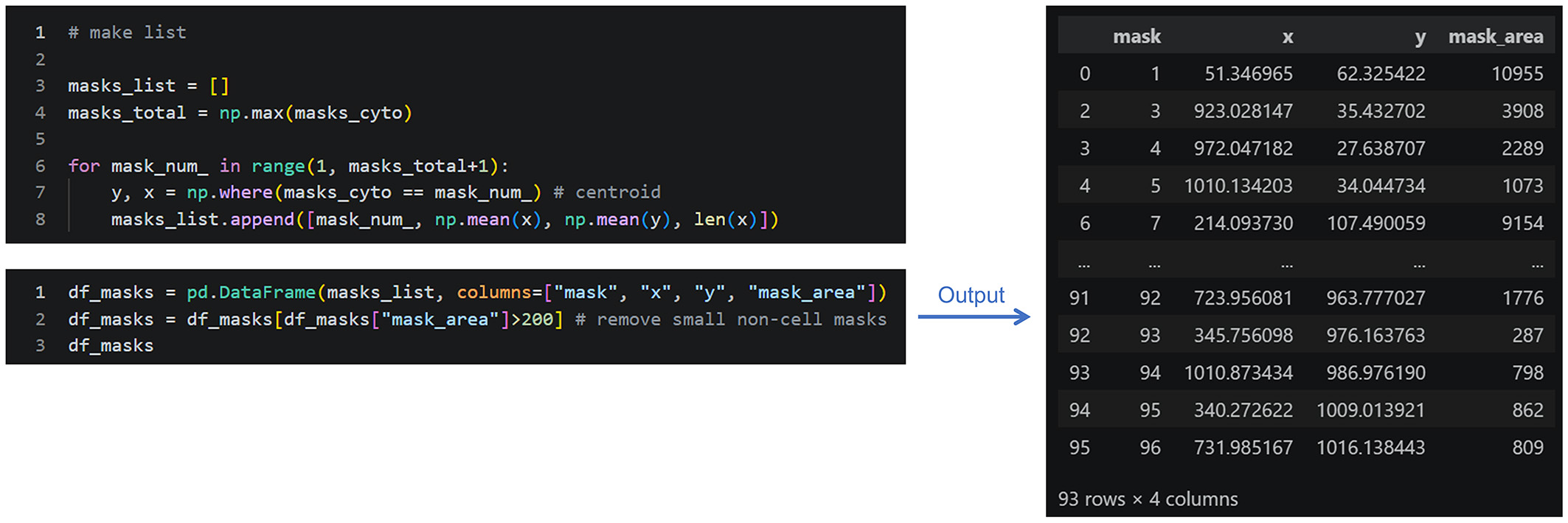
Figure 10. Format conversion of segmentation results. Convert the segmentation results from ndarray format to a DataFrame for subsequent analysis. Only cell masks with a “mask_area” greater than 200 pixels2 are extracted. This eliminates small fragments resulting from errors. When using different datasets, the size threshold should be adjusted according to the imaging resolution and the size range of objects of interest, by visual inspection or other quantitative indicators.
7. Segment subcellular structures and organelles (Figure 11).
Segment subcellular structures and organelles using Otsu thresholding. Otsu's thresholding method is a conventional binarization technique that automatically determines a threshold based on a histogram, and the threshold is calculated independently for each image using the OpenCV package in this example. Compared with deep learning–based segmentation methods, this approach is computationally efficient while providing sufficient accuracy for separating the target structures from the background in the example datasets. Its performance may vary depending on the signal-to-background ratio and target morphology. Depending on the image type and experimental objective, optimization of parameters such as channel selection and Gaussian blur may be required. For example, users should select channels corresponding to target cellular structures such as the nucleus, Golgi apparatus, or mitochondria. Gaussian blurring is applied to each image and is useful for noise reduction. We recommend adjusting the filter size according to the target size to avoid removing the target structures. Filter size is provided by kernel size (x, y) and the standard deviation of a Gaussian distribution in pixels, e.g., “(7, 7), 15” for nuclei in this example. Blurring may be avoided if the target structures are too small, or it may not be necessary if noise is sufficiently low; blurring was used only for nuclei in this example.
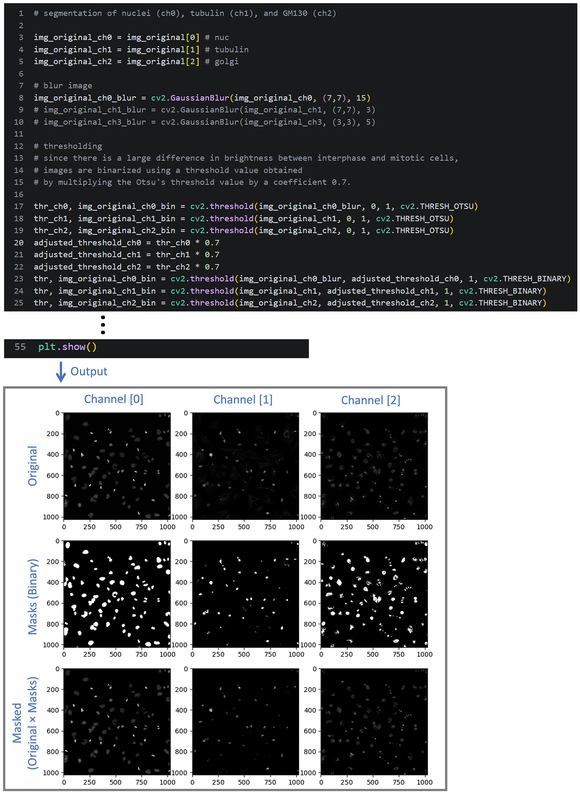
Figure 11. Segmentation of subcellular structures and organelles. Generate segmentation masks for each image channel. Gaussian blurring is used for noise reduction and smoothing (optional), and Otsu's binarization is employed to segment intracellular structures. For each channel, the original image, binary mask, and masked image are displayed.
Tips: Depending on the target structure, the masked image may appear similar to the original image. However, all background pixels are replaced with zeros, facilitating subsequent quantitative measurements. The masked image for an individual cell can be displayed by specifying its mask ID (num; e.g., 29) (Figure 12; optional). Limiting the display range with the vmax parameter of plt.imshow() can improve image visibility.
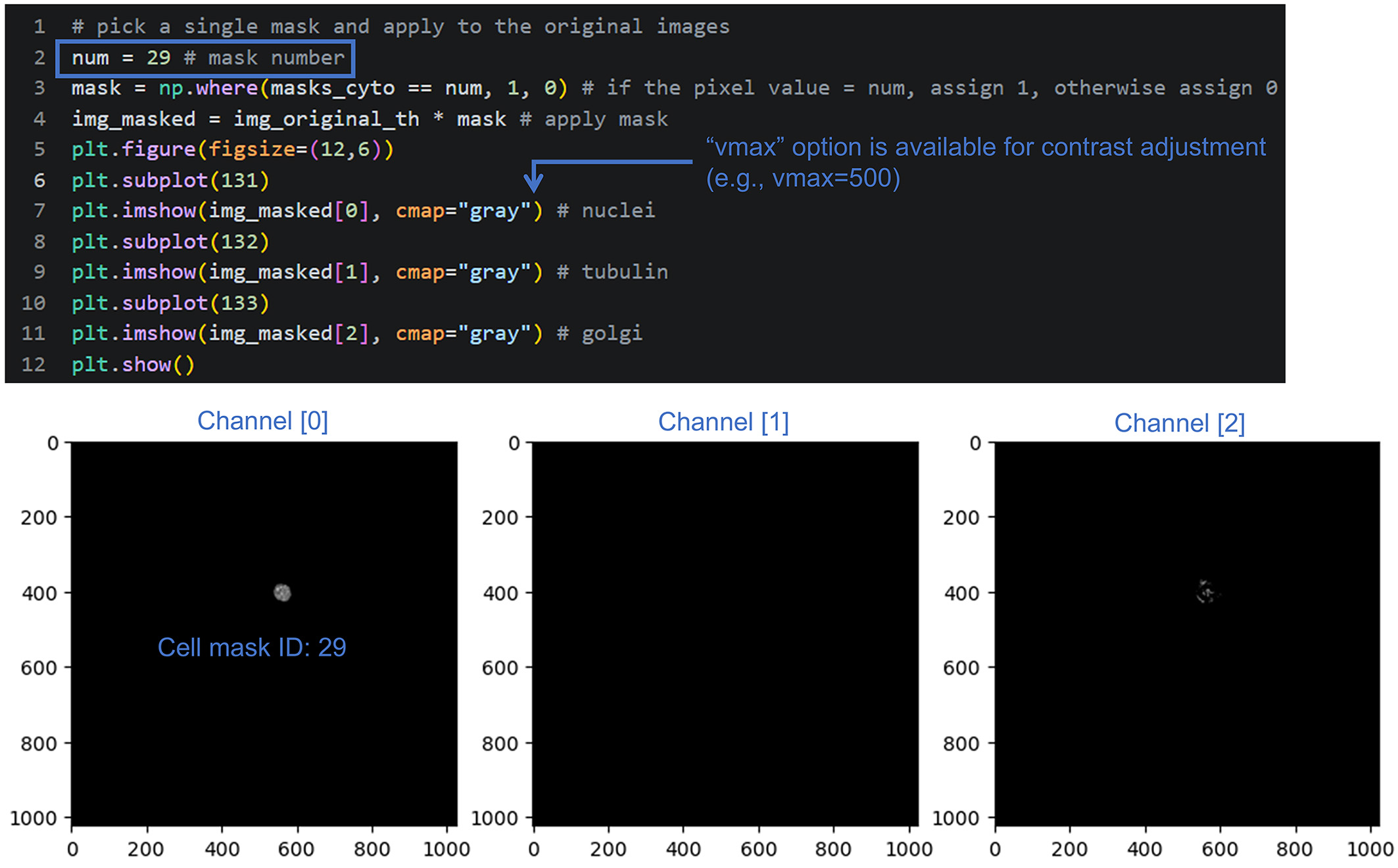
Figure 12. Display of the masked images for a selected single cell. Specify a cell mask ID to display the masked images of an individual cell. If the signal of interest is faint and difficult to see, specifying vmax to enhance contrast through clipping may make visual confirmation easier.
8. Measure cell morphological features (Figure 13).
Depending on the experimental objective and image type, the selected features and image channels may need to be modified. After measurement, export the feature profiles as a CSV file. The complete list of extracted features, including their descriptions, is provided in Variables_TableS1.xlsx in the Dryad repository (see Figure 1 for the list of repository files).
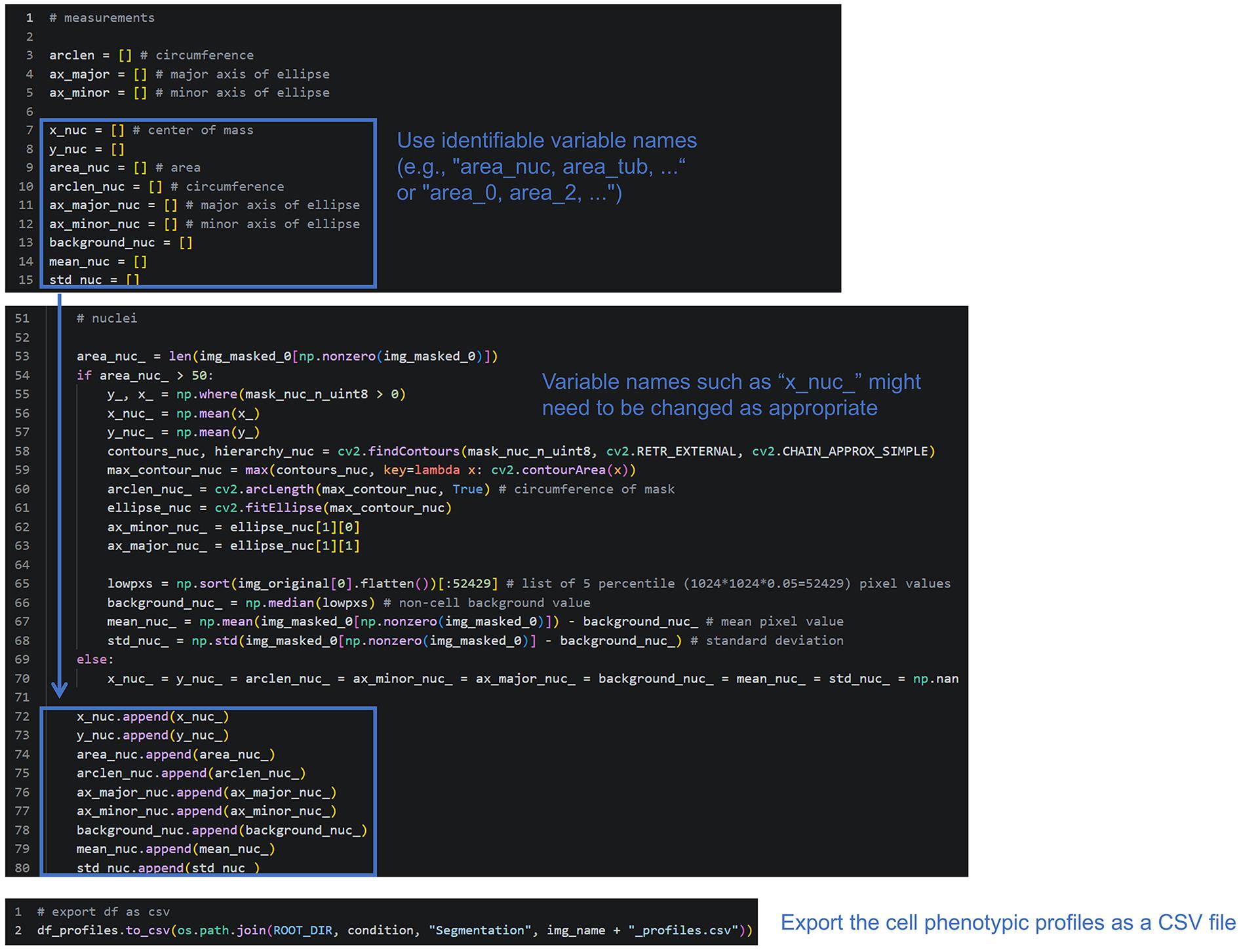
Figure 13. Feature extraction. Measure morphological features from each masked image and export the results as a CSV file. Only the measurements for channel 0 (DNA/nuclei) are shown; the workflow is essentially the same for the remaining channels. When applying the workflow to a different dataset, change the variable names (feature names) to ones that are easily identifiable. For intensity measurements, the background signal was defined as the median intensity of the lowest 5% of all pixels in the image and was subtracted from the measured intensity values.
9. Measure additional morphological features (optional).
Two additional analysis modules are provided to characterize subcellular structures by representing them as (i) bright spots or (ii) line objects. These analyses enable quantitative characterization of object distribution and morphology. Spot-based measurements are intended for discrete punctate structures, whereas line-based measurements are intended for elongated or filamentous structures. Users should select the approach according to the morphology of the structure being analyzed; it is also possible to apply both to a single target.
a. Detect bright spots and measure related features (Figure 14; optional). In this example, peak detection is applied to the tubulin (channel 1) and Golgi (channel 2) channels, and the resulting features are appended to the cell profile CSV file. For details, follow the instructions in the “Peak detection for α-tubulin” and “Peak detection for Golgi” sections of the notebook.
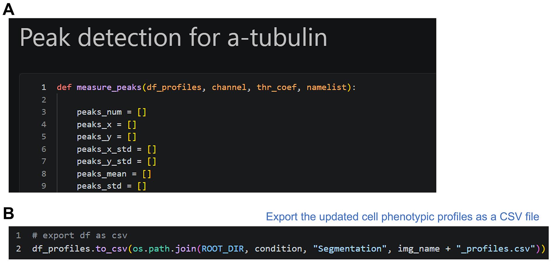
Figure 14. Additional feature extraction: Peak detection. (A) Beginning of the peak detection section. Execute the notebook cells sequentially while following the comments. (B) End of the section. Running the final cell updates the saved profile file with the newly extracted features.
b. Convert objects into line structures and measure related features (Figure 15; optional). In this example, skeletonization is applied to the Golgi channel (channel 2), and the resulting features are appended to the cell profile CSV file. For details, follow the instructions in the “Skeletonization” section of the notebook.
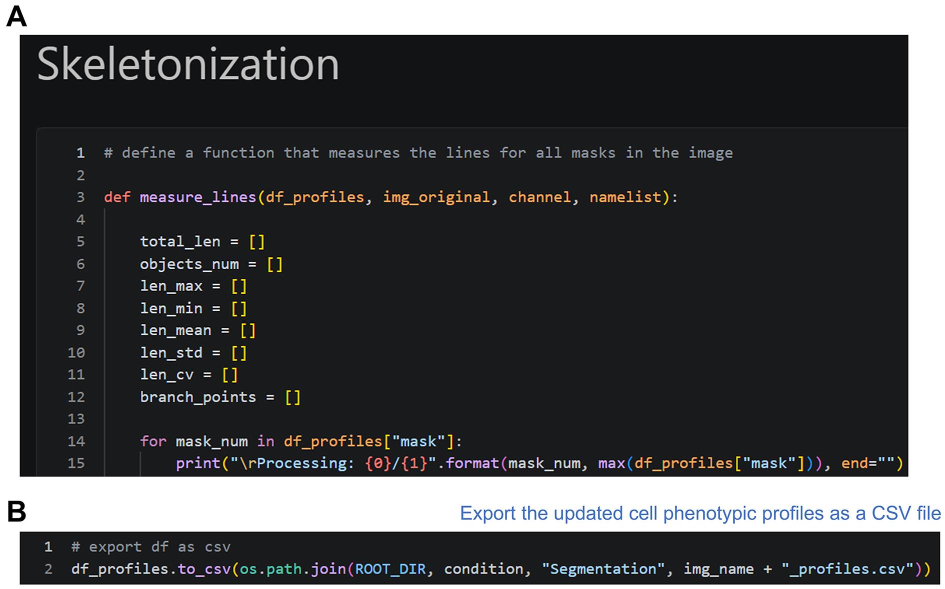
Figure 15. Additional feature extraction: Skeletonization. (A) Beginning of the skeletonization section. Execute the notebook cells sequentially while following the comments. (B) End of the section. Running the final cell updates the saved profile file with the newly extracted features.
10. Repeat the workflow for all image files.
Repeat steps B1–9 for each image to generate cell phenotypic profiles. A CSV profile file is generated for each image (e.g., 10 input images produce 10 corresponding profile files).
C. Multivariate analysis
Use 2_MVA_HeLa_1.ipynb for feature profile integration, postprocessing, multivariate analysis, and visualization. This notebook uses the cell phenotypic profiles generated in section B. The initial setup, including specifying ROOT_DIR and adding the Google Colab initialization cells (if applicable), is the same as for 1_Cellpose_HeLa_1.ipynb.
1. Load the cell phenotypic profiles (Figure 16).
Import the required packages, define the functions for loading the cell phenotypic profiles, and load the profile data (Figure 16). The load_all_csv_files function loads all profile files that meet the specified criteria and merges them into a single DataFrame. In this example, load the profiles for the three experimental conditions (DMSO, taxol, and monastrol), generating one DataFrame for each condition.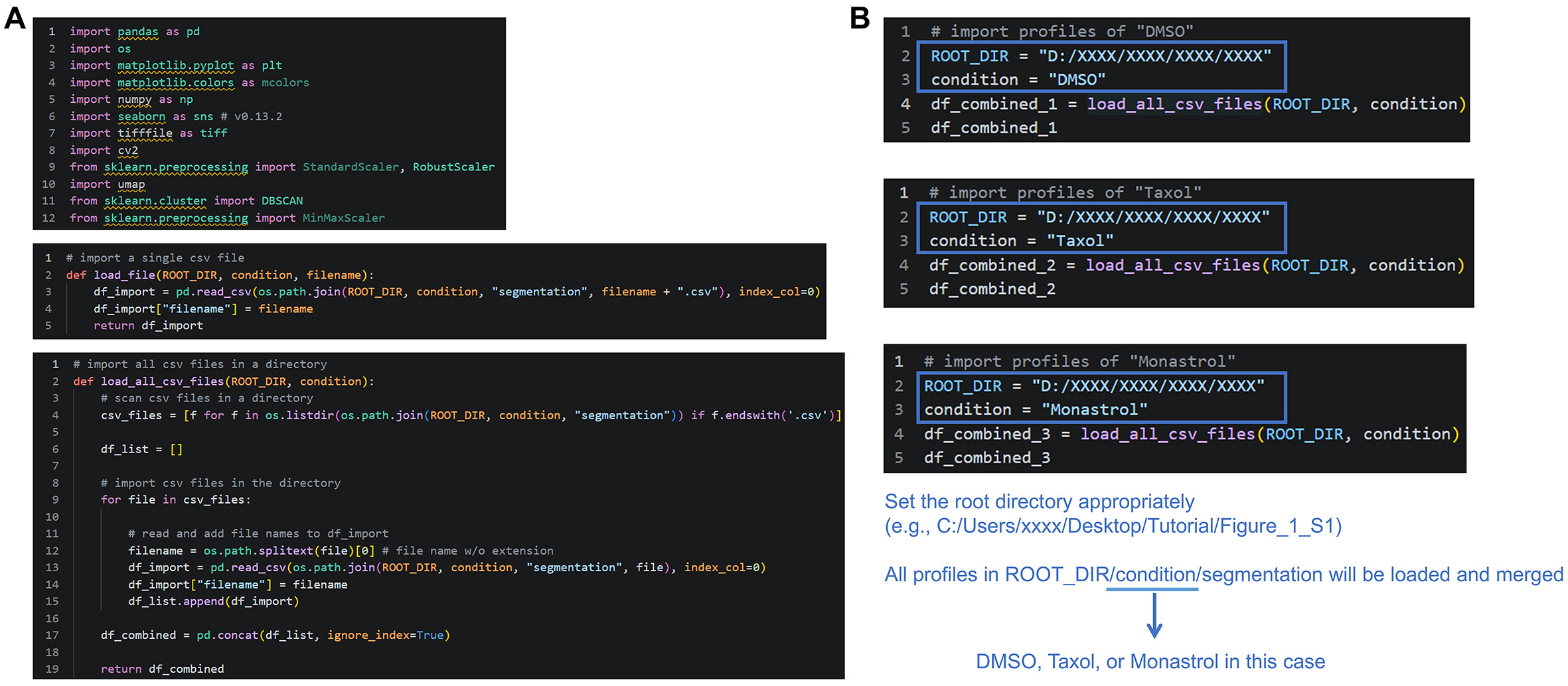
Figure 16. Startup and loading of saved profiles. (A) Import the required packages and define the functions for loading saved profiles. (B) Specify ROOT_DIR and condition, and load all corresponding profile files. The profiles are merged into a single DataFrame for each condition.
2. Merge the profile data and replace missing values (Figure 17).
Merge the three DataFrames into a single dataset for multivariate analysis. Missing values (NaN), if present, are replaced with zeros.
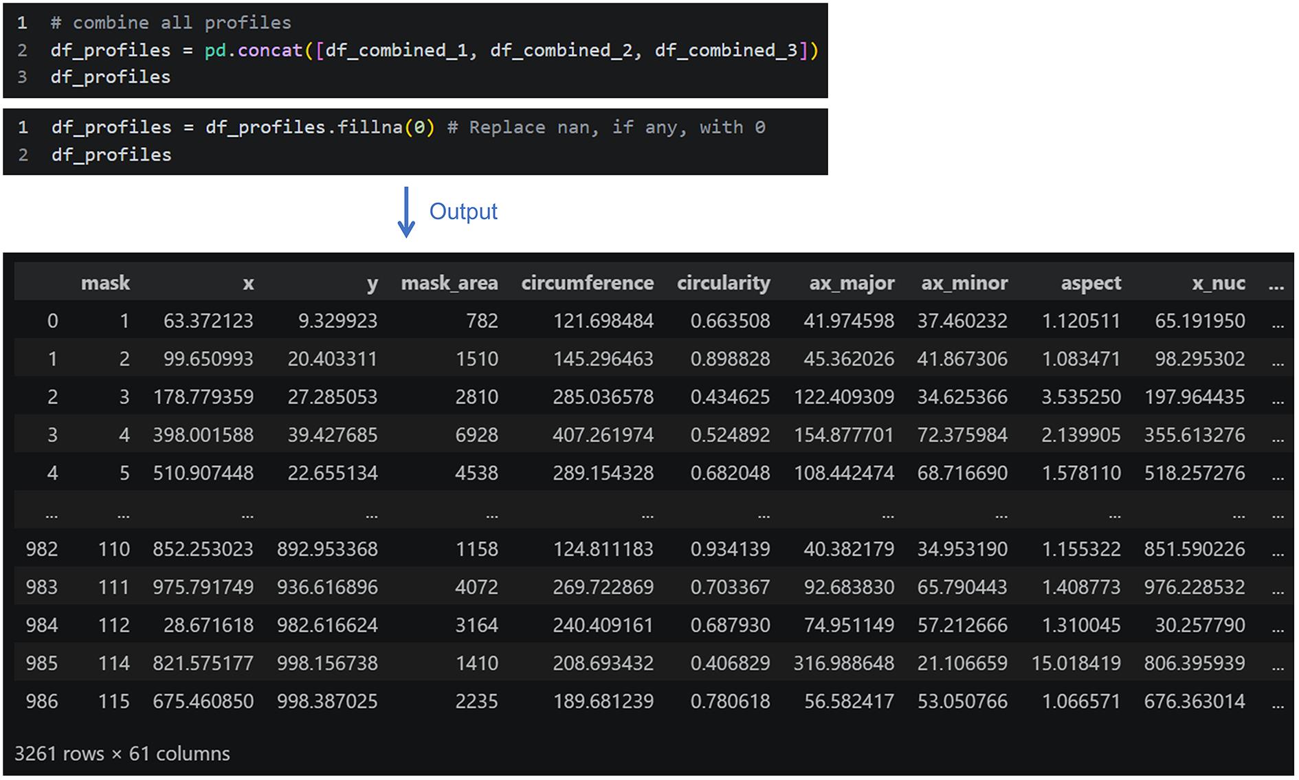
Figure 17. Data integration and preprocessing. Merge the profile data into a single dataset and replace missing values with zeros.
When no tubulin or Golgi puncta are detected, the number of puncta and associated features are returned as NaN. In this example, these NaN values are replaced with zero because the absence of detected puncta is treated as a zero count in the downstream analysis. However, this treatment may not be appropriate for all datasets or features. If missing values should not be interpreted as zero, users should instead retain the NaN values or remove cells containing NaN values using, for example, the pandas dropna() method. The effect of this replacement on the downstream analysis is evaluated in the Validation of protocol section.
3. Select and standardize the features (Figure 18).
Select the features to be included in the multivariate analysis and standardize them before dimensionality reduction. To ensure that features with different units or scales can be appropriately compared, the dataset should be standardized as a preprocessing step for multivariate analysis. Here, the robust Z-score is used.
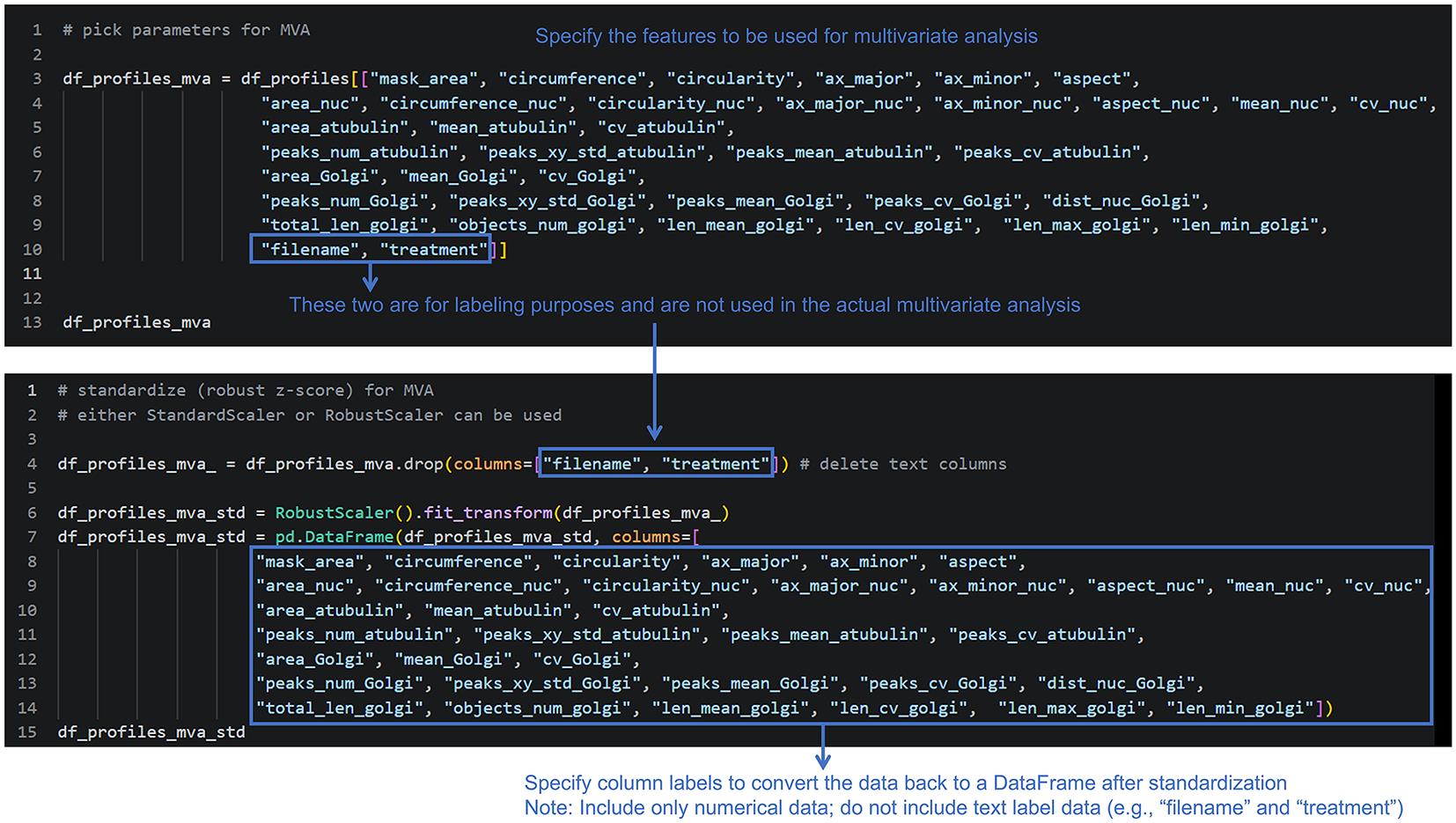
Figure 18. Feature selection and standardization. Select the features for multivariate analysis and standardize them prior to downstream analysis. While it is convenient to create a list that includes information such as file names and experimental conditions for subsequent labeling (top), only numerical data are used for the robust Z-score standardization (bottom).
Tips: If required, the following cells of the notebook can be used to generate a correlation matrix of the selected features (optional).
4. Perform UMAP and DBSCAN analysis (Figure 19).
Simultaneously, perform clustering using DBSCAN (optional). UMAP is a nonlinear dimensionality-reduction method used to visualize high-dimensional phenotypic profiles in a low-dimensional space [20]. DBSCAN is a density-based clustering algorithm that groups observations based on local density and identifies observations that do not belong to dense clusters as noise [21]. UMAP is primarily used for visualization, whereas DBSCAN is used for clustering. Because clustering results depend on eps, users should evaluate whether the identified clusters remain reasonably stable across a range of values rather than selecting eps solely to obtain a desired number of clusters. For details, follow the instructions in the “UMAP and DBSCAN” section of the code.
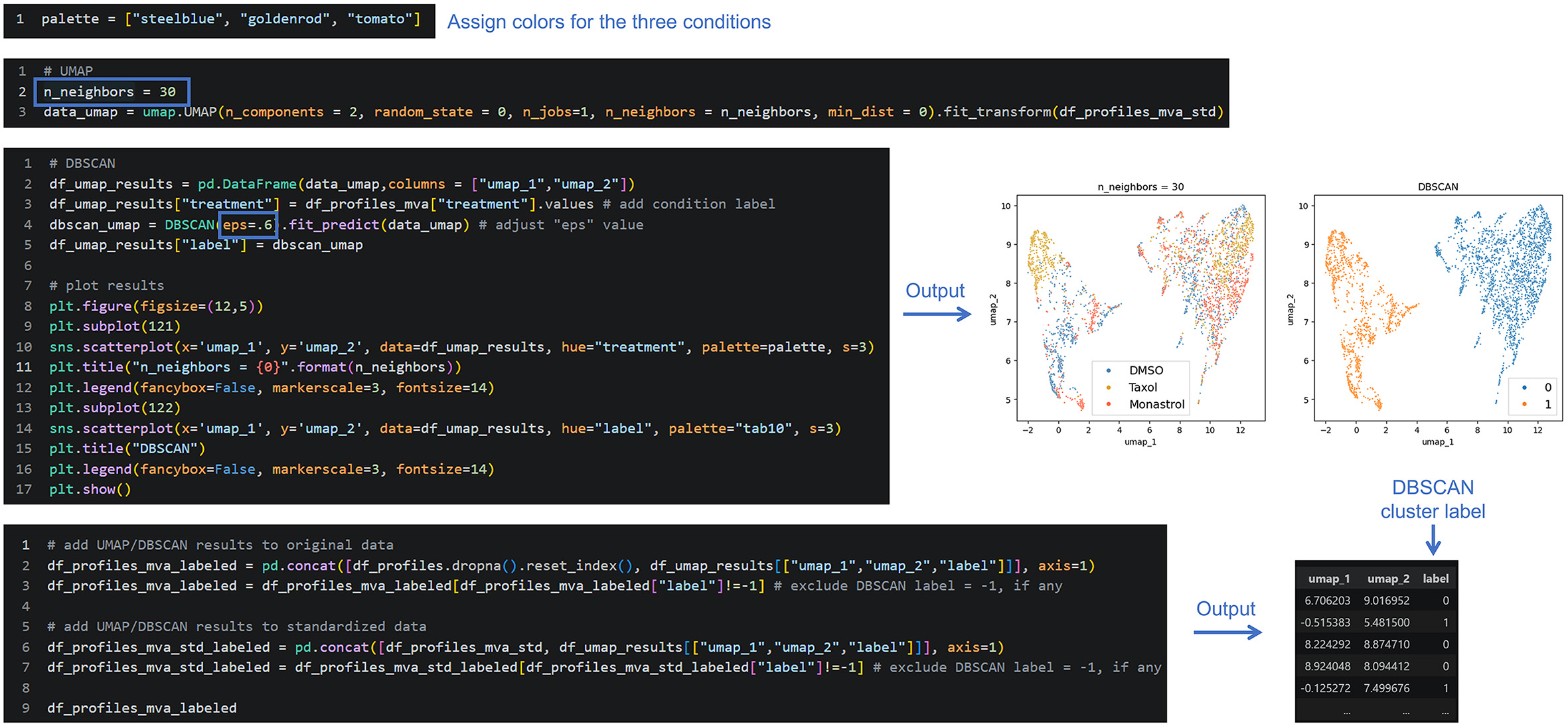
Figure 19. Dimension reduction and clustering. Perform dimensionality reduction using UMAP on the standardized profiles. n_neighbors is a parameter that determines the balance between focusing on the local and global structures of the data; values in the range of 10–30 typically yield good results. The specific value is determined by examining the data distribution. Optionally, perform clustering using DBSCAN. Adjusting the eps value changes the clustering results obtained via DBSCAN. In this example, the settings are configured to separate the two distinct clusters. However, this approach may not be particularly useful when there are no clear clusters (i.e., when the data distribution is biased but exhibits significant overlap). For details, follow the “UMAP and DBSCAN” section of the notebook.
5. Generate color-coded cell images (optional).
Generate color-coded images in which individual cells are colored according to their cluster labels by following the “Make color-coded images” section of the notebook.
6. Visualize the extracted features (Figure 20).
Follow the “Analysis of extracted features” section of the notebook to visualize the extracted features. Feature values can be mapped onto the UMAP plot (Figure 20) or displayed as violin plots for each experimental condition.
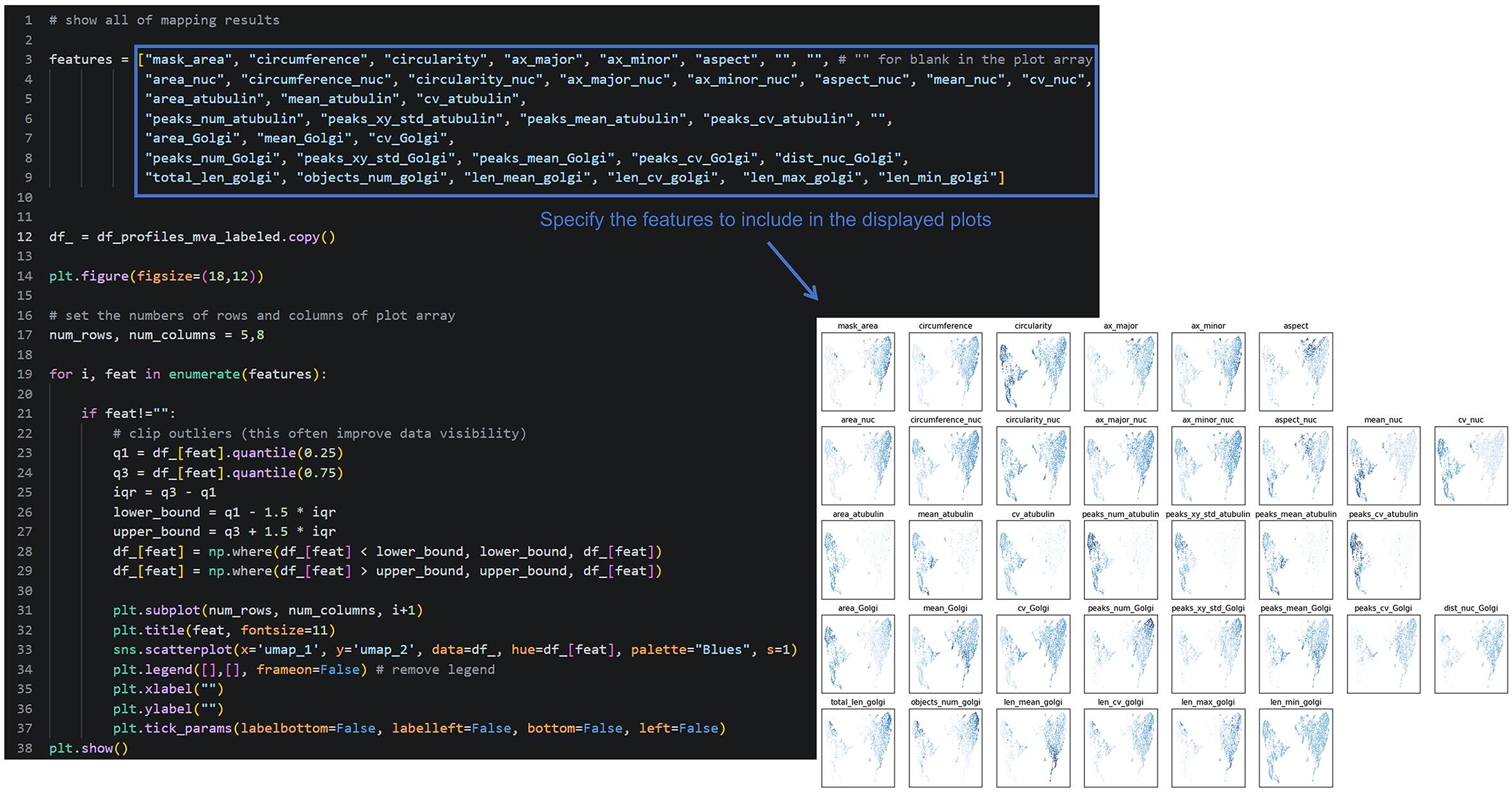
Figure 20. Visualization of the extracted features. Map selected feature values onto the UMAP plot. The subsequent cells also generate violin plots for each experimental condition. Specify at the beginning which feature’s plot to show.
7. Perform additional analysis as needed.
The remaining sections of the notebook provide additional analyses that may be useful for specific applications. These include violin plots showing the distribution of each feature across experimental conditions, as well as plots showing feature values for each cluster. Details are provided in the notebook.
Tips: The appropriate analyses depend on the experimental objective. Because all measurements are stored as cell phenotypic profiles, data can be analyzed flexibly using a wide range of downstream approaches.
8. Export the processed profiles (Figure 21).
Export the processed profile data as CSV files. Save the required datasets individually according to the intended downstream analysis.

Figure 21. Exporting processed profiles. Save the processed profile datasets as individual CSV files. The final and intermediate profiles generated by the workflow are exported as CSV files to the specified folder (in this case, MVA_Profiles under ROOT_DIR).
Data analysis
Result interpretation
The image analysis pipeline generates four major types of outputs: segmentation masks, quantitative feature tables, dimensionality reduction plots, and feature visualization. These outputs should be interpreted sequentially, beginning with visual assessment of segmentation and proceeding to quantitative feature analysis and multidimensional visualization. As the biological interpretation of the example dataset has been described in our previous work [11], the discussion here focuses primarily on how to interpret and evaluate the outputs generated by the workflow.
The segmentation masks should accurately mark individual cells and subcellular structures, including organelles. Visual inspection of representative images is recommended to confirm that most cells are correctly segmented before proceeding with downstream analyses. Segmentation errors, such as incomplete cell boundaries, merged cells, or incorrectly detected subcellular structures, can propagate to subsequent feature measurements and may therefore affect downstream interpretation.
The extracted feature table contains quantitative measurements describing the morphology and organization of cellular and subcellular structures for each individual cell. These include parameters related to size, shape, texture, staining intensity, and spatial distribution. Because the analysis is performed at single-cell resolution, biological heterogeneity within the cell population can be examined directly. Differences between experimental conditions can therefore be evaluated not only by comparing average feature values but also by examining the distributions of individual-cell phenotypes.
Importantly, the individual cells analyzed by this workflow should not automatically be considered independent biological replicates. Multiple cells obtained from the same image or biological replicate share the same experimental origin. The large number of cells measured within a biological replicate provides information about within-sample phenotypic heterogeneity, but does not increase the number of biological replicates. When statistical comparisons or biological conclusions are made across experimental conditions, biological replicates should therefore be defined at the experimental level, such as independent cultures or independent experiments, and the hierarchical structure of the data should be taken into account where appropriate [19].
Dimensionality reduction (e.g., UMAP) projects the multidimensional feature space into two dimensions while preserving similarities among cellular phenotypes [20]. Each point represents an individual cell, and cells located close to one another generally have more similar feature profiles than cells located farther apart. Cells from different experimental conditions may occupy distinct or partially overlapping regions of the embedding when the treatments produce different phenotypic profiles. However, separation in a UMAP embedding should not by itself be interpreted as evidence of a distinct biological population. UMAP is primarily a visualization tool, and the biological significance of observed patterns should be evaluated using the underlying quantitative features, experimental replicates, and corresponding microscopy images.
The exact positions and orientation of UMAP embeddings may vary slightly between analyses because UMAP is a stochastic algorithm. Therefore, individual coordinates or the exact visual arrangement of clusters should not be interpreted independently. Instead, users should focus on reproducible relationships in the feature space and on whether the observed patterns are supported by quantitative feature distributions and representative images.
Mapping feature values to UMAP and comparing feature distributions across conditions using violin plots facilitate the interpretation of morphological features associated with phenotypic clusters or experimental conditions. For example, a region of the UMAP embedding enriched in cells from a particular treatment can be examined by mapping individual feature values onto the embedding and then comparing the corresponding feature distributions across conditions. This approach can help identify which morphological or intensity-related features contribute to the observed phenotypic differences. Rather than relying on a single feature or on the visual separation of UMAP clusters alone, interpretation should be based on the combined patterns of multiple quantitative features, experimental replicates, and the corresponding segmented images. Such comparisons can also be used to determine whether the phenotypic differences observed in the example dataset are consistent with the expected cellular effects of the experimental treatments.
Validation of protocol
The validation of this protocol is designed to assess the reproducibility of the computational workflow and the consistency and interpretability of the generated phenotypic profiles. These aspects should be distinguished from independent biological validation of a phenotype-classification model.
First, the code used in this protocol is distributed as Jupyter Notebooks with precomputed outputs, allowing users to validate their analysis by comparing reproduced results with the expected outputs. Running the accompanying Jupyter Notebooks using the provided images and CSV files with the default parameters reproduces the representative outputs, including segmentation masks, quantitative feature tables, dimensionality reduction plots, and feature visualization. Successful reproduction of these outputs confirms that the software environment has been configured correctly and that the analysis pipeline has been executed as intended.
Second, the workflow can be evaluated at the analytical level by examining whether the extracted feature distributions and overall phenotypic relationships are consistent with the representative results. Because some dimensionality reduction methods, such as UMAP, are stochastic, the exact coordinates or orientation of an embedding may differ slightly between analyses unless the random seed is fixed. Such differences do not necessarily indicate a failure of the workflow. Instead, users should assess whether the overall relationships among phenotypic groups and the corresponding feature distributions are preserved.
Third, the example dataset provides an opportunity to evaluate the biological interpretability of the resulting phenotypic profiles. The DMSO-, taxol-, and monastrol-treated HeLa cells show differences in their single-cell phenotypic distributions, which can be examined using the UMAP embeddings and individual quantitative features. These differences should be interpreted together with the known effects of the experimental treatments and the corresponding microscopy images rather than using UMAP separation alone as evidence of biological validity.
The validation provided here, therefore, primarily addresses technical reproducibility, analytical consistency, and biological interpretability of the workflow. Blinded or held-out datasets would provide an additional level of validation for assessing the generalizability of phenotype classification to previously unseen images. However, such independent validation is beyond the scope of this protocol, which is intended to provide a reproducible workflow for image-based single-cell phenotypic profiling rather than a predictive phenotype-classification model.
Finally, the robustness of the downstream phenotypic analysis was evaluated by comparing the results obtained using the complete feature set, in which missing values (NaN) were replaced with 0 as described in the workflow, with those obtained after excluding features containing missing values without replacement. The UMAP and DBSCAN results obtained using the reduced feature set showed similar overall patterns to those obtained using the complete feature set (Figure 22), indicating that the major phenotypic patterns identified by the workflow were not substantially affected by the treatment of missing feature values. This comparison provides an additional sensitivity analysis supporting the robustness of the downstream dimensionality reduction and clustering results.
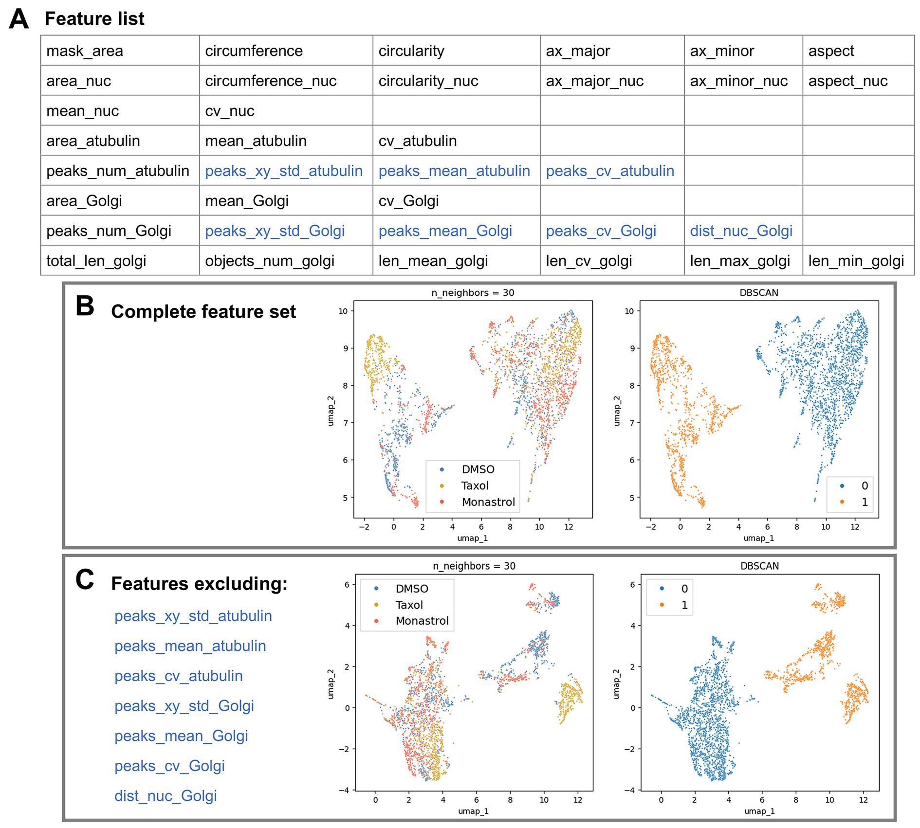
Figure 22. Robustness of UMAP and DBSCAN analyses to the exclusion of features containing NaN values. (A) Complete list of features used in the analysis. Features excluded from the alternative analysis because they contained NaN values (C) are shown in blue. (B) UMAP and DBSCAN analyses using the complete feature set, including features for which NaN values were replaced with 0 as described in the protocol. (C) UMAP and DBSCAN analyses after excluding features containing NaN values without replacement. The overall UMAP patterns and DBSCAN clustering results were highly similar between the two analyses, indicating that the major phenotypic patterns were not substantially affected by the treatment of missing feature values.
This protocol or parts of it has been used and validated in the following research article:
• Cao et al. [11]. High-content phenotyping reveals Golgi dynamics and their role in cell cycle regulation. J Cell Biol. 225(1): e202503083. https://doi.org/10.1083/jcb.202503083
General notes and troubleshooting
General notes
1. Image quality is critical for reliable quantitative analysis. Accurate segmentation and feature extraction depend on consistent image quality. Images should be acquired using identical microscope settings within each experiment, including objective lens, pixel size, exposure time, and illumination conditions. Significant variations in image quality may introduce batch effects and reduce the comparability of extracted features. It is strongly recommended to use TIFF images with 12-bit or 16-bit pixel values that are not saturated. Image formats such as JPEG are generally unsuitable for image analysis.
2. The analysis pipeline is modular and can be adapted to other imaging datasets. The workflow can be applied to other fluorescence imaging datasets, provided that appropriate segmentation masks and quantitative features are available. Feature extraction parameters may require optimization depending on the organelle or cellular structure of interest.
3. The accompanying Jupyter Notebook files are intended as both an analysis pipeline and a reference implementation. Users are encouraged to first reproduce the provided outputs before modifying analysis parameters or applying the workflow to their own datasets. This helps distinguish installation or configuration issues from dataset-specific effects.
Troubleshooting
Problem 1: The code is unable to load files, including images.
Possible cause: The referenced directory is incorrect (including mismatches due to typos).
Solution: Verify that the locations and names of all directories (folders) and files are correct. In some situations, errors may occur due to differences between forward slashes (/) and backslashes (\).
Problem 2: Cellpose fails to correctly segment cells or nuclei.
Possible cause: Cell boundaries are not clearly defined in the image.
Solutions: Increase or decrease the image contrast regardless of pixel saturation (this is acceptable since images intended for segmentation are not used for subsequent analysis); specify the approximate cell diameter (in pixels) using the “diameter” parameter through trial and error. Automatic segmentation should always be verified visually, particularly when analyzing cell types or conditions different from those used in this protocol.
Problem 3: The notebook does not run correctly or does not reproduce the expected outputs.
Possible causes: The installed Python packages differ from those used to develop and validate the workflow, or required packages are missing.
Solution: We recommend creating the Python environment using the provided cellphenotype_full.yaml file before running the workflow. This environment contains the package versions used during development and validation. Before analyzing user-generated data, first execute the notebook using the provided example dataset to confirm that the workflow runs correctly. Although UMAP embeddings may vary slightly across computing environments, the overall trends should remain reproducible.
Problem 4: Memory allocation error or out-of-memory error during Cellpose segmentation.
Possible causes: The batch contains too many or very large images for the available GPU/CPU memory.
Solutions: Reduce the number of images processed in a single batch and process the dataset in smaller batches. If available, use a system with more GPU/RAM resources or use Google Colab with GPU acceleration.
Problem 5: Image datasets load successfully but fail during downstream processing.
Possible cause: Image file names contain periods (.), spaces, hyphens (-), or other special characters that may not be handled consistently by all steps of the workflow. Although image-loading functions may successfully open such files, downstream operations such as file-name parsing, output-path generation, result saving, or calls to external tools may fail.
Solution: Use simple file names and underscores (_) to separate name parts (e.g., sample_01_cell.tif). Avoid periods (.), spaces, hyphens (-), and other special characters in the file name. If the dataset already contains such characters, rename the image files before running the workflow. If renaming is not possible, file names can also be sanitized during processing by replacing problematic characters with underscores while preserving the file extension.
Supplementary information
The complete datasets and source code associated with the research article on which this protocol is based [11] are publicly available from the Dryad repository (https://doi.org/10.5061/dryad.8gtht771s, 2025/11/07; updated 2026/08/19).
Acknowledgments
This work was supported by grants from the National Natural Science Foundation of China (32350610255; 32341051). J.S. Yaulen and Y. Peng were supported by the China Scholarship Council. This protocol provides a detailed implementation of the workflow originally described and validated in [11]. We acknowledge the Public Instrument Center of the College of Animal Science & Technology and College of Veterinary Medicine at Huazhong Agricultural University for providing access to the confocal microscopy facilities used to acquire the imaging data used in this protocol.
Author contributions
Writing—Original Draft, J.S. Yaulen and D. Takao; Writing—Review & Editing, J.S. Yaulen, X. Cao, Y. Peng, M. Yang, D. Zhang, M. Gan, and D. Takao; Funding acquisition, D. Takao; Supervision, D. Takao.
Competing interests
The authors declare no conflicts of interest.
Ethical considerations
This protocol uses previously acquired fluorescence microscopy images of the established HeLa cell line and does not involve experiments requiring ethical approval.
References
- Yan, X., Stuurman, N., Ribeiro, S. A., Tanenbaum, M. E., Horlbeck, M. A., Liem, C. R., Jost, M., Weissman, J. S. and Vale, R. D. (2021). High-content imaging-based pooled CRISPR screens in mammalian cells. J Cell Biol. 220(2): e202008158. https://doi.org/10.1083/jcb.202008158
- Govek, K. W., Nicodemus, P., Lin, Y., Crawford, J., Saturnino, A. B., Cui, H., Zoga, K., Hart, M. P. and Camara, P. G. (2023). CAJAL enables analysis and integration of single-cell morphological data using metric geometry. Nat Commun. 14(1): 3672. https://doi.org/10.1038/s41467-023-39424-2
- Stossi, F., Singh, P. K., Marini, M., Safari, K., Szafran, A. T., Rivera Tostado, A., Candler, C. D., Mancini, M. G., Mosa, E. A., Bolt, M. J., et al. (2024). SPACe: an open-source, single-cell analysis of Cell Painting data. Nat Commun. 15(1): 10170. https://doi.org/10.1038/s41467-024-54264-4
- Sommer, C., Hoefler, R., Samwer, M. and Gerlich, D. W. (2017). A deep learning and novelty detection framework for rapid phenotyping in high-content screening. Mol Biol Cell. 28(23): 3428–3436. https://doi.org/10.1091/mbc.e17-05-0333
- Funk, L., Su, K.-C., Ly, J., Feldman, D., Singh, A., Moodie, B., Blainey, P. C. and Cheeseman, I. M. (2022). The phenotypic landscape of essential human genes. Cell. 185(24): 4634–4653.e22. https://doi.org/10.1016/j.cell.2022.10.017
- Wang, P. K., Lin, K. H. and Tang, T. K. (2026). Centrosome Migration and Apical Membrane Formation in Polarized Epithelial Cells: Insights from the MDCK Cyst Model. eLife. 13: RP101088. https://doi.org/10.7554/elife.101088.2
- Kołodziej, T., Mielnicka, A., Dziob, D., Chojnacka, A. K., Rawski, M., Mazurkiewicz, J. and Rajfur, Z. (2023). Morphomigrational description as a new approach connecting cell's migration with its morphology. Sci Rep. 13(1): 11006. https://doi.org/10.1038/s41598-023-35827-9
- Beghin, A., Grenci, G., Sahni, G., Guo, S., Rajendiran, H., Delaire, T., Mohamad Raffi, S. B., Blanc, D., de Mets, R., Ong, H. T., et al. (2022). Automated high-speed 3D imaging of organoid cultures with multi-scale phenotypic quantification. Nat Methods. 19(7): 881–892. https://doi.org/10.1038/s41592-022-01508-0
- Champion, L., Linder, M. I. and Kutay, U. (2017). Cellular Reorganization during Mitotic Entry. Trends Cell Biol. 27(1): 26–41. https://doi.org/10.1016/j.tcb.2016.07.004
- Nagao, Y., Sakamoto, M., Chinen, T., Okada, Y. and Takao, D. (2020). Robust classification of cell cycle phase and biological feature extraction by image-based deep learning. Mol Biol Cell. 31(13): 1346–1354. https://doi.org/10.1091/mbc.e20-03-0187
- Cao, X., Peng, Y., Yang, M., Gan, M., Zhang, D., Zhou, S. and Takao, D. (2025). High-content phenotyping reveals Golgi dynamics and their role in cell cycle regulation. J Cell Biol. 225(1): e202503083. https://doi.org/10.1083/jcb.202503083
- Rueden, C. T., Schindelin, J., Hiner, M. C., DeZonia, B. E., Walter, A. E., Arena, E. T. and Eliceiri, K. W. (2017). ImageJ2: ImageJ for the next generation of scientific image data. BMC Bioinf. 18(1): e1186/s12859–017–1934–z. https://doi.org/10.1186/s12859-017-1934-z
- Schindelin, J., Arganda-Carreras, I., Frise, E., Kaynig, V., Longair, M., Pietzsch, T., Preibisch, S., Rueden, C., Saalfeld, S., Schmid, B., et al. (2012). Fiji: an open-source platform for biological-image analysis. Nat Methods. 9(7): 676–682. https://doi.org/10.1038/nmeth.2019
- Selzer, G. J., Rueden, C. T., Hiner, M. C., Evans, E. L., Harrington, K. I. S. and Eliceiri, K. W. (2023). napari-imagej: ImageJ ecosystem access from napari. Nat Methods. 20(10): 1443–1444. https://doi.org/10.1038/s41592-023-01990-0
- Stirling, D. R., Swain-Bowden, M. J., Lucas, A. M., Carpenter, A. E., Cimini, B. A. and Goodman, A. (2021). CellProfiler 4: improvements in speed, utility and usability. BMC Bioinf. 22(1): 433. https://doi.org/10.1186/s12859-021-04344-9
- Stringer, C., Wang, T., Michaelos, M. and Pachitariu, M. (2020). Cellpose: a generalist algorithm for cellular segmentation. Nat Methods. 18(1): 100–106. https://doi.org/10.1038/s41592-020-01018-x
- Pachitariu, M. and Stringer, C. (2022). Cellpose 2.0: how to train your own model. Nat Methods. 19(12): 1634–1641. https://doi.org/10.1038/s41592-022-01663-4
- Berg, S., Kutra, D., Kroeger, T., Straehle, C. N., Kausler, B. X., Haubold, C., Schiegg, M., Ales, J., Beier, T., Rudy, M., et al. (2019). ilastik: interactive machine learning for (bio)image analysis. Nat Methods. 16(12): 1226–1232. https://doi.org/10.1038/s41592-019-0582-9
- Serrano, E., Peters, J., Wagner, J., Graham, R. E., Chen, Z., Feng, B. Y., Miranda, G., Kalinin, A. A., Vulliard, L., Tomkinson, J., et al. (2026). Progress and new challenges in image-based profiling. Mol Syst Biol. 22(5): 624–658. https://doi.org/10.1038/s44320-026-00197-7
- McInnes, L., Healy, J. and Melville, J. (2018). UMAP: Uniform Manifold Approximation and Projection for Dimension Reduction. ArXiv. 1802.03426. https://doi.org/10.48550/arXiv.1802.0342
- Ester, M., Kriegel, H.-P., Sander, J. and Xu, X. (1996). A density-based algorithm for discovering clusters in large spatial databases with noise. Proceedings of the 2nd International Conference on Knowledge Discovery and Data Mining, 226–231.
Article Information
Publication history
Received: Jul 20, 2026
Accepted: Sep 14, 2026
Available online: Sep 24, 2026
Published: Nov 5, 2026
Copyright
© 2026 The Author(s); This is an open access article under the CC BY license (https://creativecommons.org/licenses/by/4.0/).
How to cite
Readers should cite both the Bio-protocol article and the original research article where this protocol was used:
- Yaulen, J. S., Cao, X., Peng, Y., Yang, M., Zhang, D., Gan, M. and Takao, D. (2026). A Python-Based Workflow for Image-Based Single-Cell Phenotypic Profiling From Fluorescence Microscopy Images. Bio-protocol 16(21): e5848. DOI: 10.21769/BioProtoc.5848.
- Cao, X., Peng, Y., Yang, M., Gan, M., Zhang, D., Zhou, S. and Takao, D. (2025). High-content phenotyping reveals Golgi dynamics and their role in cell cycle regulation. J Cell Biol. 225(1): e202503083. https://doi.org/10.1083/jcb.202503083

 Download Citation in RIS Format
Do you have any questions about this protocol?
Post your question to gather feedback from the community. We will also invite the authors of this article to respond.
 Post a Question


