- Protocols

- Articles and Issues
- For Authors
- About
- Become a Reviewer

A Protocol for Weighted Gene Co-expression Network Analysis With Module Preservation and Functional Enrichment Analysis for Tumor and Normal Transcriptomic Data
Published: Vol 15, Iss 18, Sep 20, 2025 DOI: 10.21769/BioProtoc.5447 Views: 2543
Reviewed by: Anonymous reviewer(s)
Original research article
The authors used this protocol in:

Aug 2017
Advertisement


Protocol Collections
Comprehensive collections of detailed, peer-reviewed protocols focusing on specific topics


Abstract
Weighted gene co-expression network analysis (WGCNA) is widely used in transcriptomic studies to identify groups of highly correlated genes, aiding in the understanding of disease mechanisms. Although numerous protocols exist for constructing WGCNA networks from gene expression data, many focus on single datasets and do not address how to compare module stability across conditions. Here, we present a protocol for constructing and comparing WGCNA modules in paired tumor and normal datasets, enabling the identification of modules involved in both core biological processes and those specifically related to cancer pathogenesis. By incorporating module preservation analysis, this approach allows researchers to gain deeper insights into the molecular underpinnings of oral cancer, as well as other diseases. Overall, this protocol provides a framework for module preservation analysis in paired datasets, enabling researchers to identify which gene co-expression modules are conserved or disrupted between conditions, thereby advancing our understanding of disease-specific vs. universal biological processes.
Key features
• Presents a step-by-step WGCNA protocol with module preservation and functional enrichment analysis [1,2] using TCGA cancer data, demonstrating network differences between normal and tumor tissues.
• Preprocesses gene expression data and conducts downstream analysis for constructed networks.
• Requires 2–3 h hands-on time and 8–12 h total computational time, depending on dataset size and permutation number used for module preservation analysis.
Keywords: WGCNAGraphical overview
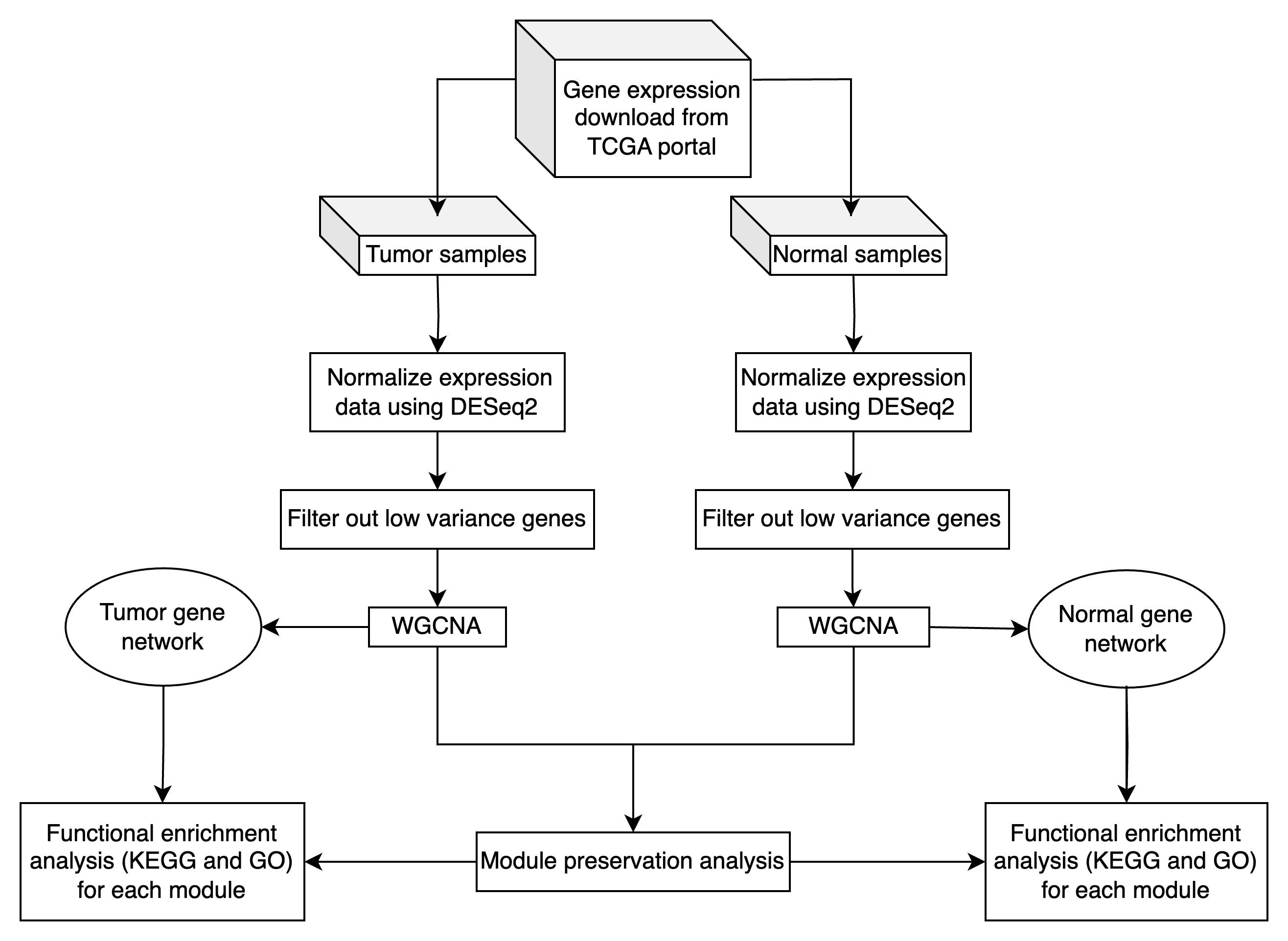
Overview of WGCNA and module preservation analysis in tumor and normal transcriptomic data
Background
Oral squamous cell cancer (OSCC) is a global public health issue, with prognosis closely linked to the stage of diagnosis. Although the five-year survival rate for early-stage OSCC is about 82.5%, it declines to 54.7% for locally advanced disease [3]. These statistics underscore the importance of identifying molecular pathways and key genes involved in OSCC pathogenesis to improve early detection and develop effective targeted therapies. Network analysis, particularly through weight gene co-expression network analysis (WGCNA) [1], has emerged as a powerful methodology for exploring complex gene expression data [1,4–11]. Unlike standard differential expression analyses that focus on individual genes, WGCNA identifies modules of highly correlated genes, providing insights into their underlying functional linkages and shared biological pathways [12]. WGCNA can construct scale-free gene co-expression networks to screen clusters (modules) of highly correlated genes, and the construction of modules is based on the inherent relationships between genes in the sample set. While WGCNA analysis can be performed entirely within the R environment, visualization of the resulting networks often benefits from specialized network visualization software. Cytoscape [13], an open-source platform for complex network analysis and visualization, has become a standard tool for representing gene co-expression networks due to its ability to handle large-scale biological networks and provide customizable visual representations of module structures and gene interactions [14]. WGCNA has been applied to several cancer types [15,16], providing insights into the molecular mechanisms underlying diseases. Manouchehri [17] used WGCNA to analyze gene expression data from prostate cancer patients and identified six significant gene expression modules correlated with cancer progression. This study highlighted the importance of population-specific studies in cancer research. Another study used WGCNA to identify 278 hub genes associated with tumorigenesis in tuberculosis-associated lung cancer [18]. For oral cancer, many studies have applied WGCNA to uncover potential prognostic makers [19], understand transcription dysregulation [20], and explore the mechanism of chemoresistance in OSCC [21]. Though WGCNA provides valuable insights into cancer gene expression, it also has some limitations, such as the need for large datasets and the complexity of interpreting co-expression networks. Module preservation analysis [2] enhances WGCNA by allowing researchers to assess the reproducibility and reliability of gene co-expression modules across different datasets, conditions, or tissue types, providing greater confidence in the biological interpretations drawn from the modules identified in a WGCNA analysis. In this protocol, we build upon previous WGCNA frameworks by constructing and comparing gene co-expression networks derived from both OSCC tumor and normal tissue samples. After identifying modules in each network, we apply module preservation analysis to determine which modules are conserved in both tumor and normal conditions. We demonstrate how to export WGCNA results for visualization in Cytoscape, enabling researchers to explore network topology and identify hub genes through interactive visual analysis. Conserved modules may represent core biological processes common to both states, while modules unique to either the tumor or normal network may highlight pathways directly relevant to OSCC pathogenesis. Previous tutorials have primarily focused on applying WGCNA to single datasets. Here, we provide a comprehensive guide for performing WGCNA and module preservation on paired tumor and normal datasets, offering a refined strategy to pinpoint functionally relevant gene clusters, improve biological interpretation, and advance our understanding of oral cancer biology.
Equipment
1. Personal computer with Windows, macOS, or a Unix-based operating system
Note: For these analyses, we recommend a computer with at least 32 GB of RAM and a modern multi-core processor.
Software and datasets
1. R software environment (> 4.4.0) (https://www.r-project.org/)
2. RStudio integrated development environment (> 1.4.0) (https://rstudio.com/)
3. WGCNA_1.73 (https://cran.r-project.org/web/packages/WGCNA/index.html)
4. DESeq2_1.46.0 (https://bioconductor.org/packages/release/bioc/html/DESeq2.html)
5. genefilter_1.88.0 [22] (https://www.bioconductor.org/packages/release/bioc/html/genefilter.html)
6. tidyverse_2.0.0 (https://cran.r-project.org/web/packages/tidyverse/index.html)
7. dendextend_1.19.0 (https://cran.r-project.org/web/packages/dendextend/index.html)
8. gplots_3.2.0 (https://cran.r-project.org/web/packages/gplots/index.html)
9. clusterProfiler_4.14.4 [23] (https://bioconductor.org/packages/release/bioc/html/clusterProfiler.html)
10. org.Hs.eg.db_3.20.0 (https://bioconductor.org/packages/release/data/annotation/html/org.Hs.eg.db.html). All gene annotations were performed using the org.Hs.eg.db package (version 3.20.0), which is consistent with the GRCh38 human genome assembly of the TCGA data
11. ggplot2_3.5.1 (https://cran.r-project.org/web/packages/ggplot2/index.html)
12. ggpubr_0.6.0 (https://cran.r-project.org/web/packages/ggpubr/index.html)
13. VennDiagram_1.7.3 ( https://cran.r-project.org/web/packages/VennDiagram/index.html)
14. dplyr_1.1.4 (https://cran.r-project.org/web/packages/dplyr/index.html)
15. GO.db_3.20.0 (https://bioconductor.org/packages/release/data/annotation/html/GO.db.html)
16. Code for WGCNA and preservation module analysis can be accessed through this GitHub link: https://github.com/biocoms/WGCNA
17. Dataset
Data can be directly downloaded through the TCGA portal. The analysis used gene expression data from the GDC Data Release v38.0, downloaded on October 18, 2023. The dataset is publicly available as a compressed file (GeneExpression.zip) in the GitHub repository: https://github.com/biocoms/WGCNA
if (!require("BiocManager", quietly = TRUE)) install.packages("BiocManager") BiocManager::install("TCGAbiolinks")TCGAbiolinks:::getProjectSummary("TCGA-HNSC")ge_query <- GDCquery( project = "TCGA-HNSC", data.category = "Transcriptome Profiling", data.type = "Gene Expression Quantification")GDCdownload(ge_query)output_m_query <- getResults(ge_query)normal_sample <- output_m_query$sample.submitter_id[output_m_query$sample_type == "Solid Tissue Normal"]tumor_sample <- output_m_query$sample.submitter_id[output_m_query$sample_type == "Primary Tumor"]ge_data <-GDCprepare(ge_query, summarizedExperiment = TRUE)# Extracts the expression valuesexpression_matrix <- assay(ge_data)expression_df <- as.data.frame(expression_matrix)expression_df <- cbind(Gene = rownames(expression_matrix), expression_df)colnames(expression_data) <- gsub("-.*$", "", colnames(expression_data))# Remove extra parts# Subset the expression data to include only normal samples/tumor samplenormal_expression_data <- expression_data[, colnames(expression_data) %in% normal_samples]tumor_expression_data <- expression_data[, colnames(expression_data) %in% tumor_samples]write.csv(normal_expression_data, “OSCC_TCGA_gene_expression_normal.csv)write.csv(tumor_expression_data, “OSCC_TCGA_gene_expression_tumor.csv)Based on the different purposes of research, we can manipulate the dataset by removing or filtering out some samples.
Caution: Troubleshooting and environment setup: this protocol was developed and tested using R version 4.4.0 or higher. However, we recognize that users may have different R versions. Here, we provide solutions for various compatibility issues:
For R versions 4.2.x–4.3.x:
Most functions should work, but some package versions may differ. If you encounter issues:
1. For WGCNA installation:
For older R versions, use the archived WGCNA version
install.packages("https://cran.r-project.org/src/contrib/Archive/WGCNA/WGCNA_1.72-1.tar.gz", repos = NULL, type = "source")2. For Bioconductor packages:
if (!requireNamespace("BiocManager", quietly = TRUE))install.packages("BiocManager")BiocManager::install(version = "3.17") # For R 4.3.xBiocManager::install(version = "3.16") # For R 4.2.xFor R 4.2.0 (Windows): Due to package compatibility issues with the older R version, users may encounter installation problems. Follow these steps:
1. Clean installation approach:
Remove any partially installed packages
remove.packages(c("WGCNA", "htmlTable", "knitr", "xfun"))Clear package cache
unlink(.libPaths()[1], recursive = TRUE)dir.create(.libPaths()[1])2. Use the compatibility script (recommended):
GitHub link: https://github.com/biocoms/WGCNA/blob/main/R_4.2.0_compatibility_script.R
3. Known issues and workarounds:
If htmlTable fails, install from source with install.packages("htmlTable", type = "source")
If the WGCNA function is not found, restart R after installation and explicitly load with library(WGCNA)
For quotation mark issues, ensure you are using straight quotes, not curly quotes.
For R versions < 4.2:
We strongly recommend upgrading to R 4.2 or higher. If an upgrade is not possible, use WGCNA version 1.70.3 or earlier. Some visualization features may not be available.
Procedure
A. Install the necessary R packages
1. The required packages to run this pipeline can be installed from CRAN and Bioconductor repositories using the following commands in an R terminal:
install.packages("WGCNA", "tidyverse", "dendextend", "gplots", "ggplot2", "ggpubr", "VennDiagram", "dplyr", "GO.db")if (!requireNamespace("BiocManager", quietly = TRUE)) install.packages("BiocManager")BiocManager::install(c("DESeq2", "genefilter", "clusterProfiler", "org.Hs.eg.db"))2. Load necessary packages before running the analysis.
library("WGCNA")library("tidyverse")library("dendextend")library("gplots")library("ggplot2")library("ggpubr")library("VennDiagram")library("dplyr")library("GO.db")library("DESeq2")library("genefilter")library("clusterProfiler")library("org.Hs.eg.db")B. Preprocess data
Before performing WGCNA, it is important to preprocess the data to ensure robust and meaningful results.
Critical: Batch effect considerations. Batch effects are a major source of technical variation in large RNA-seq datasets and must be evaluated before WGCNA analysis. The Genomic Data Commons (GDC) explicitly states that they do not perform batch effect corrections across samples, as they continuously accept new data and maintain frequent release cycles. Therefore, users might want to assess and potentially correct for batch effects to avoid technical variations masking true biological signals or leading to inaccurate conclusions [24]. For TCGA data, use principal component analysis (PCA) with tissue source site (TSS) as a batch proxy. TSS information can be obtained from TCGA clinical data using the tissue_or_organ_of_origin variable. If primary components (PC1 or PC2) significantly associate with TSS rather than biological conditions, consider batch correction using the ComBat (SVA package) method [25].
Caution: Avoid automatic batch correction without preserving biological variables, as this can remove true biological signals. WGCNA is generally robust to minor batch effects, so correction may not always be necessary depending on your research question.
Since we will be comparing networks constructed from tumor and normal datasets, these two datasets should be processed separately. The steps below illustrate how to load, normalize, and filter out the data before constructing co-expression networks.
1. Load the data
Start by loading the tumor and normal gene expression datasets, ensuring each file contains genes as row names and samples as columns.
tumor_data<-read.csv("GeneExpression/OSCC_TCGA_gene_expression_337.csv", row.names = 1)normal_data<-read.csv("GeneExpression/OSCC_TCGA_gene_expression_32.csv", row.names = 1)Print the first 5 rows and 5 columns of tumor (Figure 1) and normal (Figure 2) datasets.
tumor_data[1:5, 1:5]
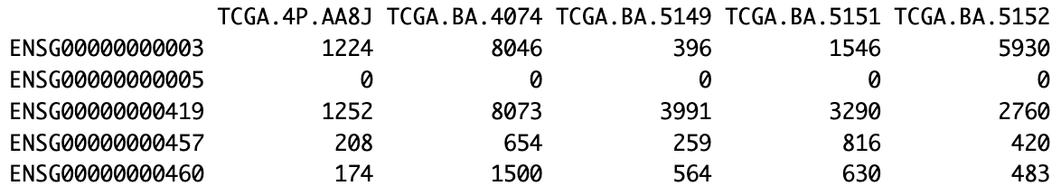
Figure 1. Representative subset of the oral squamous cell cancer (OSCC) TCGA tumor expression matrix. The first 5 genes (rows, Ensembl IDs) and 5 samples (columns, TCGA IDs) are displayed with their corresponding raw expression counts.
normal_data[1:5, 1:5]
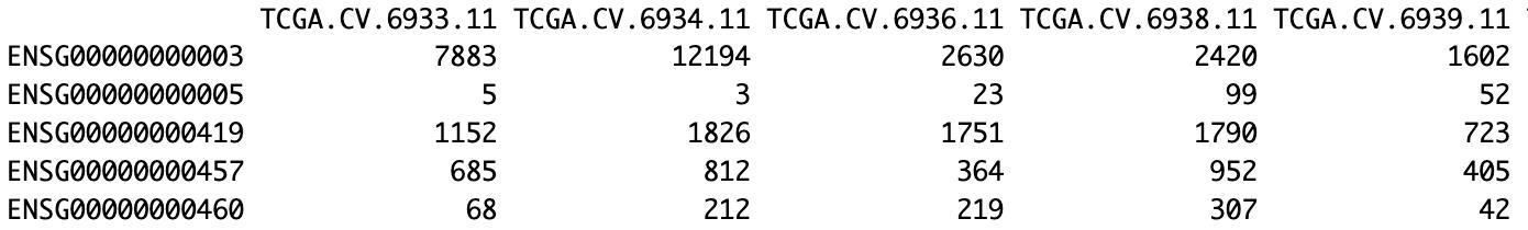
Figure 2. Representative subset of the oral squamous cell cancer (OSCC) TCGA normal expression matrix. The first 5 genes (rows, Ensembl IDs) and 5 samples (columns, TCGA IDs) are displayed with their corresponding raw expression counts.
2. Normalize the data
Gene expression data often requires normalization to account for differences in sequencing depth and other technical variables. We use the size factor normalization method from the DESeq2 package to normalize raw counts, ensuring that expression values are comparable across samples.
a. Create metadata table
The metadata table links the columns of the count matrix (samples) to their experimental conditions. Each row in the metadata corresponds to a sample, and each column describes a variable. Here, we create a simple metadata table that defines the Condition for each sample as either Tumor or Normal. The row names of the metadata table should match the column names of the count matrix. Below is how to generate the necessary metadata for the tumor_data object. The same process should be applied to the normal_data. The data.frame() creates a data frame with two columns, Sample and Condition, and rep() will replicate the total number of rows of the data frame.
metadata_tumor <- data.frame(Sample = colnames(tumor_data), Condition = rep(c('Tumor'),337))metadata_normal <- data.frame(Sample = colnames(normal_data), Condition = rep(c('Normal'),32))b. Run the DeSeq2 normalization
Caution: Errors encountered during DESeq2 normalization: The most common error that occurs when creating the DESeqDataSet object is a mismatch between the column names of the count matrix and the row names of the sample metadata. When this occurs, DESeq2 will raise an error similar to:
Error in DESeqDataSet(se, design = design, ignoreRank) : all variables in the design formula must be columns in colDataTo solve the issue, verify that the column names of the count matrix match exactly the sample identifiers in the metadata by running the following command:
all(colnames(tumor_data) == metadata_tumor$Sample)The command should return TRUE. If it returns FALSE, locate and correct any inconsistencies (e.g., "Sample-01" vs. "Sample.01", extra spaces, or different capitalization) in the count-matrix column names (or in the metadata) before recreating the DESeqDataSet object.
Here, we construct DESeqDataSet objects and run the DESeq normalization pipeline. The design = ~1 formula is used because we are not performing differential expression analysis. We are only using DESeq2's robust method for estimating size factors to normalize the data.
# 1. Construct the DESeqDataSet object for the tumor datadds_tumor <- DESeqDataSetFromMatrix(countData = round(tumor_data), colData = metadata_tumor,design = ~1)# 2. Run the DESeq function to estimate size factorsdds_tumor <- DESeq(dds_tumor)# 3. Extract the normalized counts matrixnormalized_counts_tumor <- counts(dds_tumor, normalized = TRUE)# Repeat the entire process for your normal_datadds_normal <- DESeqDataSetFromMatrix(countData = round(normal_data), colData = metadata_normal, design = ~1)dds_normal <- DESeq(dds_normal)normalized_counts_normal <- counts(dds_normal, normalized = TRUE)Alternative normalization approach: In addition to DESeq2's normalization, the trimmed mean of M-values (TMM) implemented in the edgeR package is one of the most common and direct alternative methods. For most standard differential expression analyses, both DESeq2's method and edgeR's TMM are considered gold standard choices. For TMM, please refer to the edgeR user’s guide:
https://www.bioconductor.org/packages/devel/bioc/vignettes/edgeR/inst/doc/edgeRUsersGuide.pdf
3. Filtering out low-variance genes
Filtering out genes with low variance is a key preprocessing step in WGCNA. Genes that show little variation across samples are often less biologically informative, and removing them helps reduce noise and computational burden.
To enable fair comparisons of variance, we first apply the variance-stabilizing transformation using the varianceStabilizingTransformation() function from DESeq2. This approach stabilizes the variance across a broad range of expression levels, ensuring that any observed differences reflect true biological variation rather than artifacts of expression levels.
vsd_tumor <- varianceStabilizingTransformation(dds_tumor)vsd_normal <- varianceStabilizingTransformation(dds_normal)Afterward, a subset of the most variable genes is selected for network construction. The selection of the threshold is based on the dataset characteristics. For large datasets (> 50 samples), a stringent threshold, such as selecting the top 5,000–8,000 most variable genes, or the top 10%–25% by variance, is a common and effective practice [1]. For smaller datasets (< 30 samples), a more lenient threshold, such as the top 25%–50% most variable genes, is recommended to retain enough genes for meaningful network construction [2]. Alternatively, gene selection can be guided by statistical methods to identify significantly differentially expressed genes. This approach compares expression levels between tumor and normal samples, typically applying a p-value threshold (after FDR correction) of less than 0.05. For more details, refer to the corresponding protocols [26,27]. In this study, given our large sample size, we applied a very stringent variance-based filter, selecting only the top 5% most variable genes, those above the 95th percentile of variance, for analysis.
rv_tumor <- rowVars(assay(vsd_tumor))rv_normal <- rowVars(assay(vsd_normal))q95_tumor <- quantile(rv_tumor, 0.95)q95_normal <- quantile(rv_normal, 0.95)filtered_tumor <- assay(vsd_tumor)[rv_tumor > q95_tumor, ]filtered_normal <- assay(vsd_normal)[rv_normal > q95_normal, ]Caution: Gene filtering and scale-free topology considerations. The choice of gene filtering strategy significantly impacts WGCNA's ability to construct scale-free networks, which is a fundamental assumption of the method. Users must carefully consider how their filtering approach may affect network topology, as follows:
Variance-based filtering: Selecting genes based on expression variance across samples, as described in this protocol, generally preserves scale-free topology because high-variance genes represent diverse biological processes rather than artificially connected gene sets [28].
Avoiding problematic filtering strategies: As suggested by WGCNA’s developer, do not filter genes based solely on differential expression between conditions, as differentially expressed genes are often co-regulated and highly interconnected due to shared biological perturbations. This creates artificially dense networks that violate scale-free assumptions and can lead to unreliable module detection.
As stated above, the threshold for consideration is as follows:
• Large datasets (>50 samples): Top 5%–10% most variable genes typically maintain topology while reducing computational burden.
• Smaller datasets (<30 samples): Use more lenient thresholds (top 25%–50%) to retain sufficient genes for meaningful network construction.
• Always verify topology: After filtering, examine scale independence plots to ensure R2 ≥ 0.8–0.9 at your chosen soft power threshold.
Troubleshooting poor topology fit:
If scale independence consistently falls below R2 = 0.8 across reasonable soft-thresholding power ranges (6–20), consider:
• Increasing the gene selection threshold (e.g., from top 5% to top 15%).
• Removing potential batch effects before filtering.
C. Perform WGCNA
In this section, we perform WGCNA on the preprocessed data to identify gene co-expression modules and compare their properties between tumor and normal samples. For the WGCNA, the workflow follows the tutorial by Jennifer Chang, available at https://bioinformaticsworkbook.org/tutorials/wgcna.html [29]. First, we select an appropriate soft-thresholding power, construct the co-expression networks, and identify modules. Next, we generate data for downstream analyses, such as network visualization in Cytoscape.
1. Choosing the soft-thresholding power
WGCNA requires choosing a soft-thresholding power to achieve a scale-free topology. The soft-thresholding power parameter (β) is critical for WGCNA network construction and requires careful consideration based on your dataset characteristics. The soft power transformation suppresses low correlations (typically noise) while preserving strong biological correlations, with the goal of achieving scale-free topology while maintaining reasonable connectivity. Soft-thresholding power transformation converts similarity matrices into adjacency matrices by raising correlation values to the power β. Higher powers increasingly suppress weak correlations, creating sparser networks with fewer but stronger connections. The transformation helps distinguish genuine biological co-expression from technical noise.
The optimal soft-thresholding power reflects the underlying correlation structure of the data. Thus, different datasets require different powers:
• Low powers (1–6): Datasets with strong biological drivers (disease states, drug treatments, developmental transitions) often exhibit high baseline correlations and achieve scale-free topology at lower powers.
• Moderate powers (7–12): Common for datasets with moderate biological variation or mixed sample types.
• High powers (13–20+): Required for datasets with subtle biological differences, well-controlled conditions, or normal tissue samples where genuine correlations are weaker relative to noise.
Selection criteria:
• Primary criterion: First power achieving R2 ≥ 0.9 for scale-free topology.
Note: If no reasonable power (≤ 15 for unsigned networks, ≤ 30 for signed networks) achieves R2 ≥ 0.9, a threshold of R2 ≥ 0.8 is acceptable and widely used in the WGCNA community.
• Secondary criterion: Ensure reasonable mean connectivity (typically < 200–300 for most datasets).
• Biological context: Consider the expected strength of biological effects in your experimental design.
Mean connectivity represents the average number of connections per gene in the network and serves as a crucial metric for evaluating network quality alongside scale-free topology fit. Understanding this parameter is essential for making informed decisions about soft-thresholding power selection.
Mean connectivity quantifies how densely connected your network is by calculating the average degree (number of connections) across all genes. It reflects the balance between preserving genuine biological relationships and suppressing noise correlations.
Interpreting mean connectivity values:
• Very high connectivity (> 1,000): Often indicates insufficient noise suppression, presence of strong batch effects, or dominant biological drivers that create artificially high correlations across many genes. Networks with extremely high connectivity may violate scale-free assumptions.
• High connectivity (500–1,000): May be acceptable for datasets with strong biological signals, but users should verify that high connectivity reflects genuine biology rather than technical artifacts.
• Moderate connectivity (100–500): Typical range for well-constructed biological networks that balance noise suppression with preservation of genuine co-expression relationships.
• Low connectivity (50–100): Acceptable for networks focusing on the strongest biological relationships, though users should ensure that important biological signals have not been over-suppressed.
• Very low connectivity (< 50): May indicate over-suppression of genuine biological signals due to excessively high soft-thresholding power; consider reducing the power threshold.
Balancing topology fit and connectivity: when selecting soft power, users must balance scale-free topology fit (R2) with reasonable mean connectivity:
• Ideal scenario: R2 ≥ 0.8–0.9 with mean connectivity 100–500.
• High R2 but very low connectivity: May indicate over-suppression; consider lower soft-thresholding power.
• Moderate R2 but reasonable connectivity: Often acceptable for complex biological datasets.
• Poor R2 and very high connectivity: Indicates data quality issues requiring investigation.
Dataset-specific considerations:
• Disease/treatment studies: May naturally have higher connectivity due to coordinated biological responses.
• Normal tissue studies: Typically show lower baseline connectivity, requiring higher soft-thresholding powers.
• Mixed sample types: May show higher connectivity due to biological heterogeneity.
Troubleshooting poor topology fit:
If no reasonable power (≤ 15 for unsigned networks, ≤ 30 for signed networks) achieves R2 ≥ 0.8–0.9:
• Check for batch effects or sample outliers using PCA
• Consider less stringent gene filtering
• Evaluate whether strong biological drivers are preventing scale-free topology
• For datasets with unavoidable strong drivers, use empirical power selection based on sample size rather than topology fit
Here, we evaluate powers from 1 to 20 (increasing by 2 beyond 10) and use the pickSoftThreshold() function to determine the optimal value. We can adjust this range based on each dataset’s complexity and research objectives.
allowWGCNAThreads()powers = c(c(1:10), seq(from = 10, to=20, by=2))The power is picked using pickSoftThreshold()
# Tumorsft_tumor <- pickSoftThreshold(t(filtered_tumor), powerVector = powers, verbose = 5)sft_tumor# Normalsft_normal <- pickSoftThreshold(t(filtered_normal), powerVector = powers, verbose = 5)sft_normalBased on the results, a soft-thresholding power of 3 is recommended for the tumor dataset (Figure 3), and 14 for the normal dataset (Figure 4). These choices ensure that the resulting co-expression networks approximate a scale-free topology while maintaining a reasonable neighborhood size. To confirm these selections, visualize the scale independence and mean connectivity plots (Figure 5), which should support the appropriateness of the chosen powers.
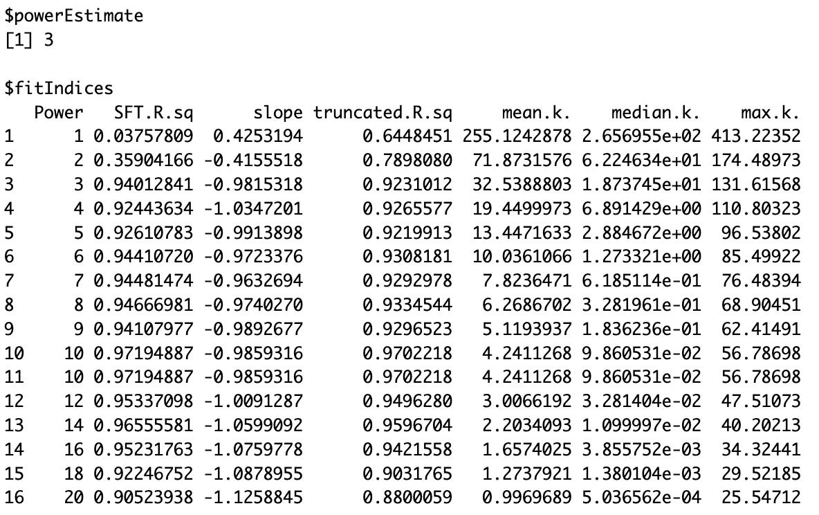
Figure 3. Soft threshold power selection for tumor samples. Output from WGCNA pickSoftThreshold() showing network topology metrics across power values 1–20. A power of 3 was chosen to approximate a scale-free co-expression network. Metrics include the scale-free topology fit index (SFT.R.sq), slope, truncated R2, and connectivity measures (mean, median, and maximum).
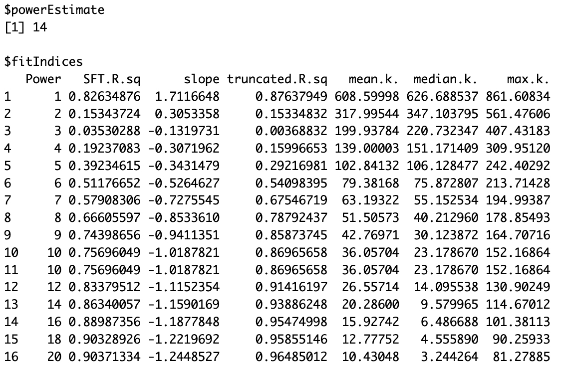
Figure 4. Soft threshold power selection for normal samples. Output from WGCNA pickSoftThreshold() showing network topology metrics across power values 1–20. A power of 14 was chosen to approximate a scale-free co-expression network. Metrics include the scale-free topology fit index (SFT.R.sq), slope, truncated R2, and connectivity measures (mean, median, and maximum).
Figure 5. Soft threshold selection for scale-free network construction. (A) Scale independence and mean connectivity plots for tumor network construction. (B) Scale independence and mean connectivity plots for normal network construction. In the scale independence plot, the y-axis represents the R2 value (scale-free topology model fit or signed R2), which indicates how well the network follows a power-law distribution. A higher R2 value signifies a stronger scale-free topology. The red line, set at 0.9, marks the threshold for selecting a soft-thresholding power that aligns the network structure with typical biological organization. The x-axis shows various power values, and the chosen power should be above this threshold. In the mean connectivity plot, the y-axis shows the average connectivity across all genes in the network at different soft-thresholding powers (shown on the x-axis). This helps assess how network connectivity changes as the power value increases.
Interpretation: Tumor samples require soft-thresholding power = 3, indicating that cancer exhibits widespread transcriptional dysregulation with strong correlations due to shared oncogenic pathways. Normal samples require soft-thresholding power = 14, indicating they show more subtle, tightly regulated expression patterns requiring stronger noise suppression to reveal genuine biological networks.
power_tumor <- 3power_normal <- 14#Plotting the resultspar(mfrow = c(1,2))cex1 = 0.9#Index the scale-free topology adjustment as a function of the power soft thresholding.plot(sft_tumor$fitIndices[,1], -sign(sft_ tumor$fitIndices[,3])*sft_ tumor $fitIndices[,2], xlab="Soft Threshold (power)",ylab="Scale Free Topology Model Fit, signed R^2",type="n", main = paste("Scale independence"))text(sft_ tumor$fitIndices[,1], -sign(sft_ tumor$fitIndices[,3])*sft_ tumor $fitIndices[,2], labels=powers,cex=cex1,col="red")#This line corresponds to use a cut-off R2 of habline(h=0.9,col="red")#Connectivity means as a function of soft power thresholdingplot(sft_ tumor$fitIndices[,1], sft_ tumor$fitIndices[,5], xlab="Soft Threshold (power)",ylab="Mean Connectivity", type="n", main = paste("Mean connectivity"))text(sft_ tumor$fitIndices[,1], sft_ tumor$fitIndices[,5], labels=powers, cex=cex1,col="red")#This line corresponds to use a cut-off R2 of habline(h=0.9,col="red")plot(sft_normal$fitIndices[,1], -sign(sft_normal$fitIndices[,3])*sft_normal$fitIndices[,2], xlab="Soft Threshold (power)",ylab="Scale Free Topology Model Fit, signed R^2",type="n", main = paste("Scale independence"))text(sft_normal$fitIndices[,1], -sign(sft_normal$fitIndices[,3])*sft_normal$fitIndices[,2], labels=powers,cex=cex1,col="red")#This line corresponds to use a cut-off R2 of habline(h=0.9,col="red")#Connectivity means as a function of soft power thresholdingplot(sft_normal$fitIndices[,1], sft_normal$fitIndices[,5], xlab="Soft Threshold (power)",ylab="Mean Connectivity", type="n", main = paste("Mean connectivity"))text(sft_normal$fitIndices[,1], sft_normal$fitIndices[,5], labels=powers, cex=cex1,col="red")#This line corresponds to using a cut-off R2 of habline(h=0.9,col="red")2. Construct the co-expression networks
Using the previously identified powers, we construct co-expression networks for the tumor and normal datasets separately. We then apply the blockwiseModules() function to identify modules, each representing a group of co-expressed genes. A dendrogram can be generated to visualize clusters of highly co-expressed genes (Figure 6).
power_tumor = 3power_normal = 14# Tumornetwk_tumor <- blockwiseModules( t(filtered_tumor), power = power_tumor, networkType = "signed", deepSplit = 2, minModuleSize = 30, mergeCutHeight = 0.25, numericLabels = TRUE, saveTOMs = TRUE, saveTOMFileBase = "tumor", verbose = 3)mergedColors = labels2colors(netwk_tumor$colors)# Plot the dendrogram and the module colors underneathplotDendroAndColors( netwk_ tumor $dendrograms[[1]], mergedColors[netwk_ tumor $blockGenes[[1]]], "Module colors", dendroLabels = FALSE, hang = 0.03, addGuide = TRUE, guideHang = 0.05 )# Normalnetwk_normal <- blockwiseModules( t(filtered_normal), power = power_normal, networkType = "signed", deepSplit = 2, minModuleSize = 30, mergeCutHeight = 0.25, numericLabels = TRUE, saveTOMs = TRUE, saveTOMFileBase = "normal", verbose = 3)mergedColors = labels2colors(netwk_normal$colors)# Plot the dendrogram and the module colors underneathplotDendroAndColors( netwk_normal$dendrograms[[1]], mergedColors[netwk_normal$blockGenes[[1]]], "Module colors", dendroLabels = FALSE, hang = 0.03, addGuide = TRUE, guideHang = 0.05 )
Figure 6. Cluster dendrogram. (A) Tumor network cluster dendrogram. (B) Normal network cluster dendrogram. These dendrograms depict the hierarchical clustering of genes based on their co-expression relationships in each dataset. Genes with similar expression patterns are grouped into modules, as indicated by the colored bars beneath the dendrogram. The branching structure reflects the clustering relationships among the modules.
We can summarize the module assignments to determine how many genes each module contains. The following code displays a table of module sizes, with each module identified by its assigned color and the corresponding gene count.
table(netwk_tumor$colors)table(netwk_normal$colors)The tumor network (Figure 7) yielded 6 modules (ranging from 176 to 553 genes per module), while the normal network (Figure 8) produced 8 modules (ranging from 47 to 549 genes per module). This difference reflects fundamental changes in gene regulatory organization between healthy and diseased states [30].
Figure 7. Gene module sizes in the tumor co-expression network
Figure 8. Gene module sizes in the normal co-expression network
Tumor network characteristics (6 modules): The tumor samples show fewer total modules with a relatively even distribution of module sizes (553, 327, 307, 298, 224, 176 genes). This pattern suggests that cancer has created broader, more interconnected regulatory networks where normal boundaries between biological processes have broken down. The largest module (553 genes) may represent a major oncogenic program where multiple pathways have become coordinately dysregulated.
Normal network characteristics (8 modules): The normal samples exhibit more modules with greater size variation (549, 446, 410, 108, 78, 50, 47 genes). The presence of several smaller, specialized modules (108, 78, 50, 47 genes) alongside larger ones reflects the maintained functional compartmentalization characteristic of healthy tissue. The smaller modules likely represent discrete, specialized biological functions that operate independently under normal physiological conditions.
This module pattern demonstrates a key principle in cancer biology: regulatory network reorganization. In healthy tissue, genes are organized into discrete functional modules that maintain cellular homeostasis. Cancer disrupts this organization, creating larger, more interconnected modules as oncogenic signals override normal regulatory boundaries and coordinate the expression of genes that would typically be independently regulated.
Guidance for interpreting your own module patterns:
When analyzing your datasets, consider these principles:
Expected patterns:
• Disease states: Often show fewer, larger modules due to regulatory disruption.
• Normal/control conditions: Typically exhibit more, smaller modules reflecting functional specialization.
• Treatment effects: May create intermediate patterns depending on treatment intensity.
Biological validation:
• Modules should contain functionally related genes (verify with GO/KEGG enrichment).
• Very large modules (> 1,000 genes) may indicate technical issues.
• Very small modules (< 30 genes) may lack statistical power.
• Module patterns should align with the known biology of your experimental system.
3. Compare module eigengenes
Module eigengenes (MEs) represent the first principal component of each module, summarizing the overall expression pattern of that module’s genes. Extracting MEs enables straightforward comparisons among modules and across conditions. To visualize module relationships, we create a heatmap of module eigengene correlations, where each cell represents the correlation between two modules (Figure 9). This approach reveals modules with similar expression patterns and can provide insights into shared biological functions or regulatory mechanisms.
# Tumor eigengenesMEs_tumor<- moduleEigengenes(t(filtered_tumor), colors = labels2colors(netwk_tumor$colors))$eigengenesMEs_tumor <- orderMEs(MEs_tumor)colnames(MEs_tumor) = names(MEs_tumor) %>% gsub("ME","", .)# Normal eigengenesMEs_normal <- moduleEigengenes(t(filtered_normal), colors = labels2colors(netwk_normal$colors))$eigengenesMEs_normal <- orderMEs(MEs_normal)colnames(MEs_normal) = names(MEs_normal) %>% gsub("ME","", .)# Correlation heatmap of module eigengenes for both conditionscor_tumor <- cor(MEs_tumor)cor_normal <- cor(MEs_normal)heatmap.2(cor_tumor, main = "Tumor Module Eigengene Correlation", trace = "none", col = colorRampPalette(c("blue", "white", "red"))(50), # Color gradient key = TRUE, # Adds a color key (legend) key.title = "Correlation", key.xlab = "Value", density.info = "none", # Disable histogram in the legend denscol = NA) # Remove histogram color)heatmap.2(cor_normal, main = "Normal Module Eigengene Correlation", trace = "none", col = colorRampPalette(c("blue", "white", "red"))(50), # Color gradient key = TRUE, # Adds a color key (legend) key.title = "Correlation", key.xlab = "Value", density.info = "none", # Disable histogram in the legend denscol = NA) # Remove histogram color)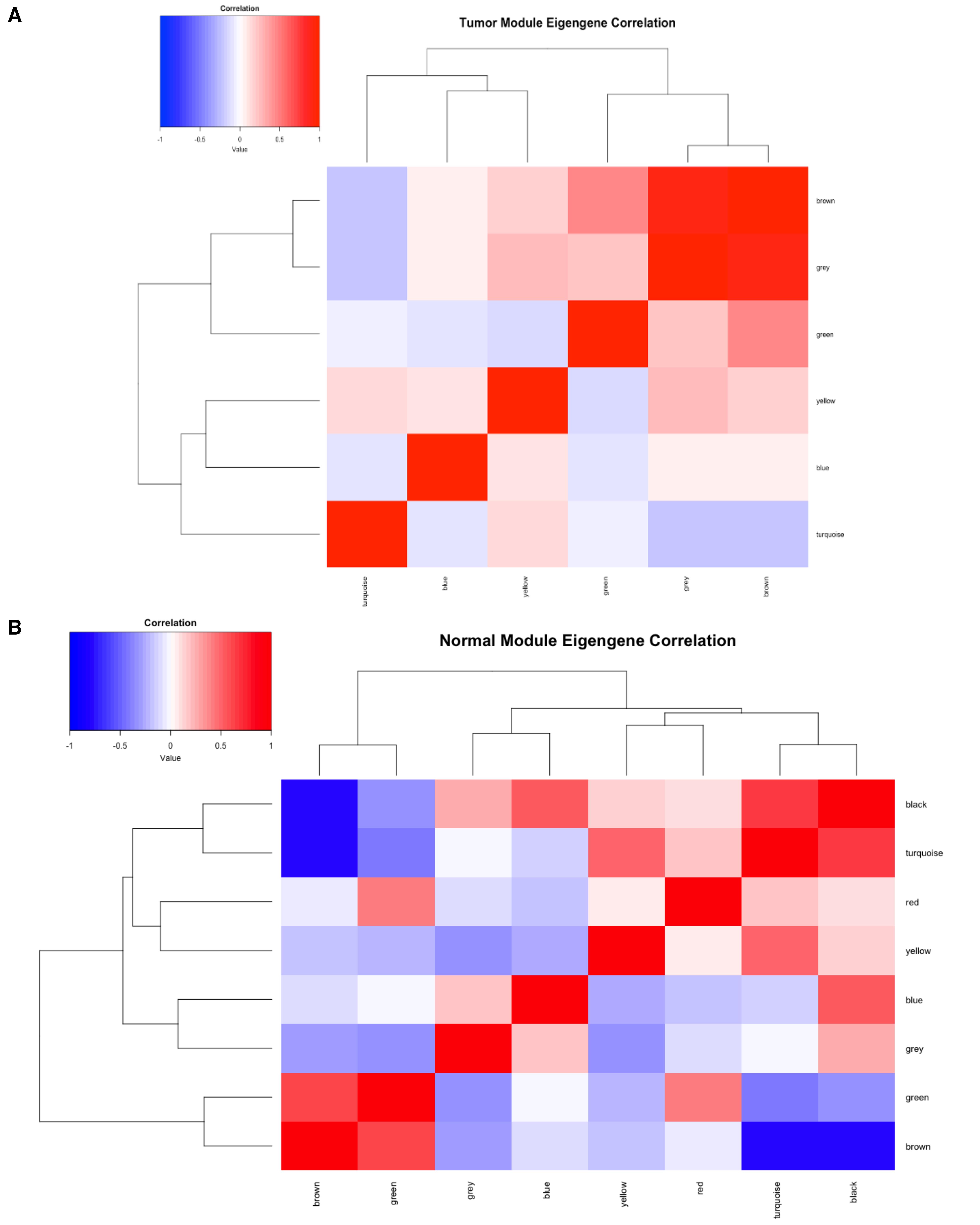
Figure 9. Module eigengene correlation heatmap. (A) Tumor module eigengene correlation heatmap. (B) Normal module eigengene correlation heatmap. The heatmap represents the pairwise correlations between module eigengenes (MEs) in the dataset. Each ME represents the first principal component of gene expression for its respective module. The color scale indicates correlation strength, ranging from blue (negative correlation) to red (positive correlation). Modules with strong positive correlations (red regions) may represent functionally related groups of genes, whereas weak or negative correlations (blue regions) suggest divergent biological processes.
4. Export the network to Cytoscape
To visualize the resulting networks, we export the data as edge and node lists compatible with Cytoscape. Rather than displaying the entire co-expression network, which can be both large and complex, we apply a filtering step to retain only edges with correlation values exceeding 0.1.
#Tumor datasetTOM_tumor <- TOMsimilarityFromExpr(t(filtered_tumor), power = power_tumor)row.names(TOM_tumor) <- row.names(filtered_tumor)colnames(TOM_tumor) <- row.names(filtered_tumor)# Convert the TOM matrix into a long-format edge listedge_list_tumor <- data.frame(TOM_tumor) %>% mutate(gene1 = row.names(.)) %>% pivot_longer(-gene1, names_to = "gene2", values_to = "correlation") %>% filter(gene1 != gene2, correlation > 0.1) # Keep edges with correlation > 0.1# Remove duplicate edges by considering them undirected (keeping only one direction)edge_list_tumor <- edge_list_tumor %>% mutate(pair = pmap_chr(list(gene1, gene2), ~ paste(sort(c(...)), collapse = "_"))) %>% distinct(pair, .keep_all = TRUE) %>% ungroup() %>% select(-pair)# Convert Ensembl gene IDs to gene symbolsedge_list_tumor$gene1.name <- mapIds(org.Hs.eg.db, keys = edge_list_tumor$gene1, column = "SYMBOL", keytype = "ENSEMBL")edge_list_tumor$gene2.name <- mapIds(org.Hs.eg.db, keys = edge_list_tumor$gene2, column = "SYMBOL", keytype = "ENSEMBL")# Create Cytoscape-compatible edge listedge_list_tumor.cyto <- data.frame( gene1 = edge_list_tumor$gene1.name, gene2 = edge_list_tumor$gene2.name, value = edge_list_tumor$correlation) %>% na.omit()write.table(edge_list_tumor.cyto, "modules/edge_list_tumor.txt", sep = "\t", row.names = FALSE, col.names = TRUE, quote = FALSE)# Create a node list with module informationmodule_tumor <- data.frame( gene = names(netwk_tumor$colors), color = labels2colors(netwk_tumor$colors))module_tumor$genename <- mapIds(org.Hs.eg.db, keys = module_tumor$gene, column = "SYMBOL", keytype = "ENSEMBL")# Keep only nodes present in the edge listmodule_tumor <- module_tumor[module_tumor$genename %in% c(unique(edge_list_tumor.cyto$gene1), unique(edge_list_tumor.cyto$gene2)),]write.table(data.frame(genename = module_tumor$genename, value = module_tumor$color), "modules/node_list_tumor.txt", sep = "\t", row.names = FALSE, col.names = TRUE, quote = FALSE)######################################### Repeat the Same Steps for the Normal Dataset########################################These output files (edge_list_tumor.txt, node_list_tumor.txt, edge_list_normal.txt, and node_list_normal.txt) can be imported into Cytoscape for network visualization.
5. Visualize a network using Cytoscape
While network visualization in Cytoscape is optional, it serves as a valuable quality check for your analysis choices, particularly your soft-threshold power selection. Network visualization helps you quickly assess whether your chosen soft power created biologically meaningful gene connections. For example, if your network is too sparse (too few connections), this indicates the soft power might be too high, filtering out real biological relationships. In contrast, if your network is too dense (too many connections), this indicates the soft power might be too low, retaining noise in the network and requiring an increase in power. For the mean connectivity, networks with high mean connectivity (> 500) should be visually apparent as dense networks, while networks with very low connectivity (< 50) should appear quite sparse.
In this protocol, network visualization and analysis were performed using Cytoscape version 3.10.3, running on macOS (version 14.6.1, aarch64) with Java version 17.0.5. No plugins were required for this analysis.
Import the network
• From the top menu bar in Cytoscape, go to File > Import > Network from File.
• Select edge_list_tumor.txt as the input file and click OK.
• There is a table pop-up as shown below (Figure 10):
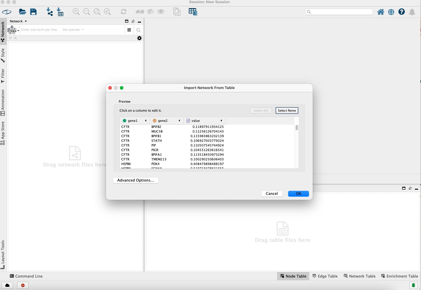
Figure 10. Importing network from edge list file
Import node attributes (module colors):
• To import the module color and assign a color to each node, navigate to File > Import > Table from File.
• In the Where to Import Table Data section, choose To selected networks only.
• Under Network List, select the previously imported network, then choose node_list_normal.txt as the attribute file. Finally, click OK to proceed (Figure 11).
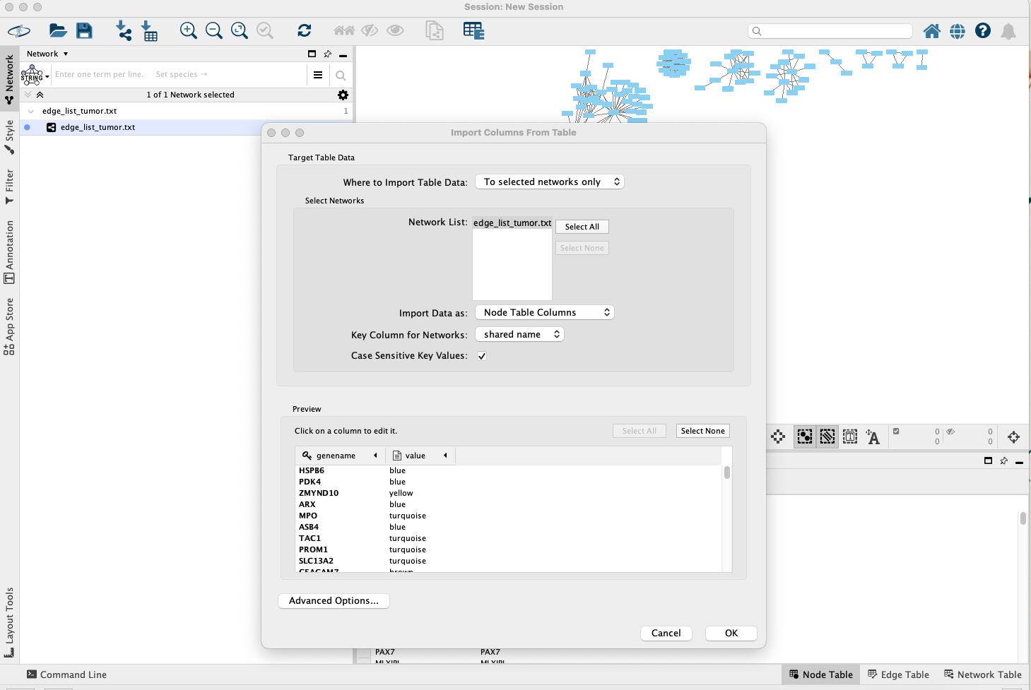
Figure 11. Importing node attributes table
Assign module colors to nodes
• On the left-hand side panel, select the Style tab.
• Under Fill Color, click the expand arrow to open the settings (Figure 12).
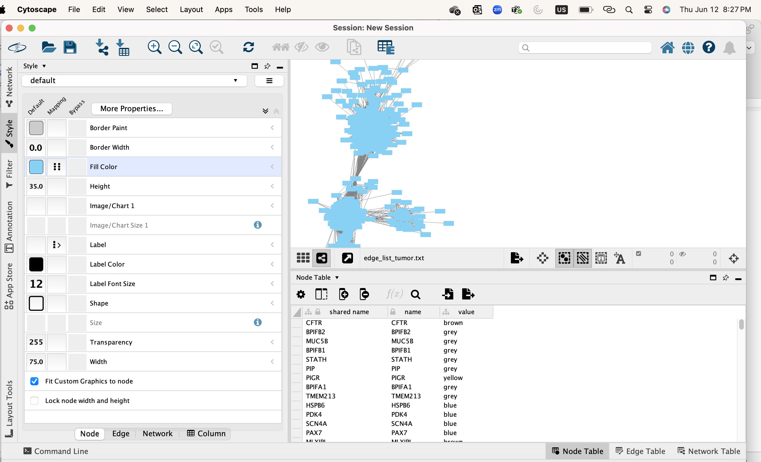
Figure 12. Accessing node color properties
• In the Column row, choose the column that contains the module colors (e.g., the value from node_list_tumor.txt) (Figure 13).
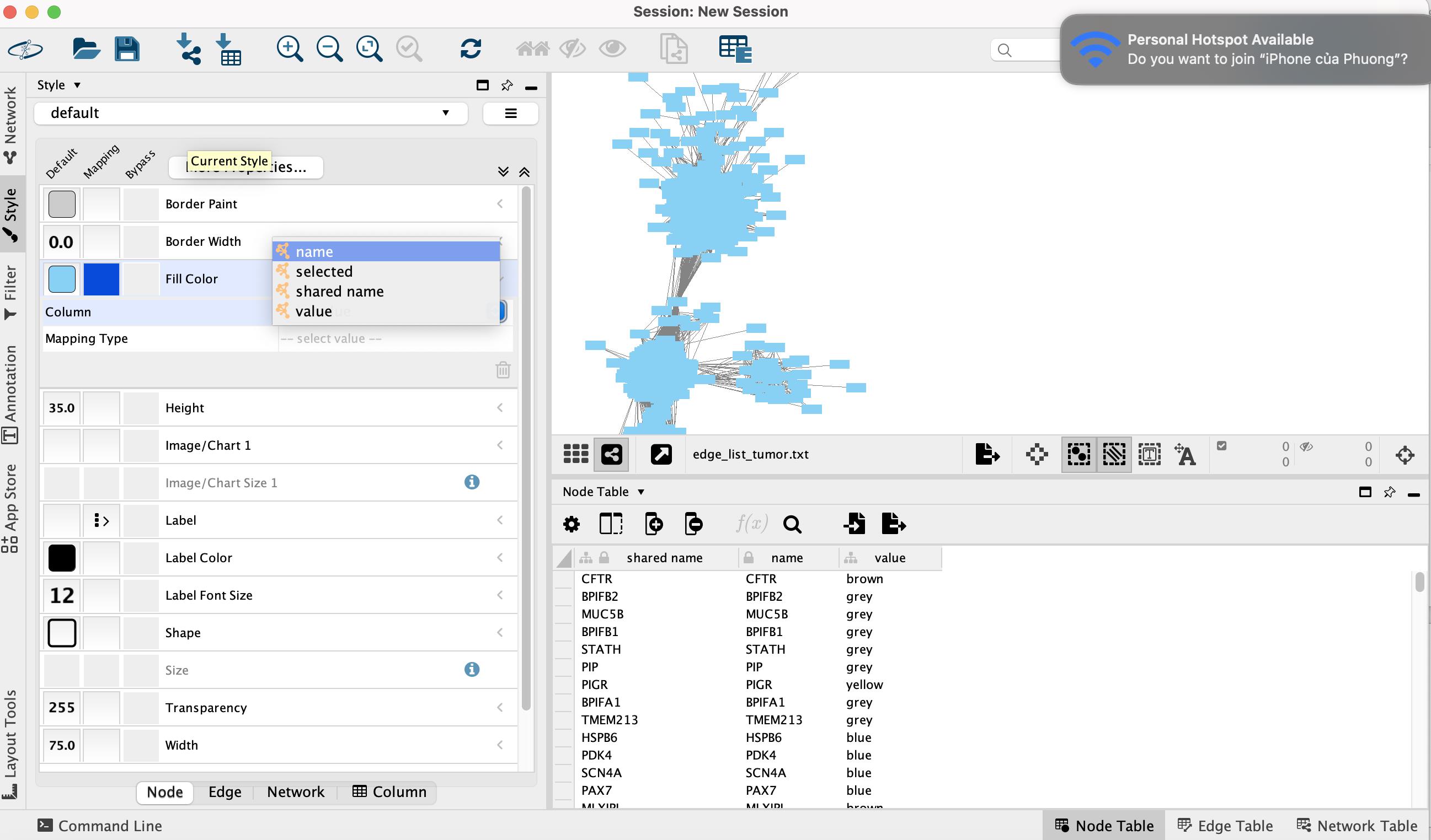
Figure 13. Selecting the module color column
• For Mapping Type, select Discrete Mapping (Figure 14).
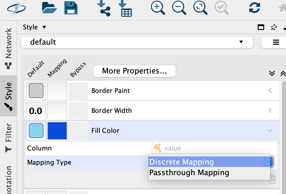
Figure 14. Setting discrete color mapping
• A list of unique module color values will appear. To set the color for each module, click the ellipsis [...] button to open the color palette. Select the color that corresponds to the module's name and click OK (Figure 15).
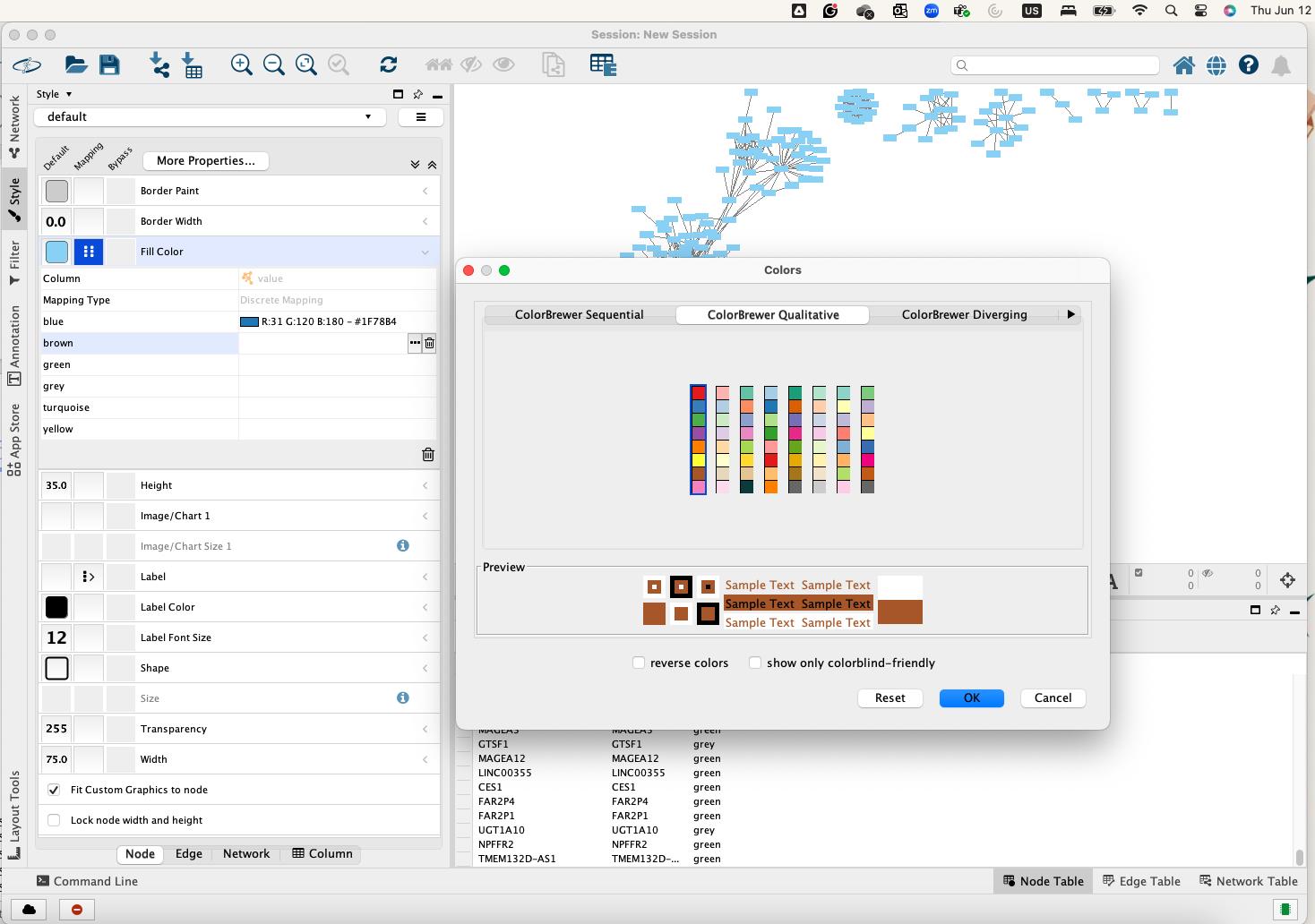
Figure 15. Assigning module-specific colors
• To change the network's visual organization, select a new algorithm from the Layout menu (Figure 16).
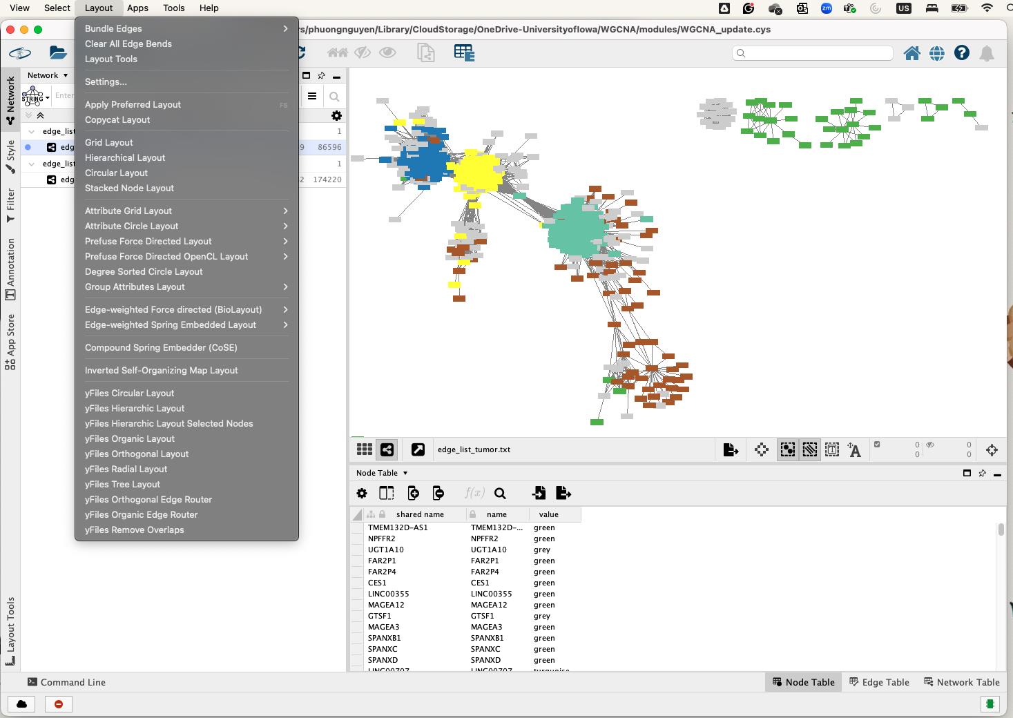
Figure 16. Network layout selection in Cytoscape
Export the network:
• To save the visualized network, go to File > Export > Network to image, or choose the first icon on the right-hand side and select Export as Image (Figure 17).
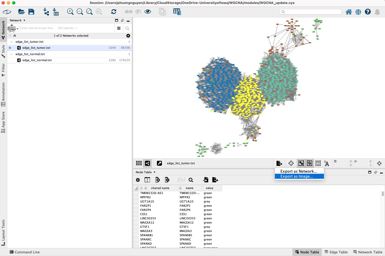
Figure 17. Exporting network visualization from Cytoscape
• Choose the desired file format (e.g., PNG, PDF, or SVG) and save it to a local directory (Figure 18).
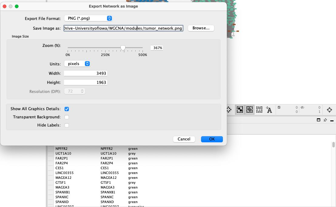
Figure 18. Saving network to local machine
• The Cytoscape network visualization should appear as shown in Figure 19.
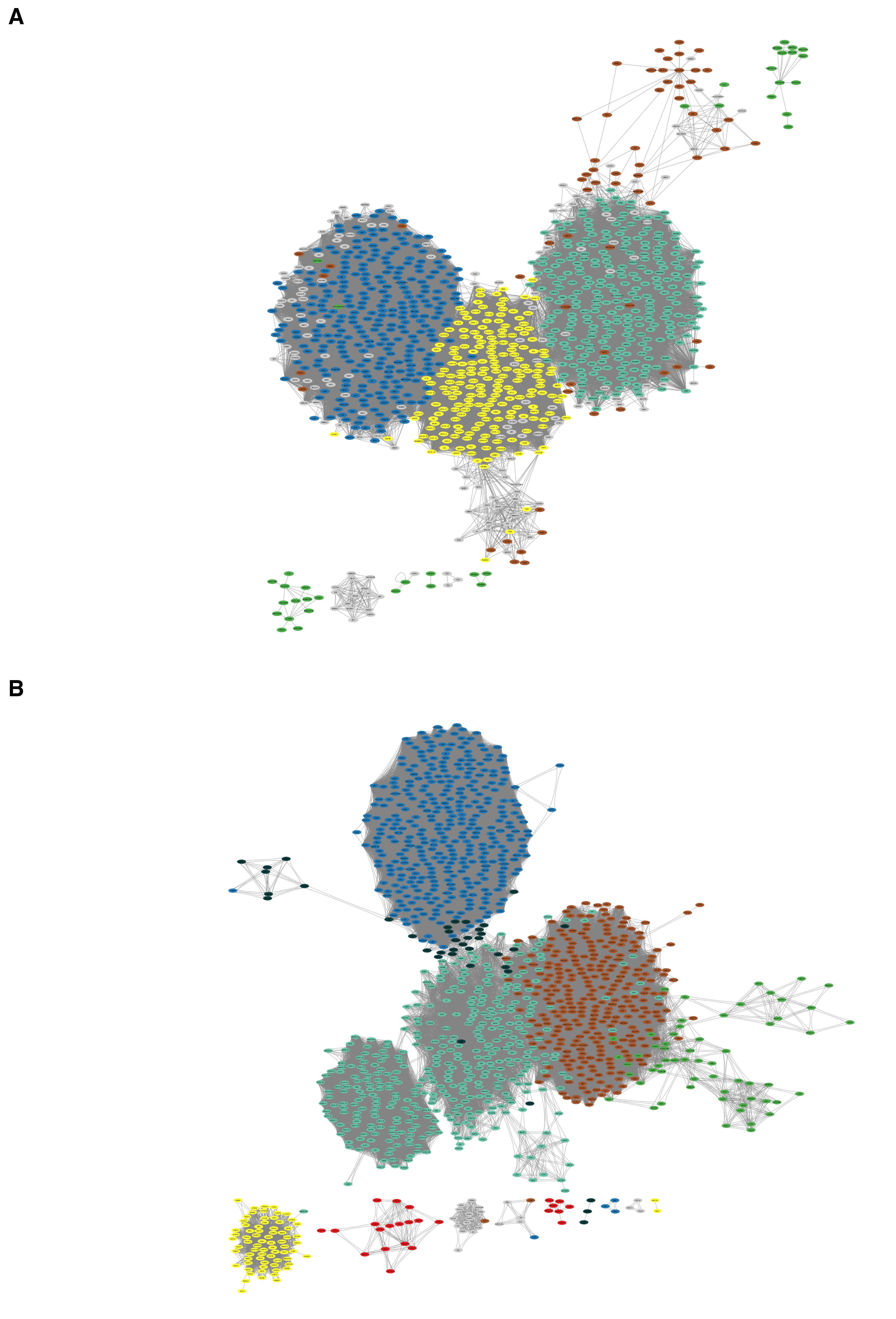
Figure 19. Network created using Cytoscape. (A) Tumor network. (B) Normal network.
Note on colorblind-friendly visualizations: While this protocol uses standard WGCNA color schemes for consistency with established tutorials, users are strongly encouraged to implement colorblind-friendly palettes when creating figures for publication or presentation. Consider using:
• Module visualizations: Colorblind-accessible palettes from R packages such as RColorBrewer (e.g., Set2, Dark2 palettes) or scico.
• Heatmaps: The viridis color scale provides excellent perceptual uniformity and accessibility as an alternative to traditional red-blue gradients.
• Network visualizations: Cytoscape offers colorblind-friendly color schemes that can be selected through the Style interface.
D. Module preservation analysis
Module preservation analysis evaluates how well modules identified in one reference dataset remain intact in another test dataset [2]. Our analysis was based on the code from the WGCNA tutorial, specifically section 12.5: “Module preservation between female and male mice” (https://pages.stat.wisc.edu/~yandell/statgen/ucla/WGCNA/wgcna.html) [31]. Here, we use our previously filtered tumor and normal datasets, transposing each matrix so that samples become columns and genes become rows.
multiData <- list( Tumor = list(data = t(filtered_tumor)), # Transpose to make samples columns Normal = list(data = t(filtered_normal)) # Transpose to make samples columns)# Extract module assignments and colorstumor_modules <- netwk_tumor$colorstumor_module_colors <- labels2colors(tumor_modules)names(tumor_module_colors) <- names(netwk_tumor$colors)normal_module_colors <- labels2colors(netwk_normal$colors)names(normal_module_colors) <- names(netwk_normal$colors)# Module colors for tumor and normal datasetsmultiColor <- list( Tumor = tumor_module_colors, # Named vector of module colors for tumor Normal = normal_module_colors # Named vector of module colors for normal)#check names to ensure genes name in multiColor match with gene names in the original dataall(names(multiColor$Tumor) %in% rownames(filtered_tumor)) # Should return TRUETRUEall(names(multiColor$Normal) %in% rownames(filtered_normal)) # Should return TRUETRUE1. Perform module preservation analysis
We designate the tumor network as the reference and the normal network as the test. Using WGCNA’s modulePreservation() function, we compute various statistics, including the Z-summary score, which measures how well modules from the reference dataset are preserved in the test dataset. Higher Z-summary scores indicate stronger preservation.
A key parameter in this analysis is nPermutations, which determines the number of times sample labels are randomly shuffled to create a null distribution. This process allows for the calculation of a p-value for each preservation statistic. A low number permutation (e.g., 100) can provide a quick assessment of module preservation. A higher number of permutations is recommended to ensure robust and stable p-values. For most datasets, setting the number of permutations to 200 is sufficient. For large datasets or when precise p-values for weakly preserved modules are critical, this can be increased to 1,000 or more. Computational time scales linearly with the number of permutations. Running a high number of permutations requires significant computational resources, particularly CPU time. The analysis is CPU-bound rather than RAM-bound, so a modern multi-core processor is the most important hardware component for completing this step in a timely manner.
For this study, we perform an initial assessment using 100 permutations.
preservation_results <- modulePreservation( multiData = multiData, # List of datasets multiColor = multiColor, # List of module colors referenceNetworks = 1, # Use tumor as reference (index in multiData) nPermutations = 100, # Number of permutations) randomSeed = 12345, # For reproducibility verbose = 3 # Verbose output)#Preservation statistics for modulespreservation_stats<- preservation_results$preservation$Z$ref.Tumor$inColumnsAlsoPresentIn.Normal#Remove the “gold” module.Caution: Understanding and evaluating the gold module
The "gold" module is an artificial reference module automatically generated by WGCNA's modulePreservation() function as a technical control. It is not a biological module identified from your data. Instead, it contains randomly selected genes used to establish baseline preservation statistics and represents the null expectation for module preservation. This module serves as a statistical control, showing what preservation statistics would look like for a randomly assembled set of genes with no genuine biological relationships. By design, the gold module should show poor preservation because it lacks biological coherence. Since it is artificially constructed rather than biologically derived, it provides no meaningful biological insights and must be removed before proceeding with further analysis.
preservation_stats <- preservation_stats[rownames(preservation_stats) != "gold", ]2. Assess module preservation
We focus on the Z-summary (Zsummary.pres) to categorize modules as "highly preserved," "moderately preserved," or "low preserved." Commonly used thresholds are adapted from the hdWGCNA tutorial [32]:
• Z-summary < 2: No preservation.
• 2 ≤ Z-summary < 10: Moderate preservation.
• Z-summary ≥ 10: High preservation.
We then visualize Z-summary statistics using a dot plot (Figure 20).
mod_colors <- rownames(preservation_stats) # Module colorsZ_summary <- preservation_stats$Zsummary.prespreservation_data <- data.frame(Module = mod_colors, Z_summary = Z_summary)# Plot Z-summary statistics with point plotggplot(preservation_data, aes(x = Module, y = Z_summary, color = Module)) + geom_point(size = 8) + # Larger points scale_color_manual(values = mod_colors) + geom_hline(yintercept = 2, linetype = "dashed", color = "red", size = 1) + # Threshold line geom_hline(yintercept = 10, linetype = "dashed", color = "blue", size = 1) + # Strong preservation line theme_minimal() + theme( axis.text.x = element_text(angle = 45, hjust = 1, vjust = 1, size = 14), # Larger x-axis tick text axis.text.y = element_text(size = 14), # Larger y-axis tick text axis.title.x = element_text(size = 14, face = "bold"), # Larger x-axis label axis.title.y = element_text(size = 14, face = "bold"), # Larger y-axis label legend.position = "none", plot.title = element_text(hjust = 0.5, face = "bold", size = 16) # Title formatting ) + labs( title = "Module Preservation Statistics", x = "Module Colors", y = "Preservation Z-summary" )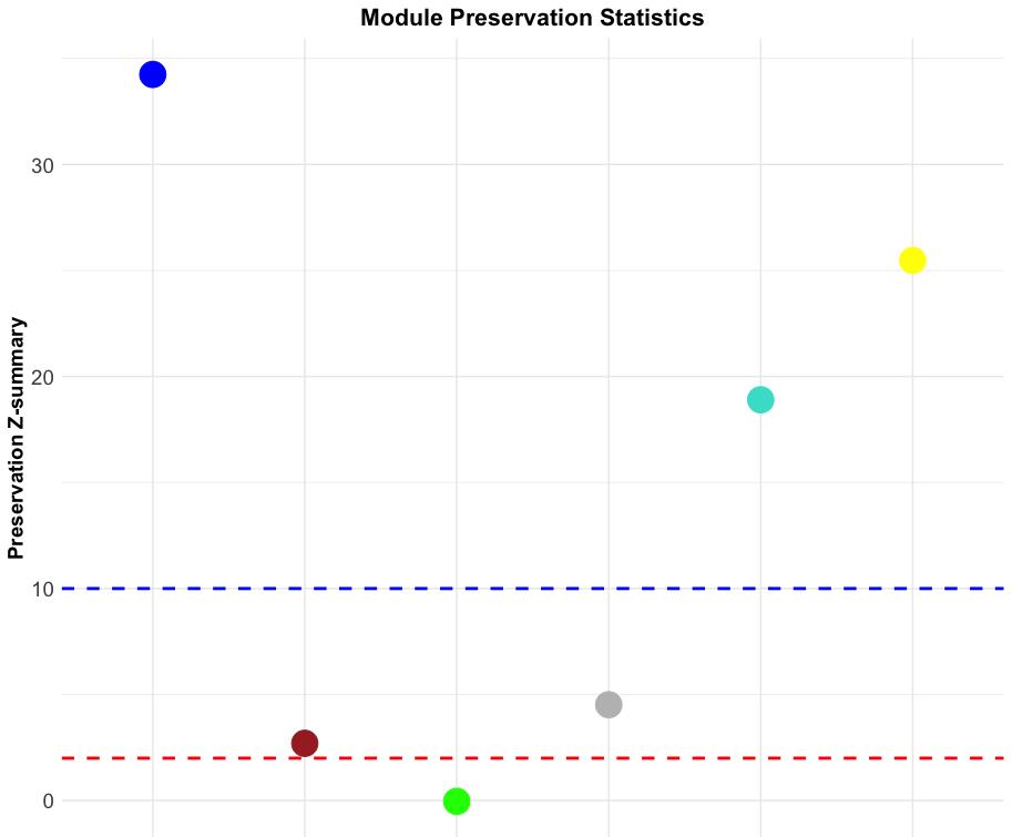
Figure 20. Module preservation statistics of the tumor network. The dot plot displays the Z-summary values for module preservation between tumor and normal networks. Each dot represents a module, with colors indicating its respective module assignment. The y-axis shows the preservation Z-summary, quantifying how well a module’s structure is preserved across both networks. The red dashed line at Z = 2 marks the threshold for low preservation (modules not well preserved), while the blue dashed line at Z = 10 marks the threshold for strong preservation (highly preserved modules).
Figure 20 shows that the blue, turquoise, and yellow modules are highly preserved; the brown and gray modules are moderately preserved; and the green module exhibits low preservation. The R code below can be used to confirm these results.
# Identify highly preserved moduleshighly_preserved <- rownames(preservation_stats)[preservation_stats$Zsummary.pres > 10]print(highly_preserved) # List of module colors“blue” “turquoise” “yellow”
# Identify moderately preserved modulesmoderately_preserved<- rownames(preservation_stats)[preservation_stats$Zsummary.pres > 10]print(moderately_preserved)“brown” “grey”
# Identify low-preserved moduleslow_preserved< rownames(preservation_stats)[preservation_stats$Zsummary.pres > 10]print(low_preserved)“green”
# Extract genes for each module (Figure 21)module_names <- unique(tumor_module_colors)genes_in_modules <- lapply(unique(tumor_module_colors), function(module) { names(tumor_module_colors[tumor_module_colors == module])})names(genes_in_modules) <- module_namesstr(genes_in_modules)
Figure 21. Extraction of module-specific gene lists from tumor network
3. Gene ontology (GO) enrichment analysis
Once modules are classified by their preservation level, we can conduct downstream functional enrichment analyses (e.g., GO terms and KEGG pathways) to explore their biological roles. Gene ontology enrichment analysis is performed with the GO.db package (v3.20.0), downloaded from the Gene Ontology database. KEGG pathway analysis is conducted by querying the live KEGG database as of Dec 9, 2024. As an example, we examine GO enrichment for the "blue" module (Figure 22). We can apply the same approach to any other module by substituting “blue” with the desired module’s name.
# GO enrichment for the “blue" moduleblue_genes <- genes_in_modules$`blue`# Define a function for GO enrichment and CSV writingperform_go_enrichment <- function(gene_list, ontology, output_path) { go_results <- enrichGO( gene = gene_list, OrgDb = org.Hs.eg.db, keyType = "ENSEMBL", ont = ontology, # Ontology (BP, CC, MF) pAdjustMethod = "BH", qvalueCutoff = 0.05 ) # Write results to CSV write.csv(go_results, file = output_path, row.names = TRUE) return(go_results)}# Perform GO enrichment for BP, CC, and MFgo_results_BP <- perform_go_enrichment(blue_genes, "BP", "enrich/GO_T_N/GO_BP_blue.csv")go_results_CC <- perform_go_enrichment(blue_genes, "CC", "enrich/GO_T_N/GO_CC_blue.csv")go_results_MF <- perform_go_enrichment(blue_genes, "MF", "enrich/GO_T_N/GO_MF_blue.csv")# Generate dotplots for each ontologydotplot_BP <- dotplot(go_results_BP, showCategory=20, font.size=10, label_format=70) + scale_size_continuous(range=c(1, 7)) + theme_minimal() + ggtitle("GO Enrichment - Biological Process (BP) - Blue module")dotplot_CC <- dotplot(go_results_CC, showCategory=20, font.size=10, label_format=70) + scale_size_continuous(range=c(1, 7)) + theme_minimal() + ggtitle("GO Enrichment - Cellular Component (CC) - Blue module")dotplot_MF <- dotplot(go_results_MF, showCategory=20, font.size=10, label_format=70) + scale_size_continuous(range=c(1, 7)) + theme_minimal() + ggtitle("GO Enrichment - Molecular Function (MF) - Blue module")# Combine dotplots into a single imagecombined_plot <- ggarrange(dotplot_BP, dotplot_CC, dotplot_MF, ncol=1, nrow=3)print(combined_plot)# Save the combined plotggsave("enrich/GO_T_N/GO_combined_dotplot_blue_module.png", combined_plot, width=10, height=15)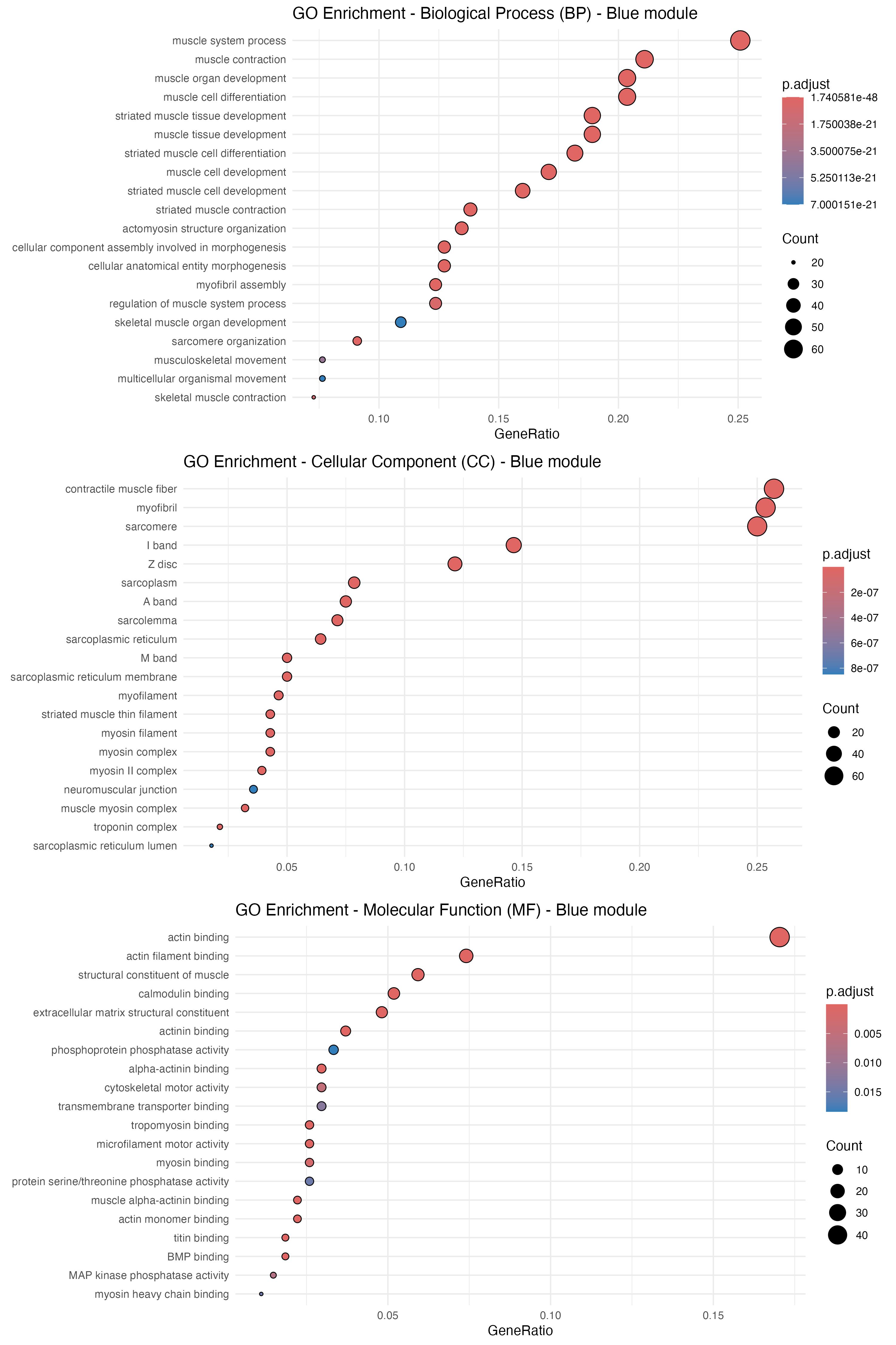
Figure 22. Gene ontology (GO) enrichment analysis for the blue module of tumor network. The dot plot displays results from GO enrichment analyses—covering biological process (BP), cellular component (CC), and molecular function (MF)—for the genes within the blue module. The y-axis lists the significantly enriched GO terms, while the x-axis indicates the gene ratio (the proportion of genes associated with each term). The size of each dot represents the number of genes in that term, and the color gradient corresponds to the adjusted p-value, with darker red signifying higher significance.
The analysis strongly indicates that this module of the OSCC tumor network is dominated by genes integral to muscle function and development. The most significant biological processes are related to muscle contraction and organogenesis, with the corresponding gene products localized to core contractile structures like myofibrils and sarcomeres. At a molecular level, the key functions involve actin binding and structural components of muscle, suggesting that dysregulation of genes related to muscle architecture and mechanics may play a role in this specific OSCC subtype.
4. Examine GO term overlap across preservation levels
By consolidating GO terms from multiple modules across various preservation levels, we can identify both overlapping and distinct functional categories using a Venn diagram. This protocol uses the VennDiagram package to compare the GO term descriptions from modules categorized as High, Moderate, or Low preservation.
Note: Ensure that files have been created for each ontology and module prior to performing these steps.
a. Create lists of GO terms
This process reads all individual GO result files and combines them into a single master data frame.
# Define directories and file patternsinput_dir <- "enrich/GO_T_N/"file_pattern <- "GO_(BP|CC|MF)_(.*).csv" # Matches files like go_BP_module1.csv# Define module preservation levelsmodule_preservation <- data.frame( Module = c("blue", "brown", "green", "grey", "turquoise", "yellow"), # Replace with your module names PreservationLevel = c("High", "Moderate", "Low","Moderate", "High", "High" ) # Corresponding preservation levels)# Function to process filesprocess_go_files <- function(file_path, ontology, module) { # Read the GO results file go_data <- read.csv(file_path) # Add ontology and module columns go_data <- go_data %>% mutate( Ontology = ontology, Module = module ) return(go_data)}# List and process all filesgo_files <- list.files(input_dir, pattern = file_pattern, full.names = TRUE)# Combine all GO resultscombined_go_results <- do.call(rbind, lapply(go_files, function(file) { # Extract ontology and module from the filename match <- regmatches(basename(file), regexec(file_pattern, basename(file))) ontology <- match[[1]][2] module <- match[[1]][3] # Process the file process_go_files(file, ontology, module)}))# Add PreservationLevel to the combined resultscombined_go_results <- combined_go_results %>% left_join(module_preservation, by = c("Module"))# Save combined results for each ontologyfor (ontology in c("BP", "CC", "MF")) { ontology_data <- combined_go_results %>% filter(Ontology == ontology) write.csv(ontology_data, file = paste0("enrich/combined_go_", ontology, ".csv"), row.names = FALSE)}b. Create GO term lists for comparison and examine the structure of GO enrichment results (Figure 23).
# Read list GO result filesgo_results_BP <- read.csv("enrich/combined_go_BP.csv")go_results_CC <- read.csv("enrich/combined_go_CC.csv")go_results_MF <- read.csv("enrich/combined_go_MF.csv")str(go_results_BP)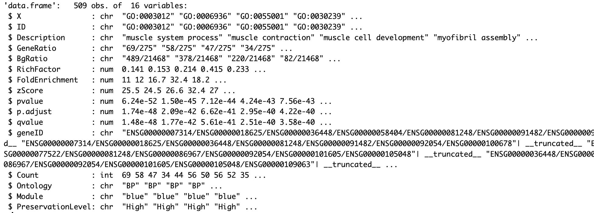
Figure 23. Structure of GO enrichment results for biological processes (BP). Data frame containing 509 observations and 16 variables from GO enrichment analysis, including gene IDs, descriptions, GeneRatio, BgRatio, statistical measures (p-values, p.adjust), and gene mappings for each enriched BP term.
# Split by preservation levelhigh_preservation_BP <- go_results_BP[go_results_BP$PreservationLevel == "High", ]moderate_preservation_BP <- go_results_BP[go_results_BP$PreservationLevel == "Moderate", ]low_preservation_BP <- go_results_BP[go_results_BP$PreservationLevel == "Low", ]high_terms_BP <- na.omit(unique(high_preservation_BP$Description))moderate_terms_BP <- na.omit(unique(moderate_preservation_BP$Description))low_terms_BP <- na.omit(unique(low_preservation_BP$Description))c. Generate a venn diagram and examine overlaps
To retrieve the specific GO terms within an overlapping region, the intersect() function is used, as illustrated below.
# Example command to find the intersection of GO termsshared_terms <- intersect(high_terms_BP, moderate_terms_BP)Finally, we use the VennDiagram package to visualize the overlap among the three term lists.
# Load the VennDiagram librarylibrary(VennDiagram)# Generate Venn diagramvenn.diagram( x = list( High = high_terms_BP, Moderate = moderate_terms_BP, Low = low_terms_BP ), filename = "enrich/GO_comparison_venn_BP.png", fill = c("red", "blue", "green"), alpha = 0.5, # controls how transparent a color is (e.g. alpha = 0.0 for completely transparent, alpha = 1 for completely opaque, and alpha = 0.5 for 50% transparent) cex = 1.5, #change text size (e.g. cex = 1.5 makes the text or symbol 50% larger than the default) main = "GO Molecular Function Venn Diagram", cat.pos = c(0, 100, 200), # Adjusts the angle for each label cat.dist = 0.05 # Increases the distance from the circleThe BP Venn diagram (Figure 24) shows that 285 GO terms are unique to highly preserved modules and 150 to moderately preserved modules, with 27 terms shared between them. Low-preservation modules contain no enriched BP terms, indicating that weakly preserved modules lack a unifying biological theme. In the CC category, highly preserved modules capture nearly all terms (76 unique), whereas moderately preserved modules include only one unique term, and low-preservation modules share just a single term with the highly preserved set. This pattern suggests that modules with different preservation levels operate in distinct cellular compartments. The MF diagram reveals the greatest functional overlap: 29 terms are common to all three preservation levels. Overall, these results indicate that while certain core molecular functions are retained across the network, many biological processes and subcellular localizations are confined to modules with high or moderate preservation, underscoring the connection between network stability and biological function.
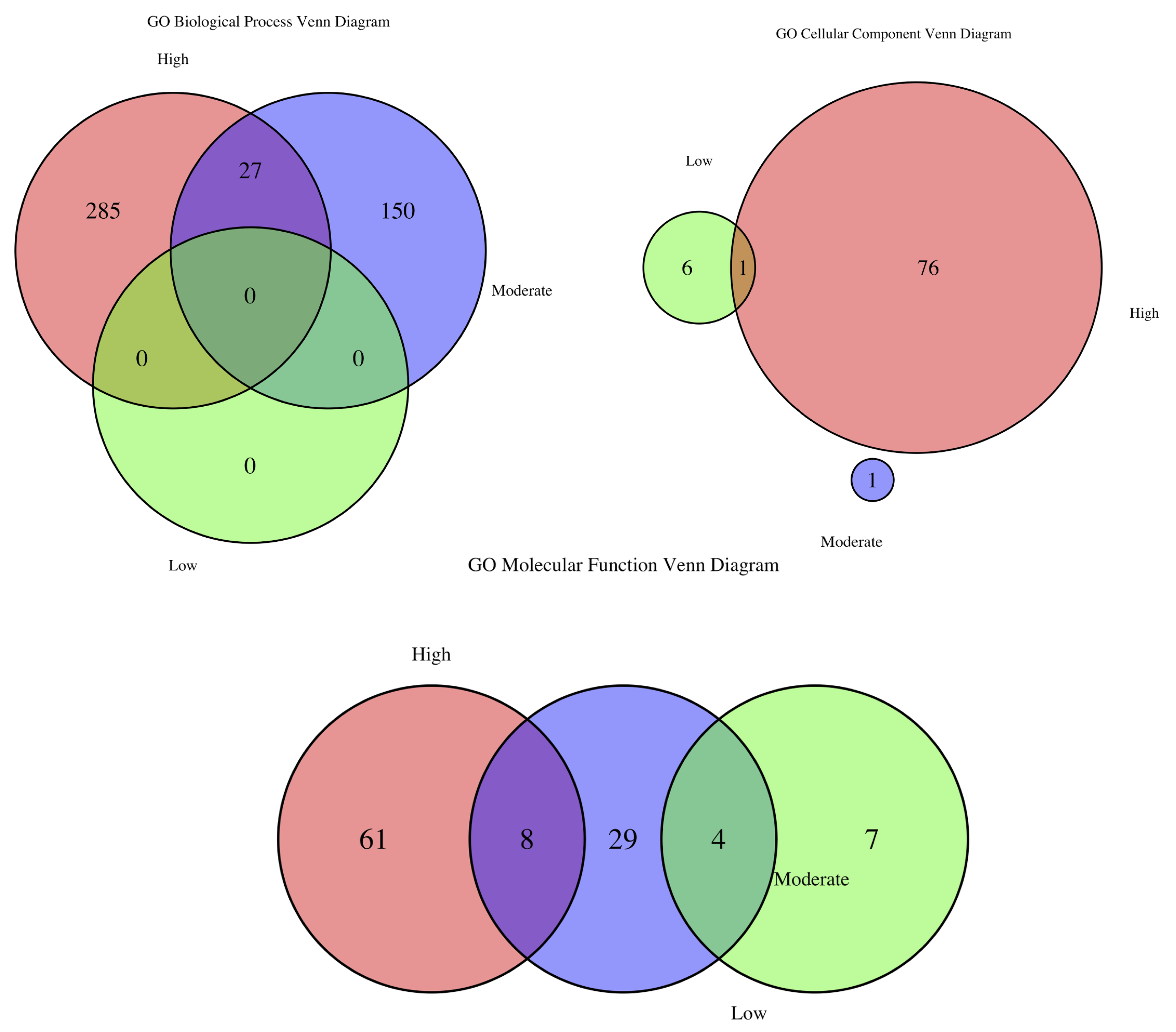
Figure 24. GO term overlap across preservation levels for biological process (BP), cellular component (CC), and molecular function (MF). The Venn diagram illustrates the overlap of enriched GO terms across BP, CC, and MF categories at high, moderate, and low preservation levels. The number indicates the counts of GO terms that are unique to each preservation category (High, Moderate, or Low) or shared between them.
Below is an example command for examining specific GO term overlap (Figure 25):
# This command finds all GO terms that are common to both the moderate and low preservation lists.intersect_MF_mod_low <- intersect(low_terms, moderate_terms)
Figure 25. GO terms shared between low and moderate preservation modules
5. Kyoto Encyclopedia of Genes and Genomes (KEGG) pathway enrichment analysis
We can similarly perform KEGG enrichment on gene sets from modules at different preservation levels. This procedure involves collecting the genes and converting them to the appropriate ID format, running enrichment analysis, and visualizing the results. As with GO term enrichment, we then use a dot plot to visualize KEGG pathways for each preservation level (Figure 26).
a. Prepare gene lists by preservation level and convert gene identifiers
We create lists of genes corresponding to the High, Moderate, and Low preservation categories. This is done by pooling all genes from the modules assigned to each category. We then have a list object genes_in_modules, where each element contains the gene IDs for a specific module (e.g., genes_in_modules$blue). As the KEGG enrichment tools in clusterProfiler require ENTREZ Gene IDs as input, we must first convert them using the bitr function from the clusterProfiler package for this task.
# Preparing Gene Lists by high preservation level geneshigh_preservation_genes <- c(genes_in_modules$blue, genes_in_modules$yellow, genes_in_modules$turquoise)# Convert to EntrezIDhigh_preservation_genes.entrez_ids <- bitr(high_preservation_genes, fromType = "ENSEMBL", toType = "ENTREZID", OrgDb = org.Hs.eg.db)#Repeat the same process with moderate preservation level genesmoderate_preservation_genes <- c(genes_in_modules$brown, genes_in_modules$grey)moderate_preservation_genes.entrez_ids <- bitr(moderate_preservation_genes, fromType = "ENSEMBL", toType = "ENTREZID", OrgDb = org.Hs.eg.db)# and low preservation levellow_preservation_genes <- c(genes_in_modules$green) # Low preservationlow_preservation_genes.entrez_ids <- bitr(low_preservation_genes, fromType = "ENSEMBL", toType = "ENTREZID", OrgDb = org.Hs.eg.db)b. Perform KEGG pathway enrichment analysis
With the gene lists in the correct format, we perform enrichment analysis using the enrichKEGG function.
# Perform KEGG enrichment for highly preserved geneskegg_high <- enrichKEGG( gene = high_preservation_genes.entrez_ids$ENTREZID, organism = 'hsa', # Human pvalueCutoff = 0.05)# Perform KEGG enrichment for moderate preserved geneskegg_moderate <- enrichKEGG( gene = moderate_preservation_genes.entrez_ids$ENTREZID, organism = 'hsa', pvalueCutoff = 0.05)# Perform KEGG enrichment for low preserved geneskegg_low <- enrichKEGG( gene = low_preservation_genes.entrez_ids$ENTREZID, organism = 'hsa', pvalueCutoff = 0.05)c. Visualize enrichment analysis results
Finally, the results of the enrichment analysis are visualized using a dot plot, an intuitive format for highlighting the most significant pathways. Figure 26 is generated using the dotplot function from the clusterProfiler package.
# Visualize KEGG enrichmentlibrary(ggplot2)dotplot(kegg_high, title = "KEGG Pathways - High Preservation") + theme_minimal()dotplot(kegg_moderate, title = "KEGG Pathways - Moderate Preservation") + theme_minimal()dotplot(kegg_low, title = "KEGG Pathways - Low Preservation") + theme_minimal()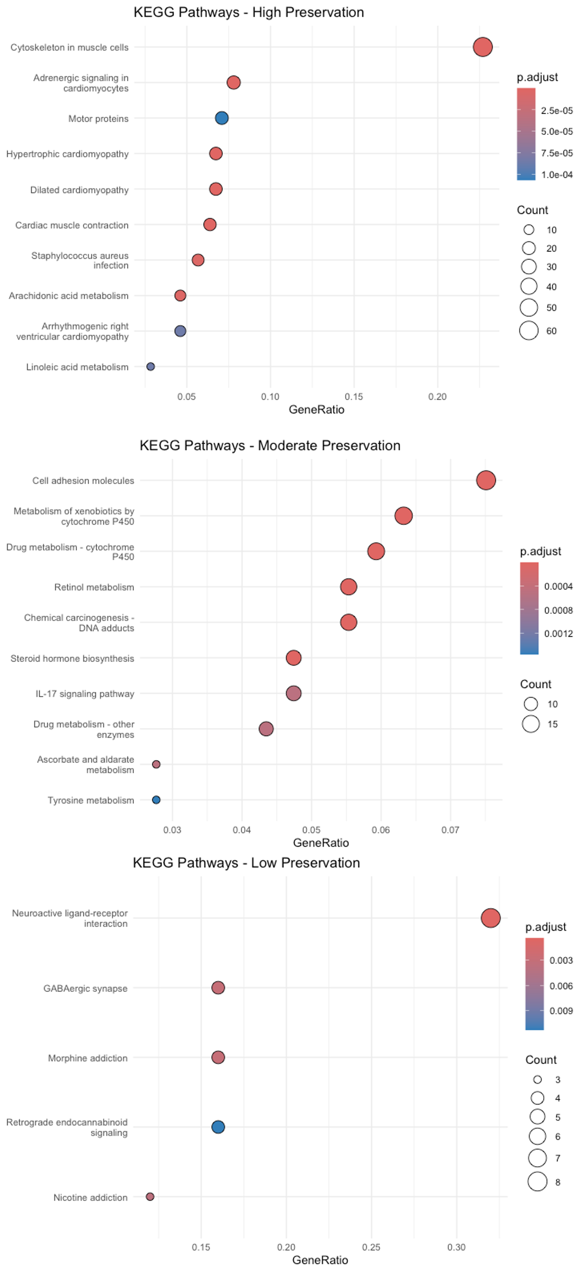
Figure 26. Kyoto Encyclopedia of Genes and Genomes (KEGG) enrichment analysis. The dot plot shows the significantly enriched KEGG pathways for modules of high, moderate, and low preservation levels. The y-axis represents pathways, while the x-axis represents the gene ratio (the fraction of module genes associated with a specific pathway). Dot size scales with the number of genes represented in each pathway, whereas the color gradient reflects the adjusted p-value—deeper reds indicate greater significance.
The plots in Figure 26 indicate that cancer-related genes from modules with moderate or low preservation are preferentially enriched in KEGG pathways such as neuroactive ligand–receptor interaction, GABAergic synapse, xenobiotic metabolism by cytochrome P450, and cell-adhesion molecules.
E. Reverse reference and test networks
To assess module preservation in the reverse direction (e.g., using the normal network as the reference and the tumor network as the test), set referenceNetworks = 2.
preservation_results.1 <- modulePreservation( multiData = multiData, # List of datasets multiColor = multiColor, # List of module colors referenceNetworks = 2, # Use normal as reference (index in multiData) nPermutations = 200, randomSeed = 12345, # For reproducibility verbose = 3 # Verbose output)Next, we repeat the Section D workflow—generate Z-summary plots, classify modules as highly, moderately, or weakly preserved, and run the corresponding enrichment analyses. The results below summarize the preservation of modules derived from normal samples within tumor networks.
1. Module preservation statistics
Figure 27 shows that the modules of blue, brown, and turquoise are highly preserved, while those of black, green, and gray modules are moderately preserved. Red and yellow modules are low-preserved.
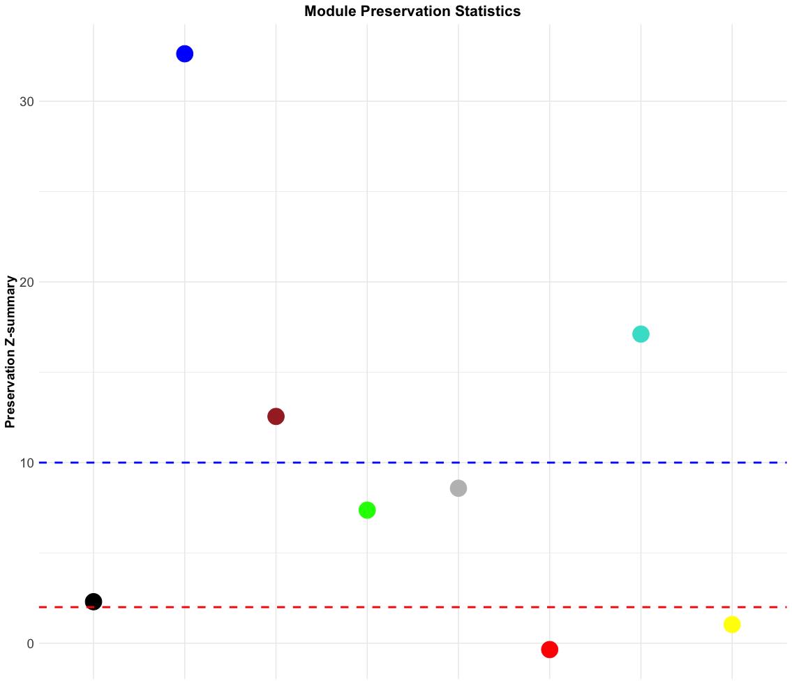
Figure 27. Module preservation statistics of normal network. The dot plot displays the Z-summary values for module preservation between the normal and tumor networks. Each dot represents a module, color-coded by its module assignment. The y-axis shows the preservation Z-summary, indicating how well each module’s structure is preserved across both networks. The red dashed line at Z = 2 denotes the threshold for low preservation (modules are considered poorly preserved), while the blue dashed line at Z = 10 marks the threshold for strong preservation (modules are considered highly preserved).
2. GO enrichment analysis
Consistent with the tumor network, GO enrichment analysis reveals that the blue module in the normal-tissue network is strongly enriched for muscle-related genes (Figure 28). The most significant biological processes include muscle contraction, muscle system processes, and muscle cell differentiation. These gene products localize to the core contractile machinery—the myofibril and sarcomere. Key molecular functions, such as actin binding and structural constituents of muscle, confirm that this module embodies the essential framework for constructing and operating healthy muscle tissue.
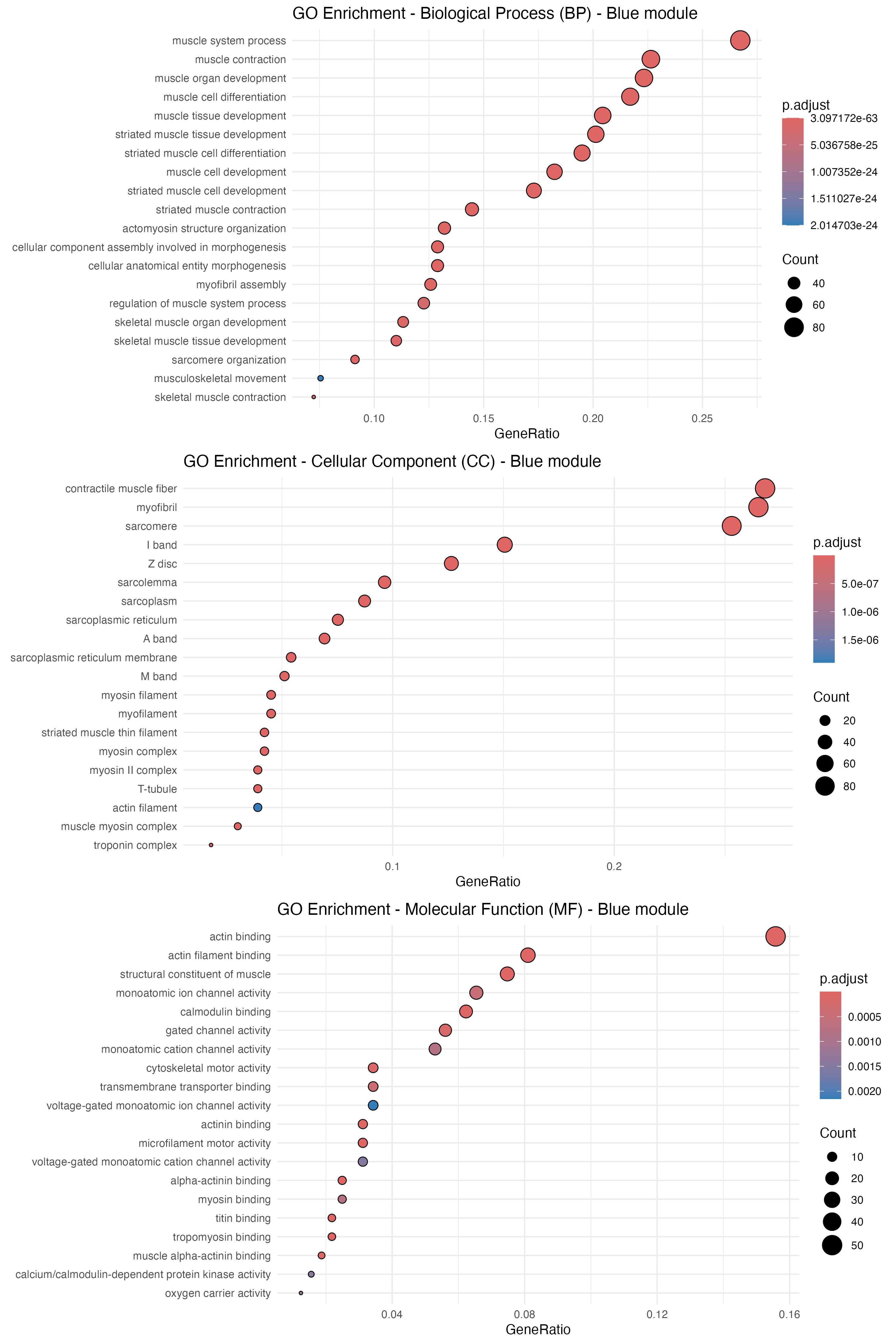
Figure 28. Gene ontology (GO) enrichment analysis for the blue module of normal network. The dot plot highlights significantly enriched GO terms for biological process (BP), cellular component (CC), and molecular function (MF) within the blue module. The y-axis lists the enriched terms, while the x-axis shows the gene ratio—the proportion of module genes mapped to each term. Dot size reflects the number of genes per term, and the color gradient represents the adjusted p-value, with deeper reds indicating greater significance.
3. Examine GO term overlap across preservation levels
The BP Venn diagram (Figure 29) shows that modules with high (292 terms), moderate (85), and even low (65) preservation each contain substantial sets of unique biological processes, unlike the tumor-referenced analysis, where low-preservation modules were largely functionally silent. Eighteen BP terms are shared across all three categories, indicating core processes vital for normal tissue homeostasis that persist even in disease. For CC, every preservation level maps to distinct cellular locales: highly preserved modules contribute the most unique components (61 terms), while low-preservation modules still add 23 unique terms. Only three CC terms are common to every level, reinforcing the idea that modules with different stability operate in separate subcellular compartments. The MF diagram highlights even stronger specialization. Highly preserved modules account for most unique functions (109 terms), whereas just two MF terms span all categories. Overall, although a small set of fundamental functions is conserved, the highly specialized activities of the normal network reside in its most stable modules, which remain functionally coherent even when their structure is perturbed in the tumor environment.
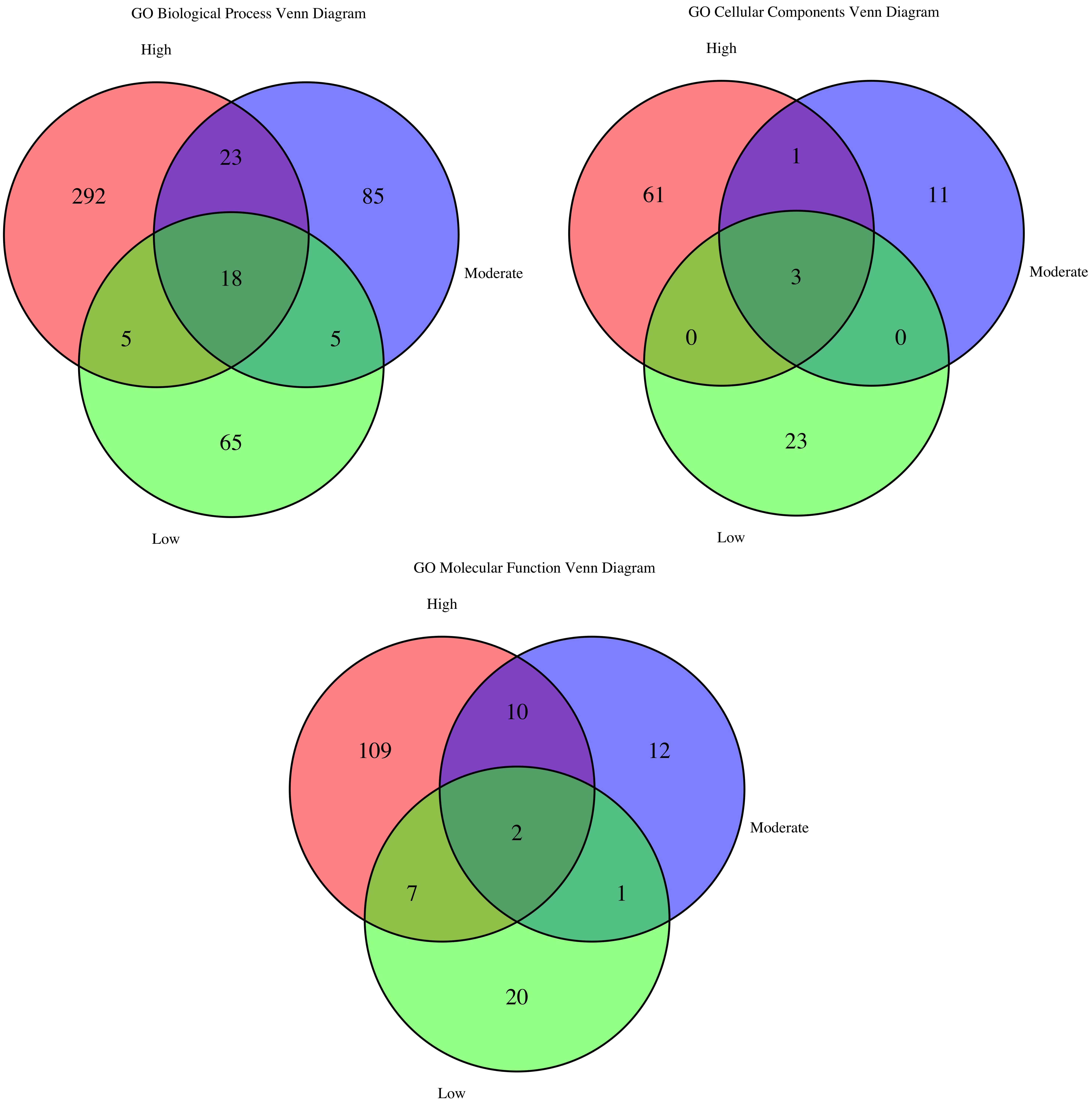
Figure 29. GO term overlap across preservation levels for biological process (BP), cellular component (CC), and molecular function (MF). The Venn diagram illustrates the overlap of enriched GO terms—covering BP, CC, and MF—among modules at high, moderate, and low preservation levels.
4. KEGG pathway enrichment analysis
Figure 30 demonstrates that cancer-associated genes from modules with high, moderate, and low preservation are enriched in KEGG pathways such as IL-17 signaling, tyrosine metabolism, xenobiotic metabolism by cytochrome P450, and chemical carcinogenesis, driven by DNA adducts.
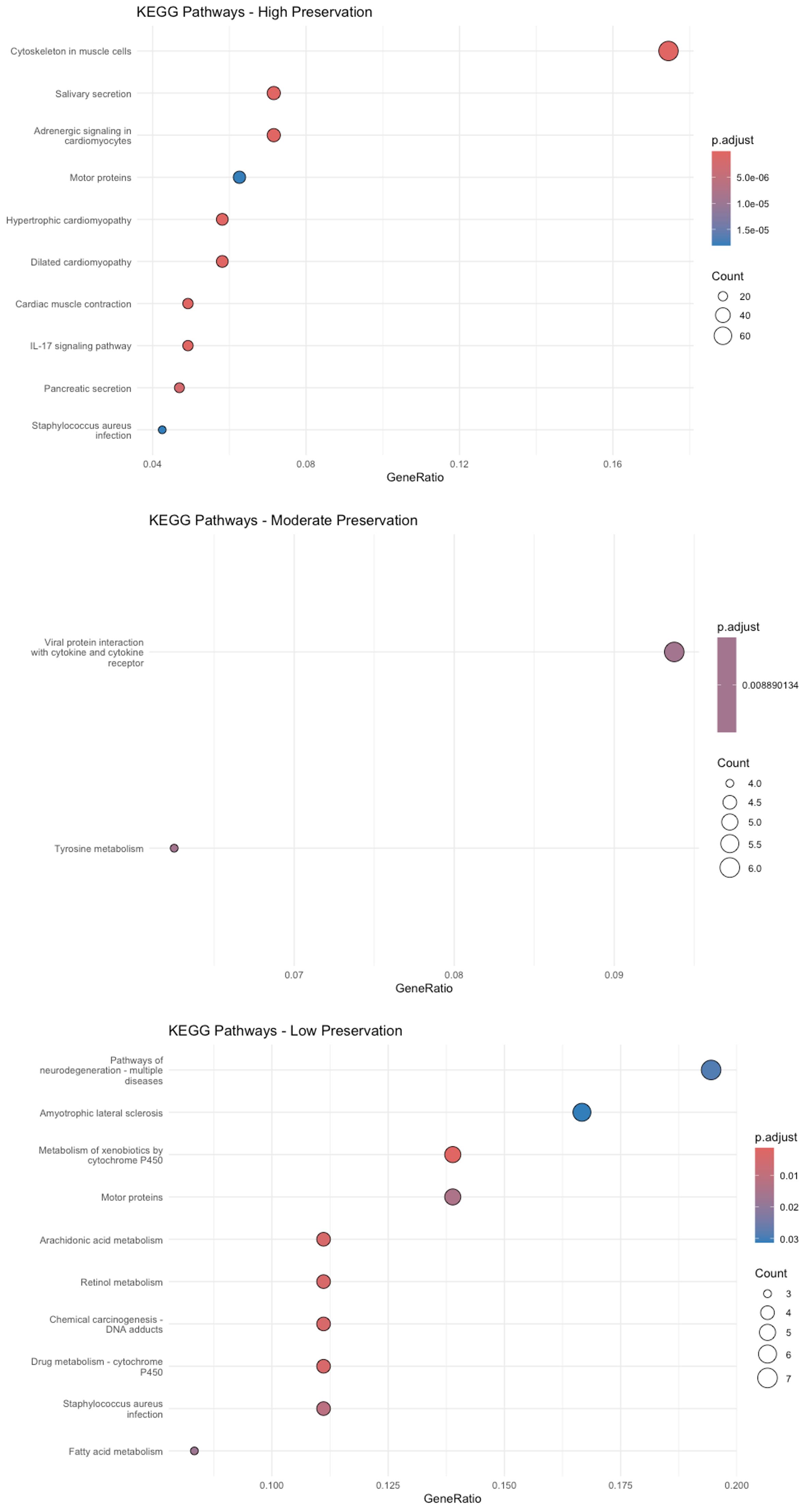
Figure 30. Kyoto Encyclopedia of Genes and Genomes (KEGG) enrichment analysis. The dot plot depicts KEGG pathways significantly enriched in modules of high, moderate, and low preservation. The y-axis lists the pathways, while the x-axis shows the gene ratio (the proportion of module genes in each pathway). Dot size represents the number of genes per pathway, and the color gradient reflects the adjusted p-value—deeper reds indicate higher significance.
Validation of protocol
This protocol has not been validated using the dataset directly downloaded through the TCGA portal. As described in the Software and datasets section, this protocol uses gene expression data from the GDC Data Release v38.0, downloaded on October 18, 2023. The dataset is also publicly available as a compressed file (GeneExpression.zip) in the GitHub repository: https://github.com/biocoms/WGCNA.
This protocol or parts of it has been used and validated in the following research articles:
• Hickner et al. [9]. Whole transcriptome responses among females of the filariasis and arbovirus vector mosquito Culex pipiens implicate TGF-beta signaling and chromatin modification as key drivers of diapause induction. Functional & Integrative Genomics (Figure 2)
• Zeng et al. [11]. A computational framework for integrative analysis of large microbial genomics data. The Proceedings of the 2015 IEEE International Conference on Bioinformatics and Biomedicine (Figure 5)
• Zhang et al. [6]. Mapping genomic features to functional traits through microbial whole genome sequences. International Journal of Bioinformatics Research and Applications (Figures 5 and 6)
• Abdullah et al. [8]. Murine myocardial transcriptome analysis reveals a critical role of COPS8 in the gene expression of cullin-RING ligase substrate receptors and redox and vesicle trafficking pathways. Frontiers in Physiology (Supplementary Figure 8)
• Zheng et al. [4]. Temporal small RNA expression profiling under drought reveals a potential regulatory role of small nucleolar RNAs in the drought responses of maize. Plant Genome (Figure 4)
• Zheng et al. [10]. Co-expression analysis aids in the identification of genes in the cuticular wax pathway in maize. Plant Journal (Figure 3)
Acknowledgments
Conceptualization, E.Z. Investigation—Coding, P.N. Writing—Original Draft, P.N. Writing—Review & Editing, E.Z. and P.N. Supervision, E.Z. This work was partially supported by the SEED grant of the University of Iowa College of Dentistry. This protocol was adapted from Langfelder et al. [1] and Langfelder et al. [2].
Competing interests
The authors declare no conflict of interest or competing interests.
Ethical considerations
This work did not use human or animal subjects and has no ethical considerations.
References
- Langfelder, P. and Horvath, S. (2008). WGCNA: an R package for weighted correlation network analysis. BMC Bioinf. 9: 559. https://doi.org/10.1186/1471-2105-9-559
- Langfelder, P., Luo, R., Oldham, M. C. and Horvath, S. (2011). Is my network module preserved and reproducible? PLoS Comput Biol. 7(1): e1001057. https://doi.org/10.1371/journal.pcbi.1001057
- Ries, L. A. G., M. D., Krapcho, M., Stinchcomb, D. G., Howlader, N. and others. (2008). Cancer Statistics Review, 1975–2005.
- Zheng, J., Zeng, E., Du, Y., He, C., Hu, Y., Jiao, Z., Wang, K., Li, W., Ludens, M., Fu, J., et al. (2019). Temporal Small RNA Expression Profiling under Drought Reveals a Potential Regulatory Role of Small Nucleolar RNAs in the Drought Responses of Maize. Plant Genome. 12(1). https://doi.org/10.3835/plantgenome2018.08.0058
- Zhang, W., Zeng, E., Emrich, S. J., Livermore, J., Liu, D. and Jones, S. E. (2013). Predicting bacterial functional traits from whole genome sequences using random forest. 2013 IEEE 3rd International Conference on Computational Advances in Bio and medical Sciences (ICCABS). IEEE.
- Zhang, W., Zeng, E., Liu, D., Jones, S. E. and Emrich, S. (2014). Mapping genomic features to functional traits through microbial whole genome sequences. Int J Bioinf Res Appl. 10: 461. https://doi.org/10.1504/ijbra.2014.062995
- Bertke, M. M., Dubiak, K. M., Cronin, L., Zeng, E. and Huber, P. W. (2019). A deficiency in SUMOylation activity disrupts multiple pathways leading to neural tube and heart defects in Xenopus embryos. BMC Genomics. 20(1): 386. https://doi.org/10.1186/s12864-019-5773-3
- Abdullah, A., Eyster, K. M., Bjordahl, T., Xiao, P., Zeng, E. and Wang, X. (2017). Murine Myocardial Transcriptome Analysis Reveals a Critical Role of COPS8 in the Gene Expression of Cullin-RING Ligase Substrate Receptors and Redox and Vesicle Trafficking Pathways. Front Physiol. 8: 594. https://doi.org/10.3389/fphys.2017.00594
- Hickner, P. V., Mori, A., Zeng, E., Tan, J. C. and Severson, D. W. (2015). Whole transcriptome responses among females of the filariasis and arbovirus vector mosquito Culex pipiens implicate TGF-beta signaling and chromatin modification as key drivers of diapause induction. Funct Integr Genomics. 15(4): 439–447. https://doi.org/10.1007/s10142-015-0432-5
- Zheng, J., He, C., Qin, Y., Lin, G., Park, W. D., Sun, M., Li, J., Lu, X., Zhang, C., Yeh, C. T., et al. (2019). Co-expression analysis aids in the identification of genes in the cuticular wax pathway in maize. Plant J. 97(3): 530–542. https://doi.org/10.1111/tpj.14140
- Zeng, E., Zhang, W., Emrich, S.J., Liu, D., Livermore, J. and Jones, S. E. (2015). A computational framework for integrative analysis of large microbial genomics data. 2015 IEEE International Conference on Bioinformatics and Biomedicine (BIBM). https://doi.org/10.1109/BIBM.2015.7359837
- Carter, S. L., Brechbuhler, C. M., Griffin, M. and Bond, A. T. (2004). Gene co-expression network topology provides a framework for molecular characterization of cellular state. Bioinformatics. 20(14): 2242–2250. https://doi.org/10.1093/bioinformatics/bth234
- Shannon, P., Markiel, A., Ozier, O., Baliga, N. S., Wang, J. T., Ramage, D., Amin, N., Schwikowski, B. and Ideker, T. (2003). Cytoscape: a software environment for integrated models of biomolecular interaction networks. Genome Res. 13(11): 2498–2504. https://doi.org/10.1101/gr.1239303
- Otasek, D., Morris, J. H., Bouças, J., Pico, A. R. and Demchak, B. (2019). Cytoscape automation: empowering workflow-based network analysis. Genome Biol. 20(1): 185. https://doi.org/10.1186/s13059-019-1758-4
- Lv, J. H., Hou, A. J., Zhang, S. H., Dong, J. J., Kuang, H. X., Yang, L. and Jiang, H. (2023). WGCNA combined with machine learning to find potential biomarkers of liver cancer. Medicine (Baltimore) 102(50): e36536. https://doi.org/10.1097/MD.0000000000036536
- Zhao, R., Wei, W. and Zhen, L. (2023). WGCNA-based identification of potential targets and pathways in response to treatment in locally advanced breast cancer patients. Open Med (Wars) 18(1): 20230651. https://doi.org/10.1515/med-2023-0651
- Manouchehri, L., Zinati, Z. and Nazari, L. (2024). Population-Specific gene expression profiles in prostate cancer: insights from Weighted Gene Co-expression Network Analysis (WGCNA). World J Surg Oncol. 22(1): 177. https://doi.org/10.1186/s12957-024-03459-6
- Abudereheman, M., Lian, Z. and Ainitu, B. (2024). Weighted gene co-expression network analysis and whole genome sequencing identify potential lung cancer biomarkers. Front Oncol. 14: 1355527. https://doi.org/10.3389/fonc.2024.1355527
- He, L., Jiang, Z., Gao, Y., Zeng, Y., Ge, W., Yu, Y. and Xie, X. (2024). Comprehensive analysis of an mRNA co-expression network and a ceRNA network reveals potential prognostic biomarkers in oral squamous cell carcinoma. Egypt J Med Hum Genet. 25(1): e1186/s43042–024–00574–7. https://doi.org/10.1186/s43042-024-00574-7
- Fang, Z., Wang, F., Zhang, M., Huang, H. and Lin, Z. (2022). Identification of Co-Expression Modules and Genes Associated With Tumor Progression in Oral Squamous Cell Carcinoma. Pathol Oncol Res. 28: 1610481. https://doi.org/10.3389/pore.2022.1610481
- Luo, J., Liu, X., Zhang, Y., Yin, M., Xu, L., Cao, M., Cheng, B. and Yang, S. (2023). Coexpression network analysis identified MT3 as a hub gene that promotes the chemoresistance of oral cancer by regulating the expression of YAP1. BMC Oral Health. 23(1): 954. https://doi.org/10.1186/s12903-023-03600-z
- Gentleman, R. C., Carey, V. J., Bates, D. M., Bolstad, B., Dettling, M., Dudoit, S., Ellis, B., Gautier, L., Ge, Y., Gentry, J., et al. (2004). Bioconductor: open software development for computational biology and bioinformatics. Genome Biol. 5(10): e1186/gb–2004–5–10–r80. https://doi.org/10.1186/gb-2004-5-10-r80
- Yu, G., Wang, L. G., Han, Y. and He, Q. Y. (2012). clusterProfiler: an R package for comparing biological themes among gene clusters. OMICS. 16(5): 284–287. https://doi.org/10.1089/omi.2011.0118
- Ibing, S., Michels, B. E., Mosdzien, M., Meyer, H. R., Feuerbach, L. and Korner, C. (2021). On the impact of batch effect correction in TCGA isomiR expression data. NAR Cancer. 3(1): zcab007. https://doi.org/10.1093/narcan/zcab007
- Wang, Q., Armenia, J., Zhang, C., Penson, A. V., Reznik, E., Zhang, L., Minet, T., Ochoa, A., Gross, B. E., Iacobuzio-Donahue, C. A., et al. (2018). Unifying cancer and normal RNA sequencing data from different sources. Sci Data. 5(1): e61. https://doi.org/10.1038/sdata.2018.61
- Withanage, M. H. H., Liang, H. and Zeng, E. (2022). RNA-Seq Experiment and Data Analysis. Methods Mol Biol.: 405–424. https://doi.org/10.1007/978-1-0716-1920-9_22
- Liang, H. and Zeng, E. (2016). RNA-Seq Experiment and Data Analysis. Methods Mol Biol. 1366: 99–114. https://doi.org/10.1007/978-1-4939-3127-9_9
- Mahler, N., Wang, J., Terebieniec, B. K., Ingvarsson, P. K., Street, N. R. and Hvidsten, T. R. (2017). Gene co-expression network connectivity is an important determinant of selective constraint. PLoS Genet. 13(4): e1006402. https://doi.org/10.1371/journal.pgen.1006402
- Chang, J. C., S. (2021). Network analysis with WGCNA. (Accessed on 2025 Jun 13 https://bioinformaticsworkbook.org/tutorials/wgcna.html#gsc.tab=0)
- Qiu, J., Du, Z., Wang, Y., Zhou, Y., Zhang, Y., Xie, Y. and Lv, Q. (2019). Weighted gene co-expression network analysis reveals modules and hub genes associated with the development of breast cancer. Medicine (Baltimore) 98(6): e14345. https://doi.org/10.1097/MD.0000000000014345
- Horvath, S. (n.d). Corrected R code from chapter 12 of the book. (Accessed on 2025 Jun 13 https://pages.stat.wisc.edu/~yandell/statgen/ucla/WGCNA/wgcna.html)
- Morabito, S. (2024). Module preservation and reproducibility. (Accessed on 2025 Jun 13 https://smorabit.github.io/hdWGCNA/articles/module_preservation.html)
Article Information
Publication history
Received: Jun 18, 2025
Accepted: Aug 13, 2025
Available online: Sep 2, 2025
Published: Sep 20, 2025
Copyright
© 2025 The Author(s); This is an open access article under the CC BY-NC license (https://creativecommons.org/licenses/by-nc/4.0/).
How to cite
Nguyen, P. and Zeng, E. (2025). A Protocol for Weighted Gene Co-expression Network Analysis With Module Preservation and Functional Enrichment Analysis for Tumor and Normal Transcriptomic Data. Bio-protocol 15(18): e5447. DOI: 10.21769/BioProtoc.5447.
Category
Bioinformatics and Computational Biology
Systems Biology > Transcriptomics > RNA-seq
Cancer Biology
Do you have any questions about this protocol?
Post your question to gather feedback from the community. We will also invite the authors of this article to respond.